shiny coupled event with R

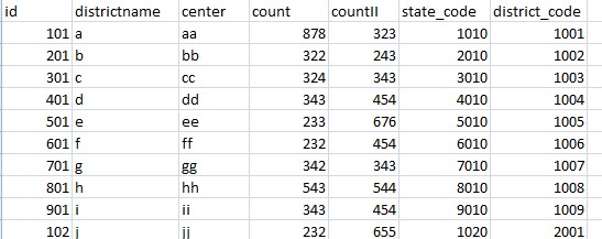
the chart that I have created...

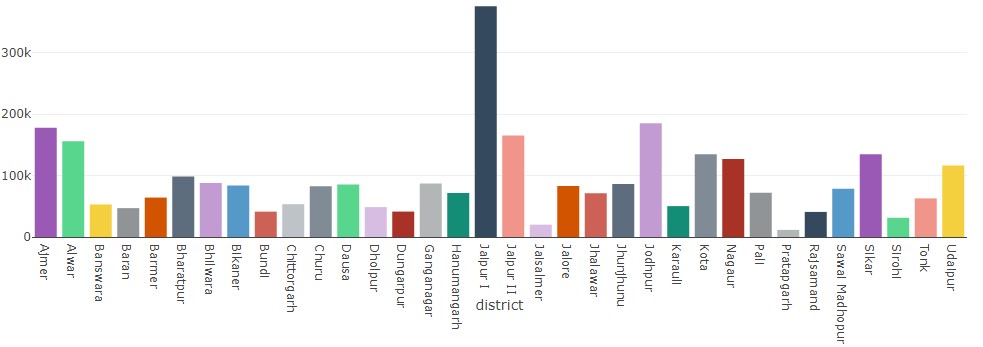
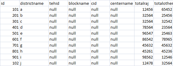
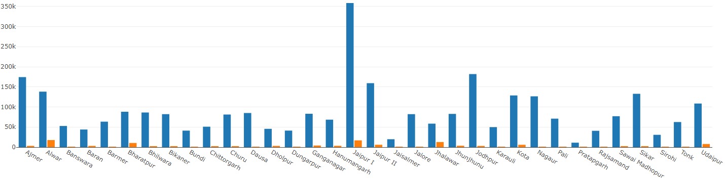
what I want to do is rendering the below chart on click of the above chart ...and this is grouped bar chart with different values

CODE FOR SECOND GROUPED CHART

but I also want to pass the key to get the data for a specific bar in the chart,

let's say that the id of each district is different for ex... 10,11,12,13 and so on for 34 districts and I want to fetch the specific data values from the stored procedure of ms SQL server as per id of district to render the chart for specific or the bar that the user clicked on

and on the second (prob2)chart which is grouped chart I wanna do the same but when I click on one part of same grouped chart data must be different and for another half of that data must be different as per requirements

how to create the coupled event chart for this problem

dummy code...

output$plott2 <- renderPlotly({
dn=odbcDriverConnect('Driver={SQL Server};Server=;Database=;Uid=;Pwd=')
qr=paste("exec databsename[stored_procedure_name],parameters)
q
d<- sqlQuery(dn,q)
d <- data.frame(d)
d
closeAllConnections()
t=rowSums(cbind(d$count,d$countII), na.rm=TRUE)
layout <- list(
font = list(size = 12),
title = "",
xaxis = list(title = "),
yaxis = list(title = " ")
)

p <- plot_ly(d, colors = COL, marker = list(color = COL))
p <- add_trace(p, x = d$districtname, y =~t,name = "",type = 'bar' )
p <- layout(p, font = layout$font, title = layout$title, xaxis = layout$xaxis, yaxis = layout$yaxis)

})

CODE FOR SECOND GROUPED CHART
output$plott2 <- renderPlotly({
dn=odbcDriverConnect('Driver={SQL Server};Server=;Database=;Uid=;Pwd=')

q=paste("exec databasename [stored_pro],parameters")
q
d <- sqlQuery(dn,q)
d <- data.frame(d)
d
closeAllConnections()

data <- data.frame(d$DistrictName, d$count, d$countII)

p <- plot_ly(data, x = d$DistrictName, y = d$count, type = 'bar', name = '') %>%
add_trace(y = d$countII, name = '') %>%
layout(yaxis = list(title = ''), barmode = 'group',bargroupgap="0.1")
})

Hi,

Writing Shiny code is dependent on many factors so we'll need a lot more details. In order for us to help you with your question, please provide us a minimal reprocudible example (Reprex) where you provide a minimal (dummy) dataset and code that can recreate the issue. One we have that, we can go from there. For help on creating a Reprex, see this guide:

Good luck!
PJ

1 Like

data is confidential so dummy data is here...
i hope you will get an idea

101

id districtname center count countII state_code district_code
101 a aa 878 323 1010 1001
201 b bb 322 243 2010 1002
301 c cc 324 343 3010 1003
401 d dd 343 454 4010 1004
501 e ee 233 676 5010 1005
601 f ff 232 454 6010 1006
701 g gg 342 343 7010 1007
801 h hh 543 544 8010 1008
901 i ii 343 454 9010 1009
102 j jj 232 655 1020 2001

here id is a unique code to distinguish among districts

Hello,

Thanks for you first effort in providing more code, we're almost there but not quite ...

The point of a reprex is that we get the data and code in such a format that we can just copy paste it into RStudio and run it until we see the error or issue. In your case, the code you shared lacks a few things:

  • The Shiny app code is incomplete, I only see parts of the server function which will not make me able to run it.I don't need all code, but I need enough to run the app with the basics that can recreate your issue (UI and server)
  • You are calling a database from your code. Since I don't have this database, I won't be able to run anything after that part of the code. Please extract one bit of sample data out of it and share it as a data frame.
  • The data you shared in the table is not in a format that I can copy-paste into a data, frame in R. Please read the reprex guide carefully on how to use the datapasta package to generate copy-paste friendly data frames.

The goal is you slim the code down to the bare minimum needed to create one example of what you are looking for. I again refer to the Shiny reprex page

I know it's not easy to create a reprex, but it really will increase the chances we find a solution.

PJ

image

id districtname tehid blockname cid centername totalraj totalother
101 a null null null null 12456 65452
201 b null null null null 32564 25456
301 c null null null null 32564 32542
401 d null null null null 78564 23564
501 e null null null null 96547 25463
601 f null null null null 86542 78965
701 g null null null null 45632 45632
801 h null null null null 45261 45236
901 i null null null null 98562 12546
102 j null null null null 12478 32564

library(RODBC)
library(RODBCext)
library(plotly)
library(shinydashboard)
library(shiny.semantic)
library(shiny)
dbcnd <- odbcDriverConnect('Driver={SQL Server};Server=;Database=;Uid=;Pwd=')

ui <- fluidPage(

plotlyOutput("boxplot1"),
plotlyOutput("boxplot2"),
plotlyOutput("boxplot3")

server <-function(input, output, session) {

output$boxplot1 <- renderPlotly({

qrydd=paste("exec databasename..[srtored_procedure]'','96','','','0','01/01/2017','31/12/2017'")
qrydd
dtd <- sqlQuery(dbcnd,qrydd)
dtd <- data.frame(dtd)
dtd
ds <- data.frame(labels = c("totalraj","totalother"),
                 values = c(dtd$totalraj,dtd$totalother)
)
closeAllConnections()

plot_ly(ds, labels = ~labels, values = ~values,type = 'pie')%>%
  layout(legend = list(orientation = "h",  
                       xanchor = "left"))    

})

output$boxplot2 <- renderPlotly({

qrydd=paste("exec databasename..[srtored_procedure] '0','0','','0','','01/01/2017','31/12/2017'")
qrydd
dtd <- sqlQuery(dbcnd,qrydd)
dtd <- data.frame(dtd)
dtd
closeAllConnections()
tablename=rowSums(cbind(dtd$totalraj,dtd$totalother),na.rm=TRUE)
layout <- list(
  font = list(size = 12),
  title = "",
  xaxis = list(title = ""),
  yaxis = list(title = " ",automargin = TRUE)
)

p <- plot_ly(dtd, colors = COL, marker = list(color = COL))
p <- add_trace(p, x = dtd$totalraj, y =~tablename,name = "",type = 'bar')
p <- layout(p, font = layout$font, title = layout$title, xaxis = layout$xaxis, yaxis = layout$yaxis)

})

output$boxplot3 <- renderPlotly({

qrydd=paste("exec databasename..[srtored_procedure]'0','0','','0','','01/01/2017','31/12/2017'")
qrydd
dtd <- sqlQuery(dbcnd,qrydd)
dtd <- data.frame(dtd)
dtd
closeAllConnections()

data <- data.frame(dtd$districtname, dtd$totalraj, dtd$totalother)

p <- plot_ly(data, x = dtd$DistrictName, y = dtd$totalother, type = 'bar', name = 'raj') %>%
  add_trace(y = dtd$totalother, name = 'other-state') %>%
  layout(yaxis = list(title = ''), barmode = 'group',bargroupgap="0.1")

})
}

shinyApp(ui,server)

i am using data as a stored procedure from sql server but you can use data here as a csv file to test the condition...
image
id districtname tehid blockname cid centername totalraj totalother
101 a null null null null 12456 65452
201 b null null null null 32564 25456
301 c null null null null 32564 32542
401 d null null null null 78564 23564
501 e null null null null 96547 25463
601 f null null null null 86542 78965
701 g null null null null 45632 45632
801 h null null null null 45261 45236
901 i null null null null 98562 12546
102 j null null null null 12478 32564

what i am trying to achieve are:

  1. there must be a pie chart half of totalraj and half of totother.
  2. when i click on totalraj then it should render other bar chart with total of states (totalraj and totalother) for all district name (a,b,c,d) separately.
    3.when i click on specific bar,let's say a then it should display information for this specific and i have to pass the key value as well in order to achieve the data for specific
  3. when i click on that then it must render next bar chart and so on...
    5.the SDLC of this system would be like

1.)pie chart with total of totalraj and totalother
2.)then barchart with total of both columns(totalraj and totalother)
3.when i click on specific bar chart like 'a' then it must render the next chart and when i click on 'b' then it must render different
4.for the above given purpose we are gonna use key ,i know all the process to achieve the goal but i am unable to implement for the same,if you noticed it in the stored procedure line you would find the arguments like '99','','0' something like that here 99 is the id which is specific for the district name here it is static what i have done but i wanna get it through dynamic parameters not static one

i hope you got my point ,i tried my best to explain you the scenario the best way possible

Hi,

Your example was still not a reprex, as it required me to copy paste and edit the plain text data you provided and then create a data frame from it after which I needed to replace all the database code. However, I could see you put a lot of effort in trying to come up with one so I went through the extra trouble of cleaning it all up :slight_smile:

The data you provide is not enough to recreate the carts you want, but I think I can show you what the functionality is you need:

library(RODBC)
library(RODBCext)
library(plotly)
library(shinydashboard)
library(shiny.semantic)
library(shiny)
library(dplyr)

dtd = data.frame(
  id = c(101L, 201L, 301L, 401L, 501L, 601L, 701L, 801L, 901L, 102L),
  totalraj = c(12456L, 32564L, 32564L, 78564L, 96547L, 86542L, 45632L,
               45261L, 98562L, 12478L),
  totalother = c(65452L, 25456L, 32542L, 23564L, 25463L, 78965L, 45632L,
                 45236L, 12546L, 32564L),
  districtname = as.factor(c("a", "b", "c", "d", "e", "f", "g", "h", "i", "j")),
  tehid = as.factor(c("null", "null", "null", "null", "null", "null",
                      "null", "null", "null", "null")),
  blockname = as.factor(c("null", "null", "null", "null", "null", "null",
                          "null", "null", "null", "null")),
  cid = as.factor(c("null", "null", "null", "null", "null", "null",
                    "null", "null", "null", "null")),
  centername = as.factor(c("null", "null", "null", "null", "null", "null",
                           "null", "null", "null", "null"))
)

ui <- fluidPage(
  plotlyOutput("boxplot1"),
  plotlyOutput("boxplot2"),
  plotlyOutput("boxplot3")
)
  
server <-function(input, output, session) {
  
  output$boxplot1 <- renderPlotly({

    ds <- data.frame(labels = c("totalraj","totalother"),
                     values = c(dtd$totalraj,dtd$totalother)
    )
    
    
    plot_ly(ds, labels = ~labels, values = ~values,type = 'pie', source = "pieChart")%>%
      layout(legend = list(orientation = "h",  
                           xanchor = "left"))    
  })
  
  output$boxplot2 <- renderPlotly({
    
    s <- event_data("plotly_click", source = "pieChart")
    req(!is.null(s))

    tablename=rowSums(cbind(dtd$totalraj,dtd$totalother),na.rm=TRUE)
    
    plotData = dtd %>% mutate(allSums = totalraj + totalother)
    
    layout <- list(
      font = list(size = 12),
      title = "",
      xaxis = list(title = ""),
      yaxis = list(title = " ",automargin = TRUE)
    )

    p <- plot_ly(data = plotData, x = ~districtname, y = ~allSums, name = "", type = 'bar', source = "barChart")
    p <- layout(p, font = layout$font, title = layout$title, xaxis = layout$xaxis, yaxis = layout$yaxis)
    p
    
  })
  
  output$boxplot3 <- renderPlotly({
    
    s <- event_data("plotly_click", source = "barChart")
    req(!is.null(s))

    plotData = dtd %>% filter(districtname == s$x)
    
    p <- plot_ly(data = plotData, x = c("totalraj", "totalother"), 
                 y = c(~totalraj, ~totalother), name = "", type = 'bar')
    p
  })
}
  
shinyApp(ui,server)
  • When the app starts, you'll only see the pie chart
  • When you click on the pie, the bar chart with all districts and their sum appears (doesnt matter where on the chart you click, as it won't influence the next chart according to you instructions)
  • When you click a bar in the district barchart, you'll get the details in a next chart (is dependent now on which bar you click). You did not provide me info/data on what should be in that chart, so I made something up.
  • Note that i use req() function to make sure a chart will only be drawn once its trigger has been clicked.

Hope this helps
PJ

PS: notice how the data now is pasted into my code for immediate use. Look at the datapasta package and the reprex guide to know how to do this in future!

thanks for your help,i really appreciate your concern,sorry for inconvenience ,i was busy in some other work and couldn't find the time to figure out and create the reprex for this scenario but your help means a lot to me,i can notice your hard work that you put to recreate this scenario.

thanks

could you please tell me how to apply the two keys to two different slices of pie,
I mean in this scenario there are two slices of totalraj and totalother in above given pie chart,
how to create a scenario when i click on totalraj slice of piechart and it must render different barchart and when i click on another slice which is totalother then it must render another barchart,i hope you got my point.treat the both parts of pie chart as an individual

Here is an updated version

library(RODBC)
library(RODBCext)
library(plotly)
library(shinydashboard)
library(shiny.semantic)
library(shiny)
library(dplyr)

dtd = data.frame(
  id = c(101L, 201L, 301L, 401L, 501L, 601L, 701L, 801L, 901L, 102L),
  totalraj = c(12456L, 32564L, 32564L, 78564L, 96547L, 86542L, 45632L,
               45261L, 98562L, 12478L),
  totalother = c(65452L, 25456L, 32542L, 23564L, 25463L, 78965L, 45632L,
                 45236L, 12546L, 32564L),
  districtname = as.factor(c("a", "b", "c", "d", "e", "f", "g", "h", "i", "j")),
  tehid = as.factor(c("null", "null", "null", "null", "null", "null",
                      "null", "null", "null", "null")),
  blockname = as.factor(c("null", "null", "null", "null", "null", "null",
                          "null", "null", "null", "null")),
  cid = as.factor(c("null", "null", "null", "null", "null", "null",
                    "null", "null", "null", "null")),
  centername = as.factor(c("null", "null", "null", "null", "null", "null",
                           "null", "null", "null", "null"))
)

ui <- fluidPage(
  plotlyOutput("boxplot1"),
  plotlyOutput("boxplot2"),
  plotlyOutput("boxplot3")
)
  
server <-function(input, output, session) {
  
  output$boxplot1 <- renderPlotly({

    ds <- data.frame(labels = c("totalraj","totalother"),
                     values = c(sum(dtd$totalraj), sum(dtd$totalother))
    )
    
    
    plot_ly(ds, labels = ~labels, values = ~values, type = "pie", source = "pieChart") %>%
      layout(legend = list(orientation = "h",  
                           xanchor = "left"))    
  })
  
  output$boxplot2 <- renderPlotly({
    
    s <- event_data("plotly_click", source = "pieChart")
    req(!is.null(s))
    
    plotData = dtd %>% select(totalraj, totalother)    
    plotData = dtd %>% mutate(value = plotData[, s$pointNumber + 1])
    
    layout <- list(
      font = list(size = 12),
      title = "",
      xaxis = list(title = ""),
      yaxis = list(title = " ",automargin = TRUE)
    )

    p <- plot_ly(data = plotData, x = ~districtname, y = ~value, name = "", 
                 type = 'bar', source = "barChart", color = I(c("#1f77b4", "#ff7f0e")[s$pointNumber + 1]))
    p <- layout(p, font = layout$font, title = layout$title, xaxis = layout$xaxis, yaxis = layout$yaxis)
    p
    
  })

  output$boxplot3 <- renderPlotly({
    
    s <- event_data("plotly_click", source = "barChart")
    req(!is.null(s))
    
    plotData = dtd %>% filter(districtname == s$x)
    
    p <- plot_ly(data = plotData, x = c("totalraj", "totalother"), y = c(~totalraj, ~totalother), 
                 name = "", type = 'bar', color = I("#2ca02c"))
    p
  })
}
  
shinyApp(ui,server)

Your pie chart was not correctly created by the way. I redefined it and now made it interactive using the event_data function with the correct source and then refer to the slice clicked. Remember that plotly is a JavaScript based language and thus counts from 0. That's why I needed to use +1 to convert it to R counting that starts from 1.

Hope this helps,
PJ

could you please tell me how to make the pie chart conditional ,i mean when i click on one part of pie it must render something whatever the condition is given and same for other slice of it.

i tried to come up with a solution but it didn't work out for me.

what i did ...
1.) tried to print the values in verbatimtextbox of pie chart,by default it render the position i guess like (0 & 1)
2.) then captured those position and given the condtion within it

let's say

i have a pie chart and i want to render different plotly chart on click event of each slice,two diferent plotly chart in my case then

i captured it like..
note: link1 is source of pie chart that i wanna add event on
cd<-event_plotly('plotly_click',source='link1')
if(cd$pointnumber==0)
{
output$plotly<-renderplotly({
barchart 1 for totalraj #different dataset
})}

else{
if(cd$pointernumber==1)
output$plotly<-renderplotly({
barchart 2 for totalother #different dataset
})}
else{
return(NULL)
}
but it doesn't look like a logical solution to me ,could you please guide me through this case.

i have added condition for second case again coz if i don't write it that way,when i click on position '0' then it would work and when click on position '1' then it gonna throw the else part and when i tried to reverse the position ,it didn't work out .so i am kinda stuck in this case for fairly long time,could you please tell me best possible logical way to get it done

i am late to respond due to time difference ,i guess ,trying to figure it out

Hi,

I don't really understand your request. As I implemented it now, clicking on the different slices of the pie char will render different charts.... So I don't understand what else you like. Could you give a more detailed example of what it is you want.

Also, instead of creating an if statement with output$plotly inside it, do it the other way around where you create one output$plotly with an if statement inside it.

output$plot <- renderPlotly({
  
  s <- event_data("plotly_click", source = "barChart")
  req(!is.null(s))
  
  if(s$pointNumber == 0){
    plot_ly(data = data1, ...)
  } else {
    plot_ly(data = data2, ...)
  }
  
})

PJ

i didn't get how to treat both slice individually with different datasets for each,could you please guide through an example.by the way one more random question,how to pass the key to stored procedure to get the data as per unique id

what i have done...
output$plott7 <- renderPlotly({
# d<-event_data('plotly_click',source = 'link10')
# if(is.null(d)==F){

  qrydd=paste("exec databasename..[stored_procedure_name] '4',",d$key,",'','','','4','2','','','01/01/2017','31/12/2017'")
  qrydd
  dtd <- sqlQuery(dbcnd,qrydd)
  dtd <- data.frame(dtd)
  dtd
  closeAllConnections()
  layout <- list(
    font = list(size = 12),
    title = "centre details",
    xaxis = list(title = "records"),
    yaxis = list(title = "centre names",automargin = TRUE)
  )
  
  p <- plot_ly(dtd, colors = COL, marker = list(color = COL),orientation='h',source = "link12",key= ~paste(dtd$DID,sep="")) %>%
    add_trace(x =dtd$TotFormFOtherState , y =dtd$CenterAddress ,name = "centre",type = 'bar') %>%
    layout(font = layout$font, title = layout$title, xaxis = layout$xaxis, yaxis = layout$yaxis)
  #}
# else
# {
#   return(NULL)
# }

})

it is showing error of atomic vector for $

it would be great help you if could guide me through this, and sorry for my vague explanation of each case...

but it is perfectly working in this case

output$plott3 <- renderPlotly({
d<-event_data('plotly_click',source = 'link3')
if(is.null(d)==F){

  qrydd=paste("exec databasename...[sp]",d$key,",'3','','0','','01/01/2017','31/12/2017'")
  
  qrydd
  dtd <- sqlQuery(dbcnd,qrydd)
  dtd <- data.frame(dtd)
  dtd
  closeAllConnections()
  
  data <- data.frame(dtd$BlockName, dtd$TotFormFRaj, dtd$TotFormFOtherState)
  
  p <- plot_ly(dtd, x = dtd$BlockName, y = dtd$TotFormFRaj, type = 'bar', name = 'rajasthan',key = ~paste(dtd$DID,sep = ""), source = 'link1') %>%
    add_trace(y = dtd$TotFormFOtherState, name = 'other-state') %>%
    layout(yaxis = list(title = 'sonographies'), barmode = 'group',title=dtd$BlockName)}
else{
  return(NULL)
}

})

Just of note, you can't start asking the same question in different forum topics. I just gave a first answer to this question in a new topic you opened. If questions are related, keep them in one topic, if they are different, open different topics, but don't start mixing them.

I'll look into your pie chart question soon

PJ

okay, I got it, I am new to this , so there might be some mistakes, I will take care next time

1 Like

Ok, here is an example:

library(plotly)
library(shiny)
library(dplyr)

#Dummy data
myData = data.frame(
  id = 1:8,
  name = c(rep("b", 4), rep("a", 4)),
  value = runif(8, 0, 100)
)

otherData = data.frame(
  x = 1:10,
  y = runif(10)
)

ui <- fluidPage(
  fluidRow(
    column(3, tableOutput("data1")),
    column(6, plotlyOutput("plot1")),
    column(3, tableOutput("data2"))
  ),
  
  fluidRow(
    column(6, plotlyOutput("plot2")),
    column(6, plotlyOutput("plot3"))
  )
)

server <-function(input, output, session) {
  
  output$data1 = renderTable(myData)
  output$data2 = renderTable(otherData)
  
  output$plot1 <- renderPlotly({
    
    #Groupt the data for the pie chart
    plotData = myData %>% group_by(name) %>% summarise(sum = sum(value))
    
    plot_ly(plotData, labels = ~name, values = ~sum, type = "pie", source = "pieChart") 
 
  })
  
  #FILTER DATA FRAME
  output$plot2 <- renderPlotly({
    
    s <- event_data("plotly_click", source = "pieChart")
    req(!is.null(s))
    
    #Get all sorted unique ids
    allId = sort(unique(myData$name))
    
    #Filter the data by id (pointNumber +1 correcponds to the sorted id list)
    plotData = myData %>% filter(name == allId[s$pointNumber+1])
    
    plot_ly(plotData, x = ~id, y = ~value, type = "bar")
  })
  
  
  #USE DIFFERENT DATA FRAME
  output$plot3 <- renderPlotly({
    
    s <- event_data("plotly_click", source = "pieChart")
    req(!is.null(s))
    
    if(s$pointNumber == 0){
      plot_ly(myData, x = ~id, y = ~value, type = "bar")
    } else {
      plot_ly(otherData, x = ~x, y = ~y, type = "scatter")
    }
    
  })
  
}

shinyApp(ui,server)

Hope this helps,
PJ

1 Like

thanks for your continuous help, i am thankful to you for all this

thanks for very well explanation ,it's real help for freshers like me

1 Like