Shinyapps: https://goedhart.shinyapps.io/PlotsOfData/
Rstudio cloud: https://rstudio.cloud/project/228371
Github: github[dot]com/JoachimGoedhart
Twitter: @joachimgoedhart
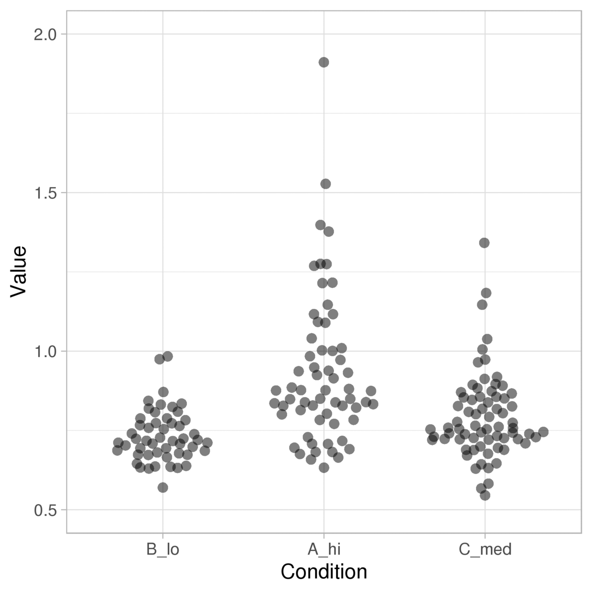
The PlotsOfData app plots the data and statistics to enable the comparison of (experimental) conditions. The philosophy of the approach is that plotting the raw data (instead of a summary) improves transparency and interpretation. To further facilitate the comparison, summary statistics (mean, median, boxplot, violinplot) and inferential statistics (confidence intervals) can be added. The user has full control over the visibility of the raw data and statistics by adjustment of the transparency (alpha).
Features:
- Automatic generation of a legend/figure caption
- Colorblind safe color palettes
- Allows tidy and wide data format as input
- Ability to clone settings
- User customizable tabel with statistics
Example visualizations: