Dear Shiny People,
This time, it is about a scientific/teaching submission ![]() Enjoy
Enjoy
Useful Links:
I must admit that this post is a bit long. Therefore, if you are bored to read the text, you can directly access all apps below.
Importantly, never use Firefox nor IE!
Virtual Patient Simulator
Entry Level App
Introduction:
During my PhD (2013-2016), I developed a rather complex mathematical model applied in physiology (here and here), composed of highly non-linear equations with delayed terms. After obtaining my PhD, the question was the following: how to make it more accessible for people without mathematical background?
This is how the CaPO4Sim package is born.
This package aims at helping students or interested users to better understand the complex mechanisms underlying calcium (Ca) and phosphate (Pi) homeostasis, letting all computations under the hood. Beyond this scope, it is a first step toward a widely more complex virtual simulator, including heart, circulatory and respiratory mechanisms, which is currently under active construction.
Note that this interactive content is completed by a classic textbook approach, which will give students physiological basis.
These apps were developed in the Interface Group.
Our interest is to answer fundamental questions of physiology and address clinical needs through the convergence of engineering, biological and medical research.
A manuscript was recently submitted to a scientific journal. I will update this post when I have more informations about its status
Technical Details:
Before starting, a crucial consideration: these apps run well on Chrome, Safari, Opera, Brave but avoid Firefox, Edges and IE since each image composing the network will not render (well).
Apps
This package is composed of 2 shiny apps:
- The entry level application, designed for students who need reminders about Ca and Pi homeostasis available here
- The virtual patient simulator, emulating real patient. Data are extracted from the literature. The goal is to provide diagnosis and treatments, like a “doctor simulator”. It is accessible here. Note that the Bootstrap 3 version will be deprecated soon but still accessible online.
For the moment, only the first application is modularized. The reason is that at the beginning, we did not expect this project to be as big as it is now. This was a mistake.
However, this is still work in progress and one day, all apps will be modularized.
These apps require the following packages:
- Shiny: the reactive engine
- Plotly: for the plotting part
- deSolve: for computations. The model was converted from Matlab to C , to substantially speed up simulations . The C code is then coupled to the R interface.
- visNetwork: provides an interactive network of Ca and Pi homeostasis with detailed images
- shinyjs: jQuery interactions
- shinycssloaders: loaders for computations
- shinyjqui: drag and drop behavior
- bsplus
- purr
- dplyr
- stringr
- shinyFeedback: provides useful messages for shiny inputs when required
- shinyWidgets: customized inputs, knobInputs
Packages developed
Below is the description of all packages developed during the project.
shinydashboardPlus
For design purpose, I had to develop an extended shinydashboard framework, including more components from the original adminLTE template. shinydashboardPlus provides almost all features from adminLTE2, especially a second sidebar on the right side, sidebars in boxes, carousels, timelines, accordions, social cards, profiles, user panels, more elements in the navbar and a lot more here. There is still a substantial amount of work to do such as building custom input/output bindings for the additional sidebar, for instance.
bs4Dash
As the design was a critical part this project, I decided to create a Bootstrap 4 dashboard template for shiny, in order to have a modern interface. Fortunately, adminLTE comes with a Bootstrap 4 version, namely adminLTE3. It proved sufficiently stable to initiate the package and now allows to build more modern dashboard, without losing the original spirit of shinydashboard. See more here.
shinyEffects
It is a tiny R package providing fancy CSS effects such as shadows, blur, perspectives, zoom, pulse that can be apply either to all elements of the same class or to a specific element given its id. If carefully used, these effects might help to better highlight what happens in the app at a specific moment. See more here.
Other details
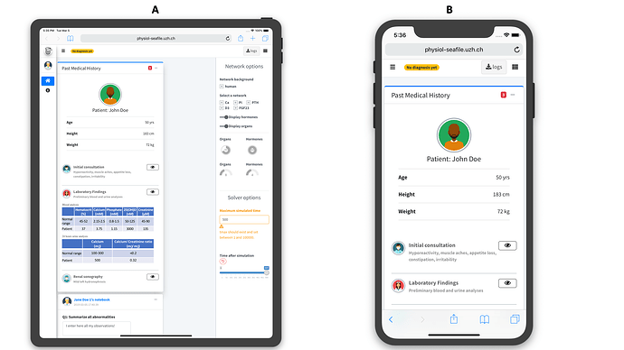
I tried to make these apps usable on mobile devices, adapting the layout when necessary. However, I strongly advise the user to choose larger screens since a lot of content needs to be displayed.
Apps.Physiol: elarning platform
The landing page was produced using the argonR package, which I developed for this purpose. argonR is built on top of the argon Bootstrap 4 library. Instead of writing raw HTML, it allows people to create an entire website with R (htmltools mainly). By calling a template function, it generates the corresponding HTML, including tracking scripts, if specified. This website can be hosted anywhere such as an apache2/nginx server, shiny server, RStudio connect or shinyapps.io.
Apps Tour
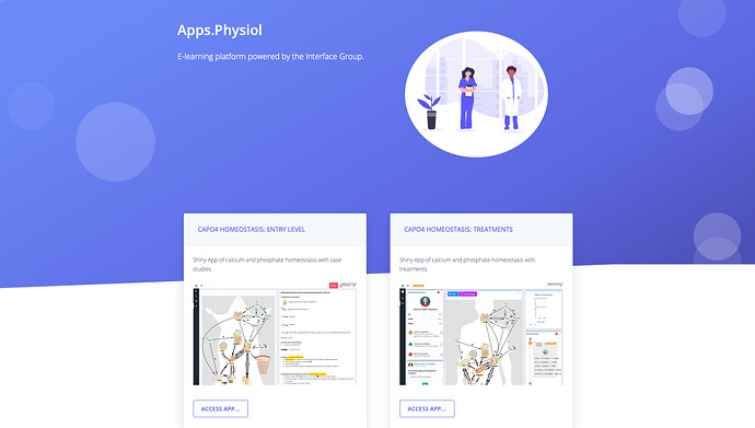
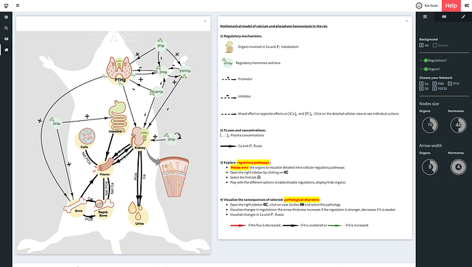
This is how the landing page looks. It is fairly simple but clear. Note that in the navbar, the help section contains details about these web applications.
For the moment, only 2 web apps are showcased, but this will grow up with time, as soon as we develop more model.
Entry level app
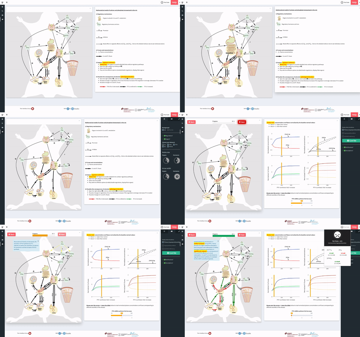
After clicking on the left card of the Apps.Physiol website, the entry level app opens. Before starting, I suggest clicking on the help button (navbar right side) to have more details.
In the right sidebar, the user can play with parameters to adjust the network, filter regulators, remove nodes, changing the size of elements, … The left sidebar contains several tabs to access more content such as a glossary, animations and acknowledgment.
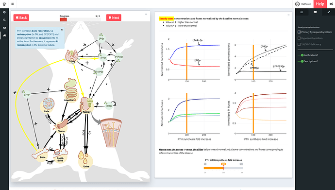
In the second tab of the right sidebar, several case studies can be selected. The user decides whether to enable or disable notifications as well as other information. Once the case study selected, he is invited to play with the network on the left panel by clicking on next/back buttons, which will display sequential animations with the corresponding description. On the right panel, there are graphs output extracted from the underlying mathematical model. By moving the bottom slider, the current disease severity is changed and it is straightforward to monitor its impact on all concentrations.
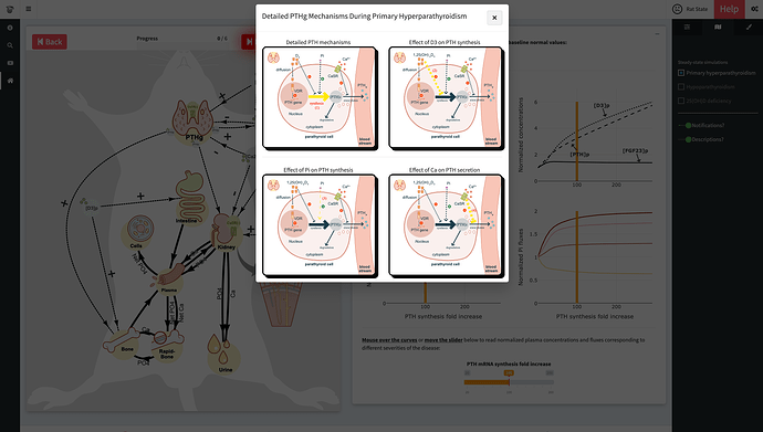
Some nodes handle a double click event, namely PTHg, bone, kidneys and intestine. Once triggered, detailed view involving cellular mechanisms may be displayed (see above)
Virtual Patient simulator
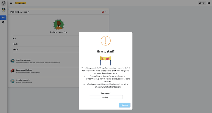
Below is a preview of the new design using bs4Dash. This will be used for the 2019/2020 Calcium-Phosphate course. You can access it here
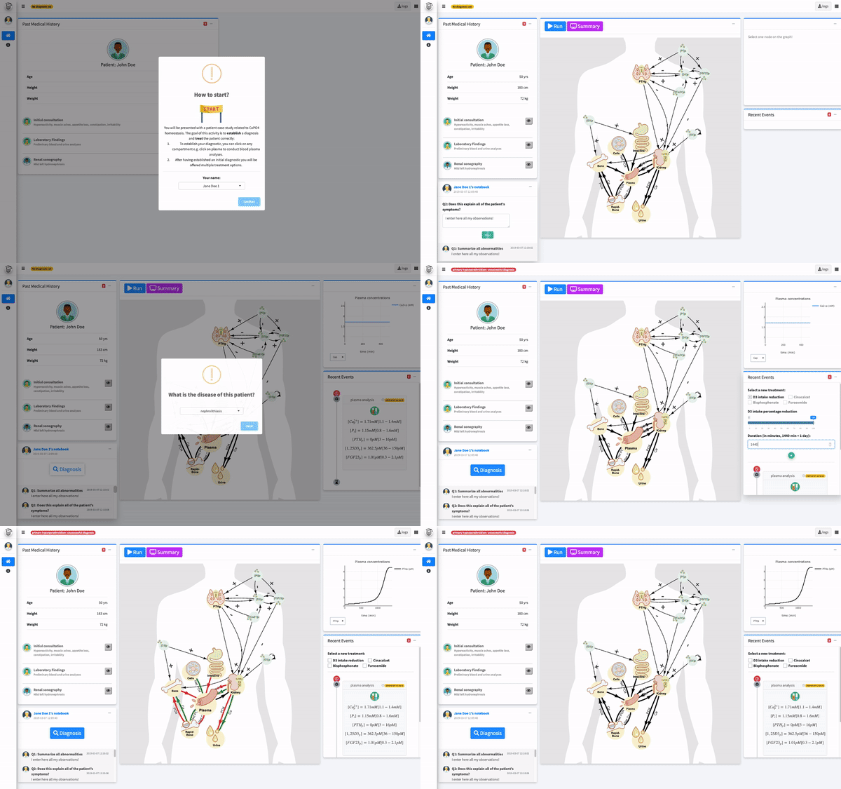
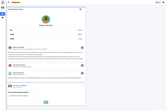
When the app starts, the user is prompted to enter its name. These names can be customized for any course by modifying the student’s names vector in the shiny app. The user is invited to carefully read the patient description (left panel)
Then, a notebook appears below the patient information box. There are 7 questions guiding through the diagnosis process. Based on the patient data, the user has to answer all questions. Results are stored in an rds file that can be used by the instructor.
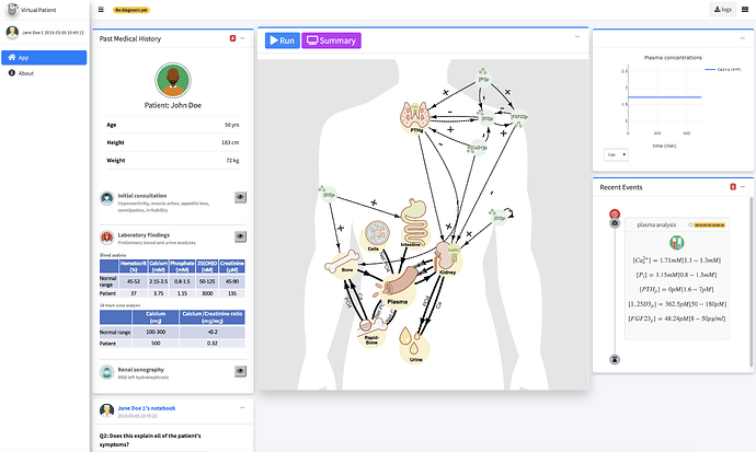
While answering questions, it is possible to access the patient Ca-P interactive network. Clicking on the plasma node simulates a blood sampling, that appears instantaneously in the timeline (bottom right panel). This timeline records all events which are also stored in a rds file. The top right panel displays time series (the duration can be controlled via a numeric input in the right sidebar, see Fig 7) depending on the currently selected node. For a given node, there might be multiple concentrations.
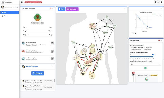
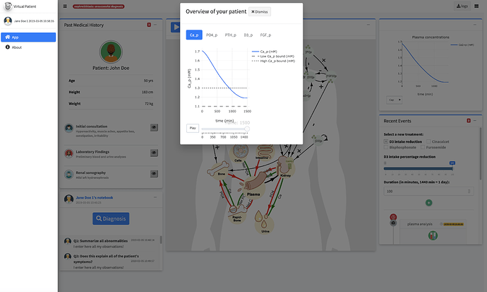
At the end of the questions, the user is asked to guess the patient disease via a select input. He can access treatments independently of its success in the diagnosis process (the user can try again later). The last step is to treat the patient. There are predefined treatments which the user can select. He has to click on the add button (+) of the bottom right box. The run button (interactive network panel) blinks, indicated that the user has to click to launch calculations. Results are displayed in the top right panel as well as in the summary panel, by pressing the related button.
According to the figure above, the goal of the treatment part is to maintain all concentrations within physiological bounds (dashed/dotted lines).
About the RinteRface project
All CRAN packages developed during this work are part of a project which aims at bringing more HTML/CSS/Javascript templates to R and shiny. It is called RinteRface accessible here.
Acknowledgments
I thank RStudio for providing us with RStudio Connect licences. All illustration backgrounds were designed by Tara Von Grebel and animations were produced by Janine Meyer, both of the Multimedia and eLearning-Services, University of Zurich.


Grants
I gratefully acknowledge the financial support provided by the Swiss National Science Foundation through the NCCR Kidney.CH, the University of Zurich (Zurich, Switzerland) through the Lehrkredit Call 2017 and the University of Lausanne (Lausanne, Switzerland) through the Fonds d’Innovation Pédagogique Call 2017.

 I learned a lot from not only Shiny Design but also biological knowledge! Using