I am having an issue creating a shiny app with a reactive choropleth map in R using leaflet (this is my first time using Shiny).
I have a dataset with death rates, death causes, year ,and states. I am trying to create a reactive filter for the causes so that the user can select a cause of death and see the different rates across all states via the change in color (year is to stay constant at 2010). I've created the filter, now I am not entirely sure if I am defining the domain in palette pal correctly (ie do I define it using the death rate or the death cause) as well as the fillColor value.
Additionally, when I run my chunk containing the Shiny code, R generates the Shiny.app window but then after 20 seconds or so the page and RStudio turns completely white and have to End Task in the Task Manager.
I have reviewed this post already: Leaflet chorolpleth with reactive layer - #2 by williaml, but wasn't sure how to implement it on my code (ie is AREA analogous to icd.chapter or crude.rate?)
Libraries and data:
library(dplyr)
library(leaflet)
library(tigris)
library(plotly)
library(shiny)
library(shinythemes)
library(rsconnect)
library(sf)

###this is a manually created sample of the actual data, there are more causes and more states###
df  <- data.frame(Year = c(2000,2001,2003),
                 State = c("AL","AL","AL"),
                 Rate = c(26.7,27.1,27.1),
                 Cause = c("Certain infectious and parasitic diseases","Certain infectious and parasitic diseases","Certain infectious and parasitic diseases")
                 )

names(df) <- lapply(names(df), tolower)

states <- tigris::states(cb=T)

#change column name on shapefile for left join with death data
states <- states %>% rename("state" = "STUSPS")

#st_crs(states)$epsg
states <- st_transform(states, 4326)

#need to use geo_join in order to get sf type datafram for leaflet
states_merged <- geo_join(data_frame=df, spatial_data= states, by_df= "state", by_sp= "state", by = NULL, how = "inner")

# #remove NA
states_merged <- subset(states_merged, !is.na(crude.rate))
Shiny app map code:
#shiny app UI
ui <- fluidPage(
    titlePanel('Causes of Death Across United States in 2010'),
    sidebarLayout(
        sidebarPanel(
            selectInput(
                inputId = 'cause',
                label = 'Cause of Death:',
                choices = unique(states_merged$icd.chapter))
                ),

        mainPanel(
           leafletOutput(outputId = 'map', height = 800)
            )
    )
)

#shiny app server
server <- shinyServer(function(input, output, session){
    map_data <- reactive({
      filter(states_merged, year == 2010 & icd.chapter == input$cause)
      })
    #create color palette based on range of Crude.Rate
      pal <- colorNumeric("Reds", domain=states_merged$crude.rate)
    #Setting up the pop up text
      popup_sb <- with(states_merged,
                 paste(NAME, '<br>',
                       "Crude Rate: ", crude.rate ,'<br>',
                       "Deaths: ", deaths, '<br>',
                       "Population", population))

    output$map <- renderLeaflet({
        map_data() %>%
        leaflet() %>%
        addProviderTiles("CartoDB.Positron") %>%
        setView(-98.483330, 38.712046, zoom = 4) %>%
        addPolygons(
              fillColor = ~pal(states_merged$crude.rate), #reference map_data() or states_merged? also do i use the rate value or the cause of death (icd.chapter)
              fillOpacity = 0.7,
              weight = 0.2,
              smoothFactor = 0.2,
              popup = ~popup_sb) %>%
        addLegend(pal = pal,
            values = states_merged$crude.rate, #reference map_data() or states_merged?
            position = "bottomright",
            title = "Death Rates")

    }
    )
})

shinyApp(ui = ui, server = server)
deployApp()
Static map code:
states_merged_filtered <- filter(states_merged, year == 2010 & icd.chapter == 'Mental and behavioural disorders')

# #create color palette based on range of Crude.Rate
pal <- colorNumeric("Reds", domain=states_merged_filtered$crude.rate)

# Setting up the pop up text
popup_sb <- with(states_merged_filtered,
                 paste(NAME, '<br>',
                       "Crude Rate: ", crude.rate ,'<br>',
                       "Deaths: ", deaths, '<br>',"Population", population))

# Mapping it with the new tiles CartoDB.Positron
leaflet() %>%
  addProviderTiles("CartoDB.Positron") %>%
  setView(-98.483330, 38.712046, zoom = 4) %>%
  addPolygons(data = states_merged_filtered,
              fillColor = ~pal(states_merged_filtered$crude.rate),
              fillOpacity = 0.7,
              weight = 0.2,
              smoothFactor = 0.2,
              popup = ~popup_sb) %>%
  addLegend(pal = pal,
            values = states_merged_filtered$crude.rate,
            position = "bottomright",
            title = "Death Rates")
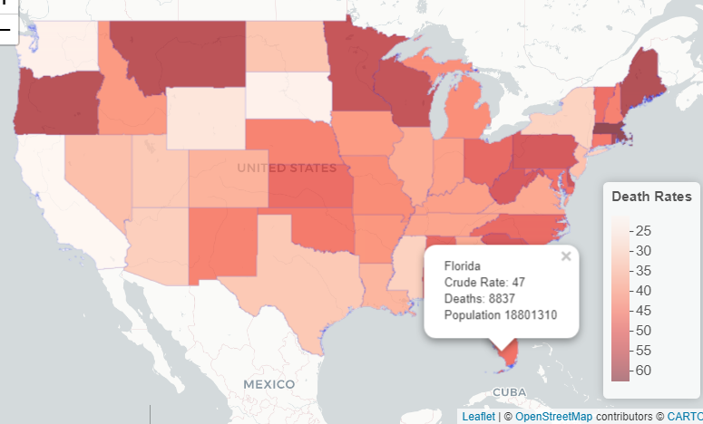
(this is the map output for the above)
US Death Rates for 2010
Cause: Mental and behavioural disorders