Shiny App not drawing labels on scale_fill_gradient

Hello everyone,

Here is a section of code that I have:

mydata <- read.csv("data/svi2020.csv")
countypop$pop_2015[2044:2131] <- mydata$"AREA_SQMI"

plot_usmap(data = countypop, values = "pop_2015", include = c("OH"), color = "black") + 
  scale_fill_gradient(low = "white", high = "black", 
                      name = "chosen_column") + 
  theme(legend.position = "right") +
  labs(title = paste("input$datasetname", " [", sep = ""))

Here is that same code, in a Shiny App's server.R:

output$testmap <- renderPlot({
    mydata <- read.csv("data/svi2020.csv")
    countypop$pop_2015[2044:2131] <- mydata$"AREA_SQMI"
    
    plot_usmap(data = countypop, values = "pop_2015", include = c("OH"), color = "black") + 
      scale_fill_gradient(low = "white", high = "black", 
                          name = "chosen_column") + 
      theme(legend.position = "right") +
      labs(title = paste("input$datasetname", " [", sep = ""))
  })

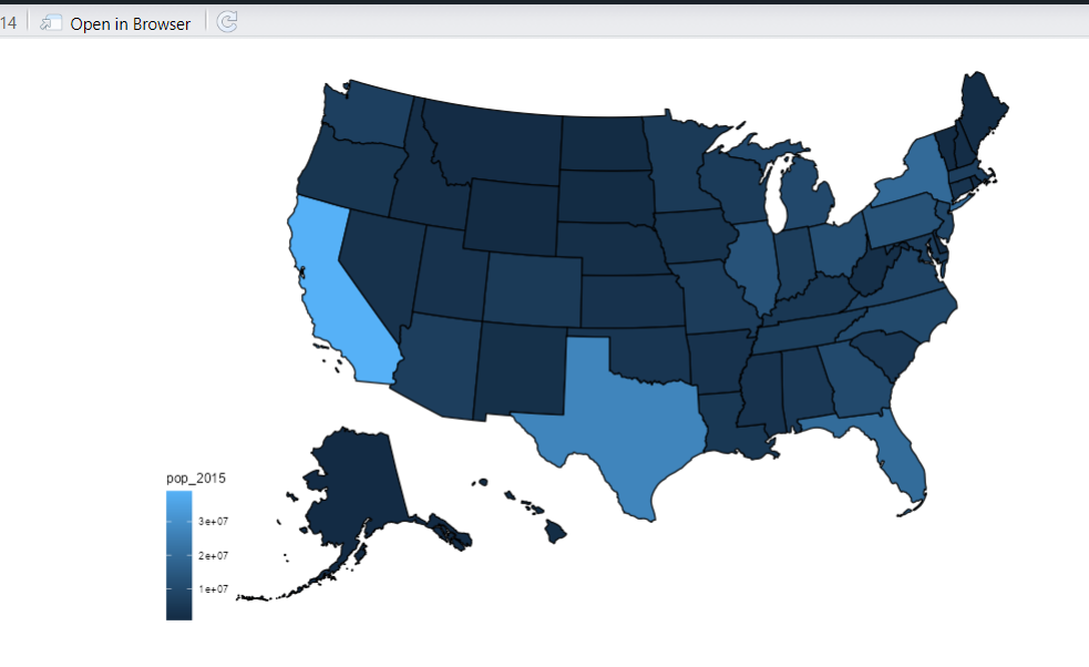
The first outputs the following to the plot window (see attachment)
Screenshot 2024-02-19 at 6.36.03 PM

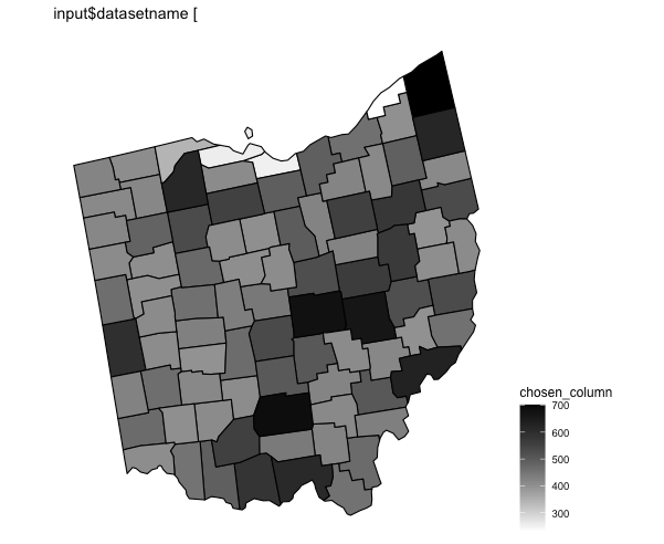
However, in the Shiny App, the labels (700,600,...) on the scale are not shown. Why might this be happening? Thanks!

There is no principled reason why this would happen; it doesnt happen for the most trivial example of placing a plot_usmap in a shiny app

library(usmap)
library(shiny)

ui <- fluidPage(
  plotOutput("myplot")
)

server <- function(input, output, session) {
  output$myplot <- renderPlot({
    plot_usmap(data = statepop, values = "pop_2015")
    
  })
}

shinyApp(ui, server)

Perhaps you can provide a reproducible example for the forum to work with ?

How do I share data for a reprex?

You might use tools such as the library datapasta, or the base function dput() to share a portion of data in code form, i.e. that can be copied from forum and pasted to R session.

Reprex Guide

server.R:

server <- function(input, output, session) {
  
  output$datasetcolumn2 <- renderUI({
    chosen_dataset <- read.csv(paste("data/", input$datasetname, sep = ""))
    selectInput("datasetcolumn", "Data choice:",
                # Only allow user to plot numerical data
                Filter(function(x) class(chosen_dataset[,match(x, names(chosen_dataset))])=="numeric",
                       names(chosen_dataset))
    )
  })
  
  output$map <- renderPlot({
    chosen_dataset <- read.csv(paste("data/", input$datasetname, sep = ""))
    
    chosen_column <- input$datasetcolumn
    chosen_index <- match(chosen_column, names(chosen_dataset))
    
    # Replace data in countypop with desired data
    # Indices of Ohio county data are from 2044 to 2131
    # FIPS codes of Ohio counties: 39001 to 39175 (odds)
    try( 
      countypop$pop_2015[2044:2131] <- chosen_dataset[,chosen_index],
      silent = TRUE # Suppress temporary error message that appears
    )
    
    plot_usmap(data = countypop, values = "pop_2015", include = c("OH"), color = "black") +
      scale_fill_gradient(low = "white", high = "black",
                          name = chosen_column) +
      theme(legend.position = "right") +
      labs(title = paste(input$datasetname, " [", chosen_column, "]", sep = ""))
    
  })
  
  # For testing
  output$testmap <- renderPlot({
    mydata <- read.csv("data/svi2020.csv")
    countypop$pop_2015[2044:2131] <- mydata$"AREA_SQMI"
    
    plot_usmap(data = countypop, values = "pop_2015", include = c("OH"), color = "black") + 
      scale_fill_gradient(low = "white", high = "black", 
                          name = "chosen_column") + 
      theme(legend.position = "right") +
      labs(title = paste("input$datasetname", " [", sep = ""))
  })
  # End testing
}

ui.R:

ui <- fluidPage(
  title = "Ohio Datasets",
  titlePanel("Visualizing Ohio Datasets"),
  sidebarPanel(
    selectInput("datasetname", "Select dataset:",
                list.files(paste(getwd(), "/data", sep = "")) # List of datasets
                )
  ),
  mainPanel(
    uiOutput("datasetcolumn2"), # Dropdown to select data to plot from dataset
    plotOutput("map"),
    plotOutput("testmap") # For debugging, temporary
  )
)

app.R:

library(shiny)
library(usmap)
library(ggplot2)

source("ohio-ui.R")
source("ohio-server.R")

shinyApp(ui = ui, server = server) # Run app

Here's a link to my data folder: Download - UploadNow.io

Hi! I just tried running your code on my computer, and it doesn't work either (it doesn't show the labels like in your screenshot).

My example was from

 packageVersion("usmap")
[1] ‘0.7.0’

But I expect even older versions would have supported showing legends, so unsure how to help you.

Are you perhaps in an environment that retains its state from session to session ? that could cause errors to propogate, so explicitly going to a clean R session might help in such a case.

I have the same version of the package. I also tried simply running the command plot_usmap(data = statepop, values = "pop_2015") in the console, and the correct plot (with labels on the gradient) appeared in the plots panel. It just doesn't show up with your Shiny example, and I just cannot understand why. I'm running shiny, version 1.7.5.

non-reproducible issues are the hardest category to solve...
Perhaps upgrade to shiny 1.8.0; maybe something will be kicked loose

This topic was automatically closed 54 days after the last reply. New replies are no longer allowed.

If you have a query related to it or one of the replies, start a new topic and refer back with a link.