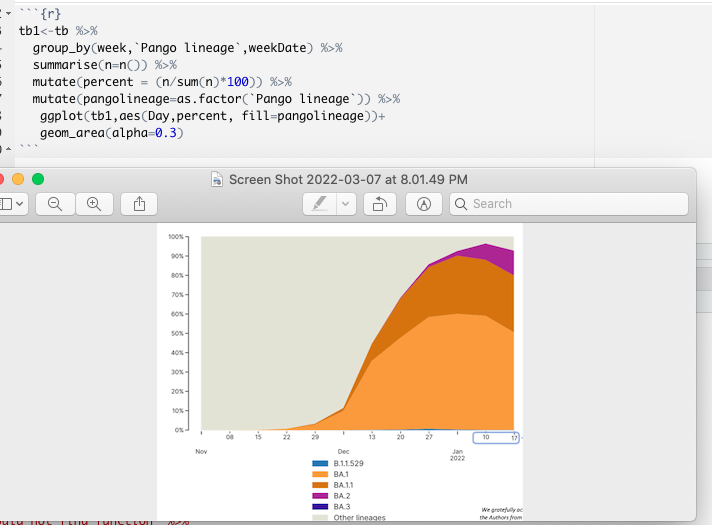
hello-i kindly need help graphing this graph. Here is a code I used that keeps giving me error. attached is my code and also the graph I want to achieve. thank you.
Hi ![]() and welcome to RStudio Community! It's a little tough to help you with just an image and not knowing exactly what error you're seeing. You may want to consider a minimal reproducible example.
and welcome to RStudio Community! It's a little tough to help you with just an image and not knowing exactly what error you're seeing. You may want to consider a minimal reproducible example.
thank you for your reply, I'm trying to get the minimal reproducible but I'm getting this problem kindly take a look for me . Thanks

Hi, Can you post the code instead of the screenshot of the code?
Also should "B.1.1" be a string? Same with all the others in that bit.
sure, thanks.
head(tb, 10)[, c('week','Pango lineage','weekDate')]
dput(head(tb, 5)[c('week','Pango lineage','weekDate')])
library(ggplot2)
df<- data.frame(week = c(1, 1, 1, 1, 1, 1, 1, 1, 1, 1),
Pango lineage = c(B.1.1, B.1, B.1, B.1, B.1, B.1, B.1, B.1, B.1.439, B.1),
weekDate=c(2020-03-30, 2020-03-30, 2020-03-30, 2020-03-30, 2020-03-30, 2020-03-30, 2020-03-30, 2020-03-30, 2020-03-30, 2020-03-30),
stringsAsFactors=FALSE
)
You should post the code for the graph too. Also post your error. What is it?
Anyway this seems to be your data frame:
tb <- data.frame(week = rep(1, 10),
                pango_lineage = c("B.1.1", "B.1", "B.1", "B.1", "B.1", "B.1", "B.1", 'B.1', "B.1.439", "B.1"),
                weekDate = rep ("2020-03-30", 10))
)
In the code for your graph, where does Day come from? You have tb1 as the first argument in ggplot but you are already piping that in so that is probably one of your errors.
thank you. I've been able to run that and also do the minimal reproducible and this is the error I'm facing. This is just 3 columns of the dataset , a very large one and I'm supposed to get a graph like the screenshot above.
library(ggplot2)

tb1 <- data.frame(week = rep(1, 10),
                pango_lineage = c("B.1.1", "B.1", "B.1", "B.1", "B.1", "B.1", "B.1", 'B.1', "B.1.439", "B.1"),
                weekDate = rep ("2020-03-30", 10))
tb2<-tb %>%
  group_by(week,`Pango lineage`,weekDate) %>%
  summarise(n=n()) %>%
  mutate(percent = (n/sum(n)*100)) %>%
  mutate(pangolineage=as.factor(`Pango lineage`)) %>%
   ggplot(tb1,aes(week,percent, fill=pangolineage))+
   geom_area(alpha=0.3)
#> Error in tb %>% group_by(week, `Pango lineage`, weekDate) %>% summarise(n = n()) %>% : could not find function "%>%"
Created on 2022-03-08 by the reprex package (v2.0.1)
Pango Lineage is the name of the column in the original data set .
Hi @Gertrude
Here are a few comments on your code:
- The last error you’re getting is because you’re using the pipe operator from the magrittr package, which was not loaded in your session. I recommend to load tidyverse, which will load for you several packages, including ggplot, dplyr, … and magrittr as a dependency.
- You can use alternatively use the base R pipe: |> but you’ll need in all cases the tidyverse package
- Make sure the variable names are consistent, I see you have 3 different versions of this one:
Pango lineage,pangolineageandpango_lineage.
I changed your example data and the few lines below should get you started:
#loading both tidyverse and lubridate (used to create a sequence of dates in sample data as well and binning dates in weeks)
library(tidyverse)
library(lubridate)

#create sample data, I put 100 data points
set.seed(245)
new_tb <- tibble(`Pango lineage` = sample(c("B.1.1", "B.1.439", "B.1"), 100, replace = TRUE),
                 weekDate = rep(seq(ymd('2020-03-30'),ymd('2020-06-02'), by = '1 week'), 10),
                 week = floor_date(weekDate, "week"))

#transform data & plot
new_tb %>%
  group_by(week, `Pango lineage`) %>%
  summarise(n=n()) %>%
  mutate(percent = n/sum(n)) %>%
  ggplot(aes(week, fill=`Pango lineage`)) + geom_area(aes(y = percent), alpha=0.3) +
  labs(title = "Pango Lineage", x = NULL, y = "Percent") +
  scale_y_continuous(labels = scales::percent)
It may behave differently on your data, let me know if you encounter issues.
I could advise some reading material to learn more about the topic:
3 Data visualisation | R for Data Science (you should read the whole book though)
Thank you.
I have run your code and I have a graph which is what I want. Now my problem is using my data set. I keep getting errors, I don't know the reason because I have a data set which I'm using but I don't get a graph as I'm getting with the codes you sent.
#loading both tidyverse and lubridate (used to create a sequence of dates in sample data as well and binning dates in weeks)

library(tidyverse)

library(lubridate)
#>
#> Attaching package: 'lubridate'
#> The following objects are masked from 'package:base':
#>
#>     date, intersect, setdiff, union


#create sample data, I put 100 data points


new_tb <- tibble(tb$`Pango lineage` ,

                 tb$weekDate ,

                 week = floor_date(tb$weekDate, "week"))
#> Error in eval_tidy(xs[[j]], mask): object 'tb' not found


#transform data & plot

new_tb  %>%

  group_by(week, tb$`Pango lineage`) %>%

  summarise(n=n()) %>%

  mutate(percent = n/sum(n)) %>%

  ggplot(aes(week, fill=tb$`Pango lineage`)) + geom_area(aes(y = percent), alpha=0.3) +

  labs(title = "Pango Lineage", x = NULL, y = "Percent") +

  scale_y_continuous(labels = scales::percent)
#> Error in group_by(., week, tb$`Pango lineage`): object 'new_tb' not found
Created on 2022-03-08 by the reprex package (v2.0.1)
Your tb object is not loaded.
There has to be a line somewhere in your code that reads your data (read.csv or any other way you load your dataframe in your R session), make sure you run it and that it is called tb.
Then you need to adapt the code a little bit, don't use new_tb, I used it for the example but you don't need it.
The following should work providing that your dataframe is loaded, is named tb, and contains the variables written exactly this way Pango lineage & weekDate.
library(tidyverse)
library(lubridate)

tb %>%
  mutate(week = floor_date(weekDate, "week")) %>%
  group_by(week, `Pango lineage`) %>%
  summarise(n=n()) %>%
  mutate(percent = n/sum(n)) %>%
  ggplot(aes(week, fill=`Pango lineage`)) + geom_area(aes(y = percent), alpha=0.3) +
  labs(title = "Pango Lineage", x = NULL, y = "Percent") +
  scale_y_continuous(labels = scales::percent)
Thank you. I have already loaded the data set and I run this code above I had this plot instead.
What might be the problem because I'm not getting the area graph correct.
T
hank you. I have already loaded the data set and I run this code above I had this plot instead.
What might be the problem because I'm not getting the area graph correct.
First of all, there is not enough data in your reproducible example. There is only one week, but we could simulate it. Secondly, it loosk like you want to group the pango lineages - look at something like forcats:::fct_other(). Third, post the code of your graph, not the screenshot. I assume that you're just after something like these: Basic Stacked area chart with R – the R Graph Gallery
This is because you have too many conditions to show, in the example plot it's just 5 (+everything else lumped together in other) you have dozens or hundreds of lineages.
Consequently you only see the legend but not the plot.
you can check it with
length(unique(tb$`Pango lineage`))
For that reason you should process your data further and extract only the relevant information.
One option would be to remove everything that doesn't reach a certain limit (e.g. 5%).
Or summarise the sub-lineages, e.g. all the B.1.177.X will be B.1.177.
Maybe you have to combine both.
Or just take the 5 with the highest percentages...
Hi @Gertrude
I realized just now that you answered some days ago.
Chiming in with the comments from @williaml & @Matthias
A first solution could be to remove the legend to show only the plot (the last line in the code is doing that):
tb %>%
  mutate(week = floor_date(weekDate, "week")) %>%
  group_by(week, `Pango lineage`) %>%
  summarise(n=n()) %>%
  mutate(percent = n/sum(n)) %>%
  ggplot(aes(week, fill=`Pango lineage`)) + geom_area(aes(y = percent), alpha=0.3) +
  labs(title = "Pango Lineage", x = NULL, y = "Percent") +
  scale_y_continuous(labels = scales::percent) +
  theme(legend.position = "none")
But in this case it will give you something illegible (unless you decide to print a mural). After checking a bit further, I found this file (pango-designation/lineages.csv at master · cov-lineages/pango-designation · GitHub) that shows 1639 unique lineages.
It's way too much to fit on a single plot and you need to opt for other plotting options, like @Matthias suggested, you can filter only lineages with the highest values, or group them by sub-lineages, although I suspect it wouldn’t be a good plotting option either since the first sublevel (“A”, “AA”, “AB”, …) contains already 45 different values and may not be relevant.
I have no knowledge of pango lineages and the nomenclature, but I think in your case a Shiny App would be the way to go, where you can dynamically plot lineages or subgroups that you select instead of trying to show all at once.
FYI, the learning curve for Shiny is not too steep for simple Shiny apps, but you need to dedicate quite some hours to learn and code your own as you go: Shiny - Tutorial
1 Like
This topic was automatically closed 21 days after the last reply. New replies are no longer allowed.
If you have a query related to it or one of the replies, start a new topic and refer back with a link.