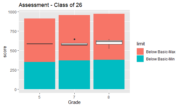
I'm creating boxplots of student assessment scores. I'd like to shade regions behind the boxplots to indicate the various proficiency levels for each grade and subject, so a person looking at the plots can quickly see how the students are performing.
I sliced (and anonymized) a random sample of 50 rows from my scores dataframe, so the boxplots look a bit funny sometimes due to low n counts. The id field refers to an individual student. The pl dataframe has the values I'd like to use to shade behind the boxplots. For a given subject and grade, I'd like to vertically shade red from Below Basic-Min to Below Basic-Max, yellow from Basic-Min to Basic-Max, etc. In a given set of boxplots for a single image, the shading would be different for each boxplot since the grade level will vary.
I've tried using the geom_rect() option, but I don't know how to dynamically set the ymin and ymax values that are retrievable from the pl dataframe, nor the xmin and xmax values that would vary depending on which plot they are behind (and how many plots are displayed).
library(tidyverse)

# create the scores dataframe
scores <- structure(
  list(
    id = c(222, 207, 123, 108, 120, 74, 156, 86, 115, 258, 152, 141, 6, 120, 40, 199, 4, 178, 74, 146, 64, 71, 19, 105, 95, 30, 97, 29, 78, 118, 41, 191, 110, 122, 153, 225, 219, 260, 165, 181, 95, 247, 231, 253, 248, 252, 156, 119, 91, 100),
    FY = c(22, 22, 23, 21, 21, 19, 22, 21, 22, 22, 23, 22, 19, 19, 19, 22, 19, 21, 22, 19, 21, 22, 19, 21, 21, 19, 22, 19, 21, 19, 19, 21, 22, 19, 23, 23, 23, 23, 21, 23, 22, 22, 22, 22, 22, 22, 23, 23, 22, 21),
    Cohort = c(26, 31, 28, 27, 27, 26, 30, 25, 27, 30, 29, 28, 23, 27, 23, 31, 23, 26, 26, 28, 26, 26, 23, 28, 26, 24, 27, 24, 26, 27, 23, 30, 27, 27, 29, 32, 32, 32, 29, 31, 26, 26, 27, 31, 30, 31, 30, 27, 27, 27),
    Grade = c("8", "3", "7", "6", "6", "5", "4", "8", "7", "4", "6", "6", "8", "4", "8", "3", "8", "7", "8", "3", "7", "8", "8", "5", "7", "7", "7", "7", "7", "4", "8", "3", "7", "4", "6", "3", "3", "3", "4", "4", "8", "8", "7", "3", "4", "3", "5", "8", "7", "6"),
    Subject = c(rep("ELA", times = 50)),
    Score = c(521L, 582L, 596L, 520L, 634L, 583L, 533L, 658L, 494L, 511L, 599L, 633L, 571L, 618L, 562L, 504L, 560L, 567L, 623L, 529L, 571L, 599L, 720L, 543L, 643L, 635L, 489L, 623L, 574L, 628L, 587L, 589L, 623L, 609L, 639L, 546L, 612L, 561L, 619L, 656L, 644L, NA, NA, 570L, 561L, 574L, 547L, 601L, 596L, 619L)
  ), row.names = c(NA, -50L), class = c("tbl_df", "tbl", "data.frame")
)

# create the performance levels dataframe
pl <- structure(
  list(
    Subject = c("ELA", "ELA", "ELA", "ELA", "ELA", "ELA", "Math", "Math", "Math", "Math", "Math", "Math", "Science", "Science", "Social Studies", "Social Studies", "Social Studies"),
    Grade = c(3, 4, 5, 6, 7, 8, 3, 4, 5, 6, 7, 8, 4, 8, 4, 8, 10),
    `Below Basic-Min` = c(330, 340, 350, 360, 370, 380, 360, 405, 430, 440, 450, 470, 300, 480, 330, 540, 645),
    `Below Basic-Max` = c(521, 545, 563, 571, 584, 591, 516, 535, 573, 581, 605, 619, 446, 652, 460, 661, 769),
    `Basic-Min` = c(522, 546, 564, 572, 585, 592, 517, 536, 574, 582, 606, 620, 447, 653, 461, 662, 770),
    `Basic-Max` = c(569, 591, 609, 621, 637, 651, 559, 587, 610, 625, 646, 666, 495, 694, 490, 692, 804),
    `Proficient-Min` = c(570, 592, 610, 622, 638, 652, 560, 588, 611, 626, 647, 667, 496, 695, 491, 693, 805),
    `Proficient-Max` = c(623, 649, 669, 670, 696, 707, 610, 632, 657, 687, 711, 717, 542, 736, 536, 733, 836),
    `Advanced-Min` = c(624, 650, 670, 671, 697, 708, 611, 633, 658, 688, 712, 718, 543, 737, 537, 734, 837),
    `Advanced-Max` = c(900, 930, 940, 950, 960, 970, 760, 800, 830, 870, 880, 890, 725, 945, 700, 860, 980)
    ), row.names = c(NA, -17L), class = c("tbl_df", "tbl", "data.frame"))

# create the boxplots
scores_split <- split(scores, scores$Cohort)
lapply(scores_split, function(df) {
  ggplot(df, aes(Grade, Score)) +
    geom_boxplot() +
    labs(title = paste("Assessment - Class of",df$Cohort))
})
Created on 2023-12-01 with reprex v2.0.2
This is an example of one of the boxplots that code creates.

What I am trying to create is something like this:
(Apparently new users are only allowed to embed one media item in a post, so I had to remove this. How silly! I'll try posting it as a comment to my post.)
Thanks in advance for any assistance you can provide!
David

