set the scale of secondary y axis,

I have data with different variables:

The code:

pm_hourly %>%  
select(date,HOUSE_SO4,HOUSE_ratio_SO4_OA,HOUSE_NOx_NEW,HOUSE_NO2_ppb,`relative_humidity_%`) %>% 
  melt(id.vars=1:1)  -> HOURLYa

levels(HOURLYa$variable) <- c( "AMS_SO[4]",
                               "AMS(SO[4]:OA)",
                               "NO[x]~ (ppb)",
                                "NO[2]~ (ppb)",
                                "RH(`%`)")

AMS_SO4_NOX_SO2_HOUSE_HOURLYaa %>%
  filter(date >= as.Date("2022-01-27 00:00") & date <= as.Date("2022-02-06 23:59")) %>%
  ggplot(aes(x = date, y = value, color = variable, fill = variable, group = variable)) + 
  geom_area(data = . %>% filter(variable != "RH(`%`)", variable != "NO[x]~ (ppb)"), alpha = 0.6) +
  geom_line(data = . %>% filter(variable == "RH(`%`)"), size = 1.5) +
  geom_line(data = . %>% filter(variable == "NO[x]~ (ppb)"), size = 1.5, linetype = "dashed") +
  xlab("(2022) Hourly") +
  ylab("") +
  labs(title = "HOUSE Site") +
  theme(legend.position = "right") +
  theme(axis.title = element_text(face = "plain", size = 16, color = "black"),
        axis.text = element_text(size = 16, face = "plain", color = "black"),
        axis.title.x = element_text(vjust = 0.1),
        axis.text.y = element_text(hjust = 0.5),
        plot.title = element_text(size = 15)) +
  theme(strip.text = element_text(size = 12, color = "black")) +
  scale_x_datetime(expand = c(0, 0),
                   date_breaks = "2 days",
                   date_minor_breaks = "5 days",
                   date_labels = "%m/%d",
                   limits = as.POSIXct(c("2022-01-26 00:00:00", "2022-02-05 20:59:00"))) +
  scale_y_continuous(sec.axis = sec_axis(~., name = "AMS(SO[4]:OA)", 
                                         breaks = seq(0, 1, by = 0.1), 
                                         labels = seq(0, 1, by = 0.1)))

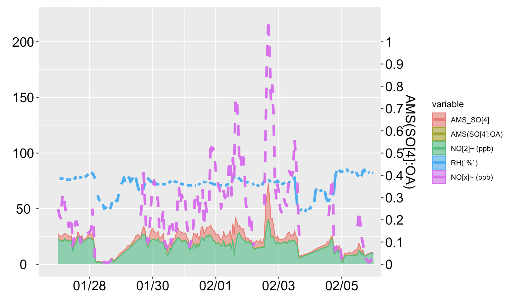
Now, I want to shift "AMS(SO[4]:OA)" to the right secondary axis with the limit 0 to 1.

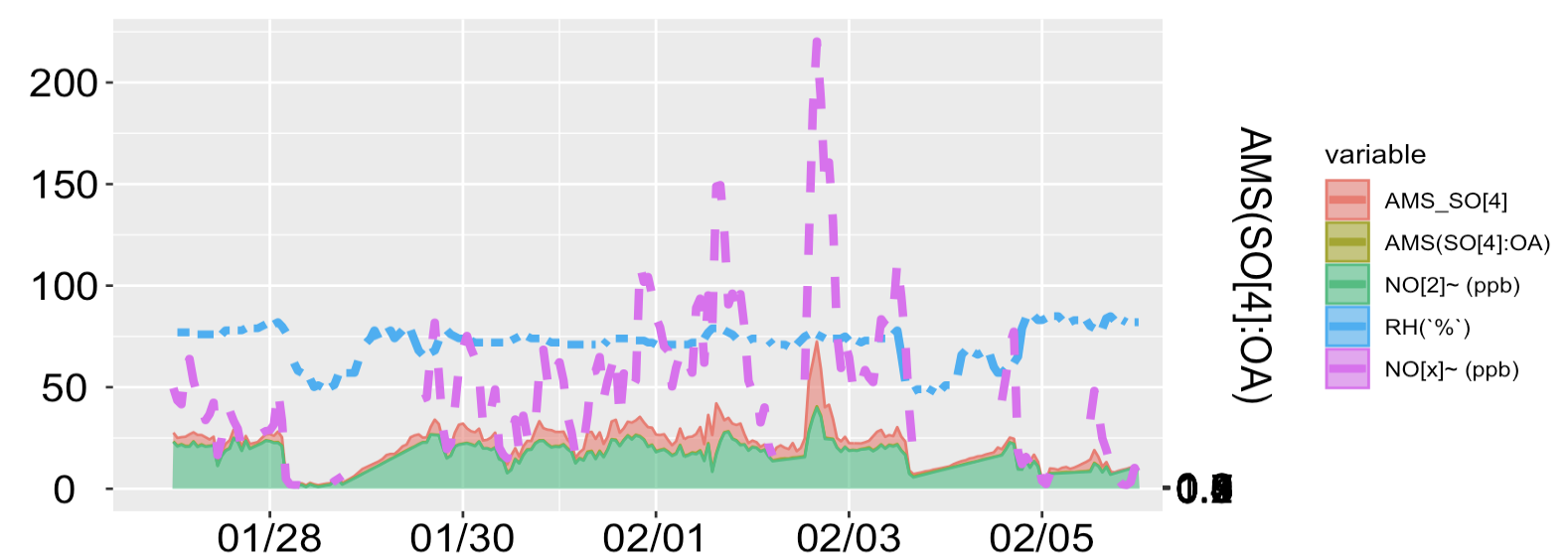
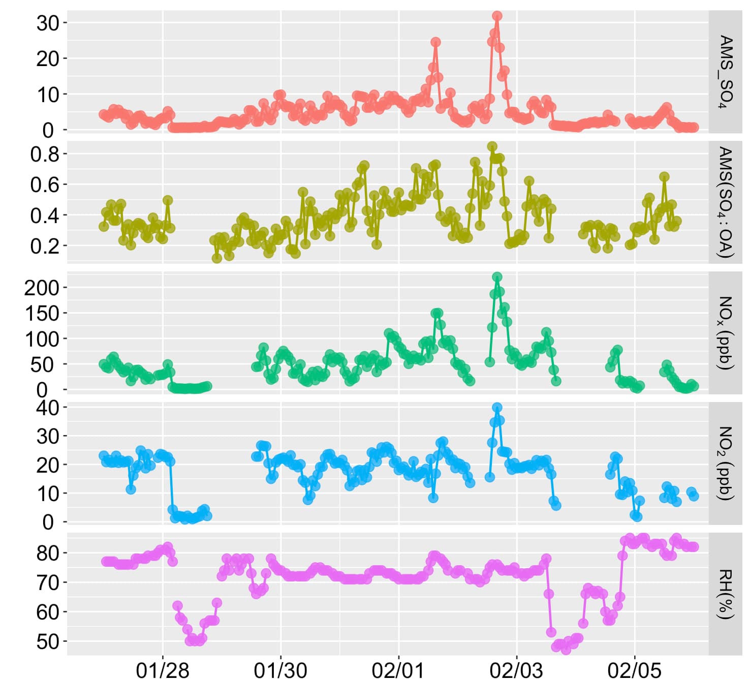
Also, I don't want a stacked filled area plot, because, AMS_SO[4] has lower values than NO[2] and from this (filled area) plot, it looks like AMS_SO[4] has a higher value than NO[2]. I have also attached the line plot.

Thanks

1 Like

You need to multiply your values of AMS(SO[4]:OA by 200 and then divide the labeling of the secondary axis by 200 with

scale_y_continuous(sec.axis = sec_axis(~ ./200, name = "AMS(SO[4]:OA)", 
                                         breaks = seq(0, 1, by = 0.1), 
                                         labels = seq(0, 1, by = 0.1)))

Great! Thanks for the response.
But, the plot for AMS(SO[4]:OA did not change with that, Only the axis scale changed

One more thing, If you look at the line plot (2nd plot), the maximum value of AMS_SO[4] reached up to ~ 30 but in the filled area map, the AMS_SO[4] value reached up to ~70. Could we modify the area-filled map to show the real value?

The default position of geom_area is "stacked", so each series rides on top of the previous series. You can change position to "identity" to show the actual values. You will then have to set the transparency to something less than 1 so the lower valued series is visible. It can also be hard to discern the fill color. In this example, the A series has values between 1 and 2 and the B series has values between 3 and 4.

library(ggplot2)
DF <- data.frame(Species = rep(c("A","B"), each = 50),
                 X = c(1:50, 1:50),
                 Value = c(runif(50, 1,2), runif(50, 3, 4)))
ggplot(DF, aes(x = X, y = Value, fill = Species)) + 
  geom_area()


ggplot(DF, aes(x = X, y = Value, fill = Species)) + 
  geom_area(position = "identity", alpha = 0.5)

Created on 2024-01-01 with reprex v2.0.2

Hi @kunal.bali9, in some opportunity I'm read this article about the use of a second axis.
I'm not a graphics expert but I enjoy get different opinions for select the correct use.

Dualaxis

I am still getting some issues; Here is a sample data.

I used this data to create THIS plot: Can I generate using the above code:

  1. Please post your data in a format that is easy to copy and paste. If your data frame is named DF, post the output of
dput(DF)

Put lines with three back ticks just before and after the pasted output, like this:
```
output of dput() goes here
```

  1. You say you are still having some issues. What issues are you having? Please be specific.
  2. Is your goal to make the plot at the bottom of your last post using ggplot?

It is very late for me, so I'll be offline for several hours. Someone else may be able to help you before then.

Thanks for your time.
You can find the data here:

Yes, My goal is to make the plot at the bottom of my last post using ggplot.

You don't say what problems you have encountered and you want a complicated plot. I have done the first steps of building the plot. I do not know how to build a legend similar the one in your image.

DF <- read.csv("~/R/Play/sample.csv")
library(tidyverse)

#filter out rows with no date. There are many at the end of the file
#Also, make the date column a numeric date. Assumed the year is  2023
DF <- DF |> filter(nchar(date) > 5) |> 
  mutate(date = mdy_hm(str_replace(date, "^(../../)", "\\12023")))

#Make SMPS_GM numeric and reshape to long format
DFlong <- DF |> mutate(SMPS_GM = as.numeric(SMPS_GM)) |>  
  pivot_longer(cols = -1, names_to = "Var", values_to = "Value") 
#> Warning: There was 1 warning in `mutate()`.
#> ℹ In argument: `SMPS_GM = as.numeric(SMPS_GM)`.
#> Caused by warning:
#> ! NAs introduced by coercion

AreaData <- DFlong |> filter(!Var %in% c("NCORE_PM2.5", "SMPS_GM"))
NCORE <- DFlong |> filter(Var == "NCORE_PM2.5")
SMPS <- DFlong |> filter(Var == "SMPS_GM")

#Order the levels of Var so the data with the largest mean is plotted first 
AreaData <- AreaData |> mutate(Var = fct_reorder(.f = Var, .x = Value, .fun = function(X) -mean(X), .na_rm = TRUE))
ggplot(mapping = aes(x = date, y = Value)) +
  geom_area(aes(fill = Var), data = AreaData) + 
  geom_line(data = SMPS, linetype = 2) + geom_point(data = SMPS, color = "darkorange2") +
  geom_line(data = NCORE) +
  theme_bw()
#> Warning: Removed 66 rows containing non-finite values (`stat_align()`).
#> Warning: Removed 3 rows containing missing values (`geom_point()`).

Created on 2024-01-02 with reprex v2.0.2

1 Like

Thank you for addressing my query. I appreciate your assistance.

The issue I encountered was that when attempting to shift any variable to the right y-axis, the plot did not adjust according to the right y-axis (y2 axis) limits. Instead, it remained aligned with the left (y1) axis.

For instance, if I intended to shift NCORE_PM2.5 and SMPS_GM to the right y-axis (y2 axis), the plot did not reflect changes relative to the limits of the right y-axis.

Yes, that is correct. All the plotting is done with respect to the primary axis. The secondary axis is for displaying values. Let's say you want to plot two data sets with a factor of 200 between their scales. You make the secondary axis by dividing the values of the primary axis by 200 and, since all plotting is done against the primary axis, you multiply the values of the second series by 200 so they will appear at the correct position. Compare these two plots. In the second one, I have appropriately scaled the Y2 values so they plot correctly against the primary axis but the labels on the secondary axis display the original Y2 values that you want the viewer to get from the plot.

library(ggplot2)
DF <- data.frame(X = 1:4, Y = c(23, 188, 97, 169), Y2 = c(0.62, 0.21, 0.98, 0.44))

ggplot(DF, aes(x = X)) +
  geom_line(aes(y = Y)) +
  geom_line(aes(y = Y2), color = "red") +
  scale_y_continuous(sec.axis = sec_axis(~ . / 200)) +
  theme(axis.text.y.right = element_text(color = "red"))


ggplot(DF, aes(x = X)) +
  geom_line(aes(y = Y)) +
  geom_line(aes(y = Y2 * 200), color = "red") +
  scale_y_continuous(sec.axis = sec_axis(~ . / 200)) +
  theme(axis.text.y.right = element_text(color = "red"))

Created on 2024-01-04 with reprex v2.0.2

This topic was automatically closed 42 days after the last reply. New replies are no longer allowed.

If you have a query related to it or one of the replies, start a new topic and refer back with a link.