Separate legends for geom_ribbon aesthetics

Greetings, ggplot wizards :wink:
After reading through chapter 14 Scales and guides from ggplot2: Elegant Graphics for Data Analysis, I would like to create two separate guides (legends), one for color and fill, one for linetype and alpha. While a variable is mapped to color and fill, linetype and alpha are set manually (i.e. as constants) depending on the layer and later mapped with manual scales.
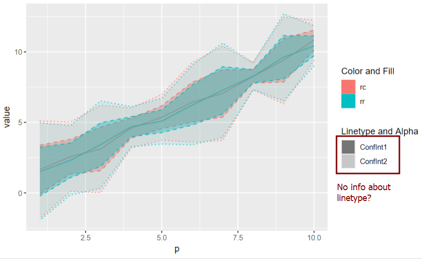
I would expect information about the 'linetype' to appear in my legend 'Linetype and Alpha'. However, only information related to alpha is shown.

library(ggplot2)
library(tidyr)

set.seed(10)

df <- tibble(rr = (1:10) + runif(10), 
			 rc = (1:10) + runif(10), 
			 p = 1:10, 
			 sd = runif(10)) |> 
	pivot_longer(cols=c(rr,rc)) 


ggplot(df)+
	geom_line(aes(x = p, y=value, color=name)) +
	geom_ribbon(aes(x = p, ymin = value-sd*2, ymax = value+sd*2, 
					color=name,
					fill = name,linetype = "ConfInt1", alpha = "ConfInt1"), show.legend=TRUE) + 
	geom_ribbon(aes(x = p, ymin = value-sd*4, ymax = value+sd*4, 
					color=name,
					fill = name,linetype = "ConfInt2", alpha = "ConfInt2"), show.legend=TRUE) + 
	scale_linetype_manual(name="Linetype and Alpha", values = c("ConfInt1"="dashed","ConfInt2"="dotted")) + 
	scale_alpha_manual(name="Linetype and Alpha",values = c("ConfInt1"=0.4,"ConfInt2"=0.1)) +
	labs(color="Color and Fill",fill="Color and Fill")

I would greatly appreciate any advice.

Hi Pascale,

In your plot, the aesthetic alpha uses numeric values, whereas the aesthetic linetypeuses categorical ones. This means that only one appears in the legend, namely alpha since ggplot() processes the alpha aesthetic before the linetype aesthetic, as is reflected in the list of aesthetics for geom_ribbon().

[EDIT: This is completely wrong; see below]

Hi David,
Thank you for your insight. I am not sure, I understand the intention behind this default behaviour. Worked around it by drawing a separate line.

My explanation was entirely off the mark! Although there can be data-type clashes that produce unintended ggplot behavior, that's not what's going on in your example. It appears there are two factors that are contributing to the behavior:

  1. the use of strings as placeholders that are later assigned values, and
  2. the splitting of attributes of a graphical element across legends

Here is a pair of examples that I think illustrate how legend behavior depends on both of these. (Full reprex at end of post.)

In the first example, all the aesthetics have the same source (the string 'a'), and lead to a single legend that combines them all:

library(tidyverse)                       

ggplot() +
  geom_tile(
    aes(
      0, 0, width = 1, height = 1,
      color = 'a',
      fill = 'a',
      linetype = 'a',
      alpha = 'a'
    ),
    linewidth = 1
  ) +
  scale_color_manual(name = 'cmb', values = 'red') +
  scale_fill_manual(name = 'cmb', values = 'blue') +
  scale_alpha_manual(name = 'cmb', values = 0.4) +
  scale_linetype_manual(name = 'cmb', values = 'dashed' )

However, if we give linetype and alpha a different source, 'b', we get this:

ggplot() +
  geom_tile(
    aes(
      0, 0, width = 1, height = 1,
      color = 'a',
      fill = 'a',
      linetype = 'b',
      alpha = 'b'
    ),
    linewidth = 1
  ) +
  scale_color_manual(name = 'cmb', values = 'red') +
  scale_fill_manual(name = 'cmb', values = 'blue') +
  scale_alpha_manual(name = 'cmb', values = 0.4) +
  scale_linetype_manual(name = 'cmb', values = 'dashed' )

Created on 2024-05-23 with reprex v2.0.2

The fact that there are now two legends corresponds to the fact that there are two sources for the data supplied to the aesthetics, but that is not all: The boundary of the rectangle is a line that incorporates the color and linetype aesthetics, but these are split between the two legends, and only one gets the graphical representation of the line, color (likely because of the order of the aesthetics of a line), and so the second legend has no "line" to be "dashed". (The light grey boundary in the second legend shows the "line" is missing.)

Full reprex
library(tidyverse)                       

ggplot() +
  geom_tile(
    aes(
      0, 0, width = 1, height = 1,
      color = 'a',
      fill = 'a',
      linetype = 'a',
      alpha = 'a'
    ),
    linewidth = 1
  ) +
  scale_color_manual(name = 'cmb', values = 'red') +
  scale_fill_manual(name = 'cmb', values = 'blue') +
  scale_alpha_manual(name = 'cmb', values = 0.4) +
  scale_linetype_manual(name = 'cmb', values = 'dashed' )


ggplot() +
  geom_tile(
    aes(
      0, 0, width = 1, height = 1,
      color = 'a',
      fill = 'a',
      linetype = 'b',
      alpha = 'b'
    ),
    linewidth = 1
  ) +
  scale_color_manual(name = 'cmb', values = 'red') +
  scale_fill_manual(name = 'cmb', values = 'blue') +
  scale_alpha_manual(name = 'cmb', values = 0.4) +
  scale_linetype_manual(name = 'cmb', values = 'dashed' )

Created on 2024-05-23 with reprex v2.0.2

Here is an attempt to achieve your intended plot without too many alterations of your code. (Full reprex at the botton of post.) The re-use of geom_ribbon() and the placeholder strings suggest that changing the format of your table might help streamline your ggplot() code, but I'll leave that for later.

original data, saved as "df"
library(ggplot2)
library(tidyr)

set.seed(10)

df <- 
  tibble(
    rr = (1:10) + runif(10), 
    rc = (1:10) + runif(10), 
    p = 1:10, 
    sd = runif(10)
  ) |> 
  pivot_longer(cols = c(rr, rc)) 
ggplot(df) +
  # draw lines using ConfInt1 and ConfInt2 as placeholders for
  # the color black and the line types dashed and dotted
  geom_hline(
    aes(yintercept = -2.5, color = 'ConfInt1', linetype = 'ConfInt1'),
  ) +
  geom_hline(
    aes(yintercept = -2.5, color = 'ConfInt1', linetype = 'ConfInt2'),
  ) +
  # draw center lines of ribbon in desired colors and line type on top of
  # previous center lines
  geom_line(
    aes(x = p, y=value, color = name)
  ) +
  geom_ribbon(
    aes(
      x = p, ymin = value-sd*2, ymax = value+sd*2, 
      color = name,
      fill = name,
      linetype = "ConfInt1",
      alpha = "ConfInt1"
    )
  ) +
  geom_ribbon(
    aes(
      x = p, ymin = value-sd*4, ymax = value+sd*4, 
      color = name,
      fill = name,
      linetype = "ConfInt2",
      alpha = "ConfInt2"
    )
  ) +
  # add manual color scale to add black lines to line type legend, but don't show
  scale_color_manual(
    # add red and blue values that are close to default ones
    values = c("ConfInt1"="black", 'rc' = '#F8766D', 'rr' = '#00BFC4'), 
    guide = 'none'
  ) +
  # merge line type and alpha legends
  scale_linetype_manual(
    name = "Linetype and Alpha", 
    values = c("ConfInt1" = "dashed", "ConfInt2" = "dotted")
  ) +
  scale_alpha_manual(
    name = "Linetype and Alpha",
    values = c("ConfInt1" = 0.4, "ConfInt2" = 0.1)
  ) +
  scale_fill_discrete(name = "Color and Fill") +
  # remove lines created at beginning of plot (generates warnings)
  ylim(-2, 13)

Created on 2024-05-23 with reprex v2.0.2

Full reprex
library(ggplot2)
library(tidyr)

set.seed(10)

df <- 
  tibble(
    rr = (1:10) + runif(10), 
    rc = (1:10) + runif(10), 
    p = 1:10, 
    sd = runif(10)
  ) |> 
  pivot_longer(cols = c(rr, rc)) 

ggplot(df) +
  # draw lines using ConfInt1 and ConfInt2 as placeholders for
  # the color black and the line types dashed and dotted
  geom_hline(
    aes(yintercept = -2.5, color = 'ConfInt1', linetype = 'ConfInt1'),
  ) +
  geom_hline(
    aes(yintercept = -2.5, color = 'ConfInt1', linetype = 'ConfInt2'),
  ) +
  # draw center lines of ribbon in desired colors and line type on top of
  # previous center lines
  geom_line(
    aes(x = p, y=value, color = name)
  ) +
  geom_ribbon(
    aes(
      x = p, ymin = value-sd*2, ymax = value+sd*2, 
      color = name,
      fill = name,
      linetype = "ConfInt1",
      alpha = "ConfInt1"
    )
  ) +
  geom_ribbon(
    aes(
      x = p, ymin = value-sd*4, ymax = value+sd*4, 
      color = name,
      fill = name,
      linetype = "ConfInt2",
      alpha = "ConfInt2"
    )
  ) +
  # add manual color scale to add black lines to line type legend, but don't show
  scale_color_manual(
    # add red and blue values that are close to default ones
    values = c("ConfInt1"="black", 'rc' = '#F8766D', 'rr' = '#00BFC4'), 
    guide = 'none'
  ) +
  # merge line type and alpha legends
  scale_linetype_manual(
    name = "Linetype and Alpha", 
    values = c("ConfInt1" = "dashed", "ConfInt2" = "dotted")
  ) +
  scale_alpha_manual(
    name = "Linetype and Alpha",
    values = c("ConfInt1" = 0.4, "ConfInt2" = 0.1)
  ) +
  scale_fill_discrete(name = "Color and Fill") +
  # remove lines created at beginning of plot
  ylim(-2, 13)
#> Warning: Removed 20 rows containing missing values or values outside the scale range
#> (`geom_hline()`).
#> Removed 20 rows containing missing values or values outside the scale range
#> (`geom_hline()`).

Created on 2024-05-23 with reprex v2.0.2

Here is an example of the approach I was referring to. (Full reprex at the botton of post.)

original data, saved as "df"
library(ggplot2)
library(tidyr)

set.seed(10)

df <- 
  tibble(
    rr = (1:10) + runif(10), 
    rc = (1:10) + runif(10), 
    p = 1:10, 
    sd = runif(10)
  ) |> 
  pivot_longer(cols = c(rr, rc)) 
library(tidyverse)

# add confidence interval data to table
df_ci <- 
  df |> 
  # cross table with the vector ci = c('ConfInt1', 'ConfInt2')
  expand_grid(ci = c('ConfInt1', 'ConfInt2')) |> 
  # add columns to keep track of upper and lower edges of ribbon
  mutate(mulitple = parse_number(ci)) |>
  mutate(upper = value + 2 * mulitple * sd) |> 
  mutate(lower = value - 2 * mulitple * sd)

df_ci
#> # A tibble: 40 × 8
#>        p    sd name  value ci       mulitple upper   lower
#>    <int> <dbl> <chr> <dbl> <chr>       <dbl> <dbl>   <dbl>
#>  1     1 0.865 rr     1.51 ConfInt1        1  3.24 -0.222 
#>  2     1 0.865 rr     1.51 ConfInt2        2  4.97 -1.95  
#>  3     1 0.865 rc     1.65 ConfInt1        1  3.38 -0.0778
#>  4     1 0.865 rc     1.65 ConfInt2        2  5.11 -1.81  
#>  5     2 0.615 rr     2.31 ConfInt1        1  3.54  1.08  
#>  6     2 0.615 rr     2.31 ConfInt2        2  4.77 -0.155 
#>  7     2 0.615 rc     2.57 ConfInt1        1  3.80  1.34  
#>  8     2 0.615 rc     2.57 ConfInt2        2  5.03  0.106 
#>  9     3 0.775 rr     3.43 ConfInt1        1  4.98  1.88  
#> 10     3 0.775 rr     3.43 ConfInt2        2  6.53  0.326 
#> # ℹ 30 more rows
# calculate min and max values of upper and lower for later use
df_ci |> 
  summarise(max = max(upper), min = min(lower))
#> # A tibble: 1 × 2
#>     max   min
#>   <dbl> <dbl>
#> 1  12.7 -1.95
df_ci |> 
  ggplot() +
  # draw lines using ConfInt1 and ConfInt2 as placeholders for
  # the color black and the line types dashed and dotted
  geom_hline(
    # prevent drawing of duplicate lines
    data = df_ci |> slice(1:2),
    aes(yintercept = -2, linetype = ci),
    color = 'black'
  ) +
  geom_line(
    # prevent drawing of duplicate lines
    data = df,
    aes(x = p, y=value, color = name)
  ) +
  geom_ribbon(
    aes(
      x = p, ymin = lower, ymax = upper, 
      color = name,
      fill = name,
      linetype = ci,
      alpha = ci
    )
  ) +
  # remove color legend
  scale_color_discrete(
    guide = 'none'
  ) +
  # merge line type and alpha legends
  scale_linetype_manual(
    name="Linetype and Alpha", 
    values = c("ConfInt1" = "dashed", "ConfInt2" = "dotted")
  ) +
  scale_alpha_manual(
    name="Linetype and Alpha",
    values = c("ConfInt1" = 0.4, "ConfInt2" = 0.1)
  ) +
  scale_fill_discrete(name = "Color and Fill") +
  # use min and max values of upper and lower to remove lines created at
  # beginning of plot (generates the warning below)
  ylim(-1.96, 12.8)
#> Warning: Removed 2 rows containing missing values or values outside the scale range
#> (`geom_hline()`).

Created on 2024-05-23 with reprex v2.0.2

Full reprex
library(ggplot2)
library(tidyr)

set.seed(10)

df <-
  tibble(
    rr = (1:10) + runif(10), 
    rc = (1:10) + runif(10), 
    p = 1:10, 
    sd = runif(10)
  ) |> 
  pivot_longer(cols = c(rr, rc))

library(tidyverse)

# add confidence interval data to table
df_ci <- 
  df |> 
  # cross table with the vector ci = c('ConfInt1', 'ConfInt2')
  expand_grid(ci = c('ConfInt1', 'ConfInt2')) |> 
  # add columns to keep track of upper and lower edges of ribbon
  mutate(mulitple = parse_number(ci)) |>
  mutate(upper = value + 2 * mulitple * sd) |> 
  mutate(lower = value - 2 * mulitple * sd)

df_ci
#> # A tibble: 40 × 8
#>        p    sd name  value ci       mulitple upper   lower
#>    <int> <dbl> <chr> <dbl> <chr>       <dbl> <dbl>   <dbl>
#>  1     1 0.865 rr     1.51 ConfInt1        1  3.24 -0.222 
#>  2     1 0.865 rr     1.51 ConfInt2        2  4.97 -1.95  
#>  3     1 0.865 rc     1.65 ConfInt1        1  3.38 -0.0778
#>  4     1 0.865 rc     1.65 ConfInt2        2  5.11 -1.81  
#>  5     2 0.615 rr     2.31 ConfInt1        1  3.54  1.08  
#>  6     2 0.615 rr     2.31 ConfInt2        2  4.77 -0.155 
#>  7     2 0.615 rc     2.57 ConfInt1        1  3.80  1.34  
#>  8     2 0.615 rc     2.57 ConfInt2        2  5.03  0.106 
#>  9     3 0.775 rr     3.43 ConfInt1        1  4.98  1.88  
#> 10     3 0.775 rr     3.43 ConfInt2        2  6.53  0.326 
#> # ℹ 30 more rows

# calculate min and max values of upper and lower for later use
df_ci |> 
  summarise(max = max(upper), min = min(lower))
#> # A tibble: 1 × 2
#>     max   min
#>   <dbl> <dbl>
#> 1  12.7 -1.95

df_ci |> 
  ggplot() +
  # draw lines using ConfInt1 and ConfInt2 as placeholders for
  # the color black and the line types dashed and dotted
  geom_hline(
    # prevent drawing of duplicate lines
    data = df_ci |> slice(1:2),
    aes(yintercept = -2, linetype = ci),
    color = 'black'
  ) +
  geom_line(
    # prevent drawing of duplicate lines
    data = df,
    aes(x = p, y=value, color = name)
  ) +
  geom_ribbon(
    aes(
      x = p, ymin = lower, ymax = upper, 
      color = name,
      fill = name,
      linetype = ci,
      alpha = ci
    )
  ) +
  # remove color legend
  scale_color_discrete(
    guide = 'none'
  ) +
  # merge line type and alpha legends
  scale_linetype_manual(
    name="Linetype and Alpha", 
    values = c("ConfInt1" = "dashed", "ConfInt2" = "dotted")
  ) +
  scale_alpha_manual(
    name="Linetype and Alpha",
    values = c("ConfInt1" = 0.4, "ConfInt2" = 0.1)
  ) +
  scale_fill_discrete(name = "Color and Fill") +
  # use min and max values of upper and lower to remove lines created at
  # beginning of plot
  ylim(-1.96, 12.8)
#> Warning: Removed 2 rows containing missing values or values outside the scale range
#> (`geom_hline()`).

Created on 2024-05-23 with reprex v2.0.2

Thank you again, for your effort in helping me out, David! I agree, data could be reorganized in a better way, however, I wanted to illustrate the failure of the splitting of aesthetic attributes, even when using manual scales.

I guess this explains it. Due to the fact that line color and linetype can be applied independently (when I specify color without linetype a solid line is drawn by default) I assumed that the same would apply to the legends (specifying linetype produces a line with default color). So to my current understanding, a scale can map the aesthetic elements of a geometry type only once.

There is a package called ggnewscale that lets you use multiple colour/fill scales.

I'm afraid I'm not exactly sure what you mean since we seem to use the terms differently, but here is how I understand what's going on:

  1. A geom is associated to (an ordered?) set of aesthetics that represent attributes of its visual rendering.
  2. Each aesthetic for that geom is assigned a source vector, for example, color = c("a", "b").
  3. A scale, like the color scale, is a global property of the entire plot, and is a map from the set E formed by the union of all the elements of all the source vectors for all of the assignments to the color aesthetic, to the set of possible literal values — i.e., in this case, colors — of the aesthetic. In other words, if one geom has color = c("a", "b") and another geom has color = c("b", "cat"), then the scale has to associate a literal color with each of the three distinct elements from the source vectors.
    In short, we can say the color scale "translates" the elements of E into literal colors.
  4. Each assignment of a source vector to an aesthetic creates what you might call an "atomic" (single aesthetic, single source) legend, and "atomic" legends that come from the same source vector or the same aesthetic are merged into a single "compound" legend. The resulting legends can then be further merged as long as their labels are identical.

As we saw In your example above, the source vector for the linetype aesthetic is different from the source vector for the color aesthetic, so they become part of different legends. In addition, in your case, the appearance of the line icon in the legend that includes the color aesthetic prevents the appearance of the line icon in the legend that includes the linetype aesthetic. However, this seems to be a design choice in representing area-based geoms, like rectangles, whose interiors and boundaries can be treated independently — the same icon-suppression does not seem to happen with the line geom, for example.

This topic was automatically closed 7 days after the last reply. New replies are no longer allowed.

If you have a query related to it or one of the replies, start a new topic and refer back with a link.