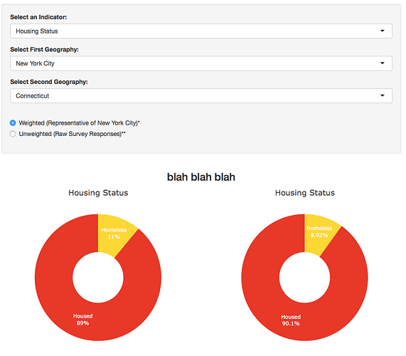
Some of the plotly stuff needs to be cleaned up, though that really doesn't matter here. I already have an app that's similar to this, but only has one geography. Ideally I'll have 10 in total, which means 10 datasets. I was thinking it would be easier to create a dataset for each indicator rather than each geography, since I won't be using all the indicators from all the datasets. This code only has one indicator, so if what I'm trying to do is possible, there would be a plot for each indicator. I really hope this is making sense!
UI:
shinyUI(fluidPage(
  tags$head(tags$style(
    HTML('header {background: #089AD1; min-width: 550px;}
          h1 {min-width: 550px !important;}
          h3 {min-width: 500px !important;}
          #sidebar {min-width: 550px !important;}
          #mainpanel {min-width: 550px !important;}
          #groupbars {min-width: 550px !important;}
         '))),

                    sidebarLayout(
                      sidebarPanel(id = "sidebar",
                                   h3(),
                        selectInput("var", label = "Select an Indicator:",
                                    choices = list("Demographics" = c("Housing Status", "Sex", "Race", "Sexual Orientation"))),
                        selectInput("geo", label = "Select First Geography:",
                                    choices = list("Cities" = c("", "New York City"),
                                                   "States" = c("Connecticut", "Maryland")), selected = "New York City"),
                        selectInput("geo2", label = "Select Second Geography:",
                                    choices = list("Cities" = c("", "New York City"),
                                                   "States" = c("Connecticut", "Maryland")), selected = "Connecticut"),
                        width = 12),
              mainPanel(id = "mainpanel",
                  fluidRow(h3("blah blah blah"), align = "center",
                      column(6, align = "center",
                             plotlyOutput("hmlpie1")),
                      column(6, align = "center",
                             plotlyOutput("hmlpie2"))),

                  fluidRow(
                    column(12,
                        h4("Data Table"),
                        tableOutput("table"),
                        downloadButton("DownloadPieData", "Download Table"),
                        br(), br(),
                        h3("Outcomes by Type of Homelessness"),
                        br(), br(),
                        plotlyOutput("groupbars", height = 500),
                        br(),
                        h4("Data Table"),
                        tableOutput("bartable"),
                        downloadButton("DownloadBarData", "Download Table"),
           br(), br())),
           width = 12)
))
)
Server:
shinyServer(
  function(input, output) {
    output$image1 <- renderImage({
      list(src = "www/image1.png",
           contentType = "image/png"
      )
    }, deleteFile = FALSE)
    output$hmlpie1 <- renderPlotly({
      data <- switch(input$geo,
                      "New York City" = hml[hml$Geography=="NYC", ], "Connecticut" = hml[hml$Geography=="CT", ],
                      "Maryland" = hml[hml$Geography=="MD", ])
      plot_ly(data, labels = ~HousingStatus, values = ~Value,
              type = "pie", hole = 0.4, textinfo = "label+percent", hoverinfo = "label+percent", insidetextfont = list(color = "#FFFFFF"),
              marker = list(colors = c("#FED90B", "#EA361C", "#ACDEFA", "#0A56A2")),
              showlegend = F, sort = F) %>%
        layout(margin = list(l = 40, r = 40), title = FALSE,
               xaxis = list(showgrid = FALSE, zeroline = FALSE, showticklabels = FALSE),
               yaxis = list(showgrid = FALSE, zeroline = FALSE, showticklabels = FALSE),
               autosize = F, width = 370, height = 430) %>%
        add_annotations(text = paste(input$var), showarrow = F, x = 0.5, y = 1.07, xref = "paper", yref = "paper",
                        font = list(size = 18))
    })


      output$hmlpie2 <- renderPlotly({
        data <- switch(input$geo2,
                       "New York City" = hml[hml$Geography=="NYC", ], "Connecticut" = hml[hml$Geography=="CT", ],
                       "Maryland" = hml[hml$Geography=="MD", ])
        plot_ly(data, labels = ~HousingStatus, values = ~Value,
                type = "pie", hole = 0.4, textinfo = "label+percent", hoverinfo = "label+percent", insidetextfont = list(color = "#FFFFFF"),
                marker = list(colors = c("#FED90B", "#EA361C", "#ACDEFA", "#0A56A2")),
                showlegend = F, sort = F) %>%
          layout(margin = list(l = 40, r = 40), title = FALSE,
                 xaxis = list(showgrid = FALSE, zeroline = FALSE, showticklabels = FALSE),
                 yaxis = list(showgrid = FALSE, zeroline = FALSE, showticklabels = FALSE),
                 autosize = F, width = 370, height = 430) %>%
          add_annotations(text = paste(input$var), showarrow = F, x = 0.5, y = 1.07, xref = "paper", yref = "paper",
                          font = list(size = 18))


    })
  })
