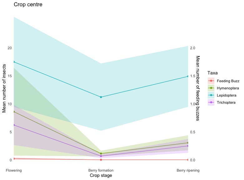
Secondary y-axis not linking data

Hi,
I'm very much a beginner user and have gotten my code to this point but I don't seem to be able to work out how to link the feeding buzz data to the secondary y-axis, it just seems to follow the primary axis values. All the data appears to be correct except for the secondary y-axis.
I appreciate the help, I'm lost.

2023-12-14T14:00:00Z

# Your data
data <- data.frame(
Stage = rep(c("Flowering", "Berry formation", "Berry ripening"), each = 4),
  Taxa = rep(c("Hymenoptera", "Lepidoptera", "Trichoptera", "Feeding Buzz"), times = 3),
 Value = c(
    8.595238095, 17.5, 6.214285714, 0.2,
    1.114285714, 11.2, 0.657142857, 0,
    3.038961039, 14.90909091, 2.480519481, 0))

# Standard error data
error_data <- data.frame(
  Stage = rep(c("Flowering", "Berry formation", "Berry ripening"), each = 4),
  Taxa = rep(c("Hymenoptera", "Lepidoptera", "Trichoptera", "Feeding Buzz"), times = 3),
  SE = c(
    7.846380726, 8.053050727, 3.582532101, 0.2,
    0.50836933, 6.012843397, 0.354900524, 0,
    1.344521498, 5.438407432, 1.238978808, 0))

# Merge data and error_data
merged_data <- merge(data, error_data, by = c("Stage", "Taxa"))

# Reorder the stages
merged_data$Stage <- factor(merged_data$Stage, levels = c("Flowering", "Berry formation", "Berry ripening"))

# Create ggplot for a line graph with shaded error bands using geom_ribbon
ggplot(merged_data, aes(x = Stage, group = Taxa)) +
  geom_line(aes(y = Value, color = Taxa)) +
  geom_point(aes(y = Value, color = Taxa)) +
  geom_ribbon(aes(ymin = Value - SE, ymax = Value + SE, fill = Taxa), alpha = 0.2) +
  scale_y_continuous(
    name = "Mean number of insects",
    breaks = seq(0, 20, 5),
    sec.axis = sec_axis(~. *.1, name = "Mean number of feeding buzzes", breaks = seq(0, 2, 0.5))) +
  scale_x_discrete(expand = c(0, 0)) +
  labs(title = "Crop centre",
       x = "Crop stage") +
  theme_minimal() +
  theme(panel.grid.major = element_blank(),
        panel.grid.minor = element_blank())

Yes, all the data are plotted against the primary axis. The secondary axis is displayed with the scaling used in sec_axis and then you can plot the data with the inverse scaling so it is at the correct position. Here is an example with your data.

library(ggplot2)
library(dplyr)

# Your data
data <- data.frame(
  Stage = rep(c("Flowering", "Berry formation", "Berry ripening"), each = 4),
  Taxa = rep(c("Hymenoptera", "Lepidoptera", "Trichoptera", "Feeding Buzz"), times = 3),
  Value = c(
    8.595238095, 17.5, 6.214285714, 0.2,
    1.114285714, 11.2, 0.657142857, 0,
    3.038961039, 14.90909091, 2.480519481, 0))

# Standard error data
error_data <- data.frame(
  Stage = rep(c("Flowering", "Berry formation", "Berry ripening"), each = 4),
  Taxa = rep(c("Hymenoptera", "Lepidoptera", "Trichoptera", "Feeding Buzz"), times = 3),
  SE = c(
    7.846380726, 8.053050727, 3.582532101, 0.2,
    0.50836933, 6.012843397, 0.354900524, 0,
    1.344521498, 5.438407432, 1.238978808, 0))

# Merge data and error_data
merged_data <- merge(data, error_data, by = c("Stage", "Taxa"))

# Reorder the stages
merged_data$Stage <- factor(merged_data$Stage, levels = c("Flowering", "Berry formation", "Berry ripening"))

Insects <- merged_data |> filter(Taxa != "Feeding Buzz")
Buzz <- merged_data |> filter(Taxa == "Feeding Buzz")
# Create ggplot for a line graph with shaded error bands using geom_ribbon
ggplot(merged_data, aes(x = Stage, group = Taxa)) +
  geom_line(aes(y = Value, color = Taxa), data = Insects) +
  geom_point(aes(y = Value, color = Taxa), data = Insects) +
  geom_ribbon(aes(ymin = Value - SE, ymax = Value + SE, fill = Taxa), data = Insects, alpha = 0.2) +
  geom_line(aes(y = Value*10, color = Taxa), data = Buzz) +
  geom_point(aes(y = Value*10, color = Taxa), data = Buzz) +
  geom_ribbon(aes(ymin = (Value - SE)*10, ymax = (Value + SE)*10, fill = Taxa), data = Buzz, alpha = 0.2) +
  scale_y_continuous(
    name = "Mean number of insects",
    breaks = seq(0, 20, 5),
    sec.axis = sec_axis(~. *.1, name = "Mean number of feeding buzzes", breaks = seq(0, 2, 0.5))) +
  scale_x_discrete(expand = c(0, 0)) +
  labs(title = "Crop centre",
       x = "Crop stage") +
  theme_minimal() +
  theme(panel.grid.major = element_blank(),
        panel.grid.minor = element_blank())

Created on 2023-12-15 with reprex v2.0.2

1 Like

Thank you so much! I really appreciate your help. I have managed to complete the remaining graphs with your help, except for this one. I don't know what has happened to the feeding buzz data. I have followed the same steps but I can't seem to get it to plot on the graph. I am still trying to get the feeding buzz data on the secondary axis and the remaining information on the primary axis. I can see both my y-axes aren't lined up correctly but don't think that's the issue.

# Your data
data_toppers <- data.frame(
  Stage = rep(c("Flowering", "Berry formation", "Berry ripening"), each = 8),
  Taxa = rep(c("Blattodea: epifamily Termitoidae", "Coleoptera", "Diptera", "Hemiptera", "Hymenoptera", "Lepidoptera", "Trichoptera", "Feeding buzz"), times = 3),
  Value = c(
    16.21904762, 13.75238095, 6.847619048, 4.504761905, 4.485714286, 17.37142857, 5.771428571, 1.650793651,
    5.478991597, 26.3697479, 3.201680672, 3.201680672, 4.042016807, 12.97478992, 2.487394958, 0.76344086,
    0.772321429, 16.60714286, 2.589285714, 2.825892857, 5.78125, 19.27678571, 5.375, 1.695852535))

# Standard error data
error_data_toppers <- data.frame(
  Stage = rep(c("Flowering", "Berry formation", "Berry ripening"), each = 8),
  Taxa = rep(c("Blattodea: epifamily Termitoidae", "Coleoptera", "Diptera", "Hemiptera", "Hymenoptera", "Lepidoptera", "Trichoptera", "Feeding buzz"), times = 3),
  SE = c(
    15.33, 4.23, 2.51, 1.47, 3.15, 6.67, 2.45, 0.600886327,
    4.741634794, 8.508755894, 1.317364004, 1.022575248, 2.045605757, 4.36192794, 0.894352786, 0.146963857,
    0.541099663, 3.838235446, 0.719987453, 0.865588511, 1.799553968, 5.059323044, 1.710841869, 0.382953191))


# Merge data and error_data
merged_data_toppers <- merge(data_toppers, error_data_toppers, by = c("Stage", "Taxa"))

# Reorder the stages
merged_data_toppers$Stage <- factor(merged_data_toppers$Stage, levels = c("Flowering", "Berry formation", "Berry ripening"))

Insects_toppers <- merged_data_toppers |> filter(Taxa != "Feeding buzz")
Buzz_toppers <- merged_data_toppers |> filter(Taxa == "Feeding buzz")
# Create ggplot for a line graph with shaded error bands using geom_ribbon
ggplot_toppers <- ggplot(merged_data_toppers, aes(x = Stage, group = Taxa)) +
  geom_line(aes(y = Value, color = Taxa), data = Insects_toppers) +
  geom_point(aes(y = Value, color = Taxa), data = Insects_toppers) +
  geom_ribbon(aes(ymin = Value - SE, ymax = Value + SE, fill = Taxa), data = Insects_toppers, alpha = 0.2) +
  geom_line(aes(y = Value*15, color = Taxa), data = Buzz_toppers) +
  geom_point(aes(y = Value*15, color = Taxa), data = Buzz_toppers) +
  geom_ribbon(aes(ymin = (Value - SE)*15, ymax = (Value + SE)*15, fill = Taxa), data = Buzz_toppers, alpha = 0.2) +
  scale_y_continuous(
    name = "Mean insects/night",
    breaks = seq(0, 45, 5),  # Adjusted the breaks to include 40
    sec.axis = sec_axis(~. *.065, name = "Mean feeding buzz/night", breaks = seq(0, 3, 0.5)),
    limits = c(0, 45)  # Set the primary y-axis limits
  ) +
  scale_x_discrete(expand = c(0, 0)) +
  scale_color_manual(values = c("Blattodea: epifamily Termitoidae" = 'peachpuff3', "Coleoptera" = 'slategrey', "Diptera" = 'mistyrose2', "Hemiptera" = 'thistle3', "Hymenoptera"= 'azure4', "Lepidoptera" = "bisque4", "Trichoptera" = "bisque3", "Feeding Buzz" = "black")) +
  scale_fill_manual(values = c("Blattodea: epifamily Termitoidae" = 'peachpuff3', "Coleoptera" = 'slategrey', "Diptera" = 'mistyrose2', "Hemiptera" = 'thistle3', "Hymenoptera"= 'azure4', "Lepidoptera" = "bisque4", "Trichoptera" = "bisque3", "Feeding Buzz" = "black")) +
  labs(title = "",
       x = "") +
  theme_minimal() +
  theme(panel.grid.major = element_blank(),
        panel.grid.minor = element_blank(),
        # Move the legend inside the plot space
        legend.position = c(0.9, 0.9),
        legend.justification = c(.4, .4),
        # Increase axis text size
        axis.text = element_text(size = 12),
        axis.title = element_text(size = 14))

print(ggplot_toppers)

Check your spelling of Feeding Buzz in the ggplot code and Feeding buzz in the data frame.

1 Like

This topic was automatically closed 42 days after the last reply. New replies are no longer allowed.

If you have a query related to it or one of the replies, start a new topic and refer back with a link.