Scheduled reporting monitoring

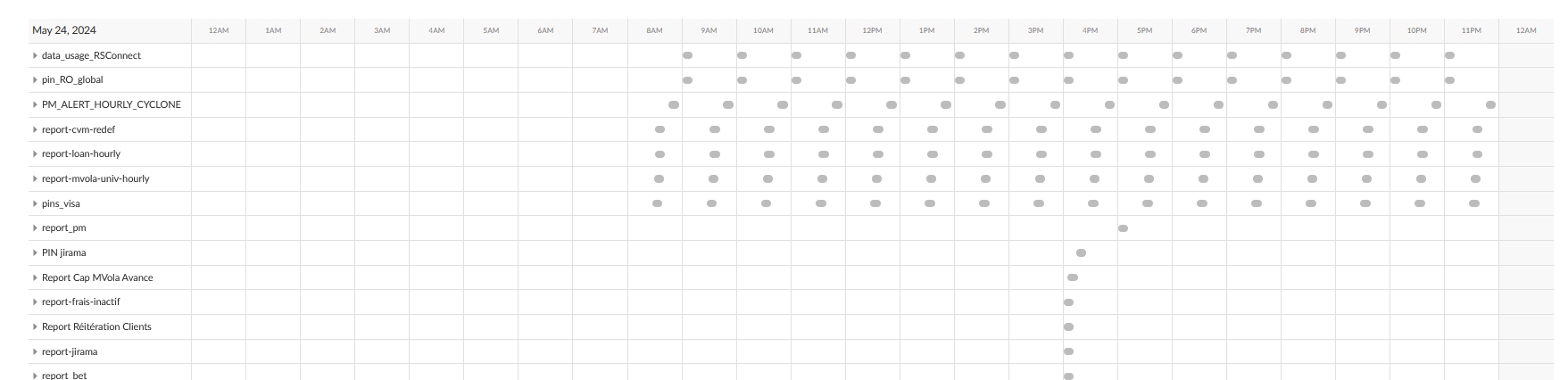
Hello everyone I am looking for a graph like table type to achieve a scheduled report monitoring like in the posit connect built in "scheduled content" in the screenshot with a dataframe of reports
my columns are report name, sending time, status (sent/not sent)
so the dots are going to be either green if sent and red if not instead of just grey


Thanks in advance

Check out the {gt} extention {gtExtras} gt_plt_point() probaly does what you need.
Create a point plot in place of each value. — gt_plt_point • gtExtras

2 Likes

Thank you @mduvekot let me try that real quick

This topic was automatically closed 90 days after the last reply. New replies are no longer allowed.

If you have a query related to it or one of the replies, start a new topic and refer back with a link.