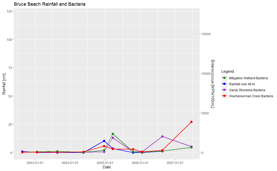
Hello! I'm trying to create a graph with two y-axes using ggplot. However, when I manage to get the two scales to line up with each other, both scales become too large to show the smaller trends. The graph is supposed to show the Bacterial levels at three sites alongside the centimeters of rainfall over the previous 48 hrs.
#The code with the scaling ratio that lines the rainfall data up with the bacteria data

ggplot(weatherdata,aes(x = WeatherDate, group = 1)) +
  geom_line(aes(y = Rain, colour = "Rainfall over 48 hr"), size = 1) +
  geom_point(aes(y = Rain, colour = "Rainfall over 48 hr"), size = 3) +
  scale_y_continuous(sec.axis = sec_axis(~./.007, name = "Enterococcus [MPN/100mL]")) +
  geom_line(aes(y = (SSL *.007), colour = "Sandy Shoreline Bacteria"), size =1) +
  geom_point(aes(y = (SSL *.007), colour = "Sandy Shoreline Bacteria"), size =3) +
  geom_line(aes(y = (MWL *.007), colour = "Mitigation Wetland Bacteria"), size =1) +
  geom_point(aes(y = (MWL *.007), colour = "Mitigation Wetland Bacteria"), size =3) +
  geom_line(aes(y = (WWC_MPN *.007), colour = "Washerwoman Creek Bacteria"), size =1) +
  geom_point(aes(y = (WWC_MPN *.007), colour = "Washerwoman Creek Bacteria"), size =3) +
  scale_colour_manual(values = c("forestgreen", "blue", "darkorchid", "red")) +
  scale_x_date(date_breaks = "1 year") +
  labs(y = "Rainfall [cm]",
       x = "Date",
       colour = "Legend",
       title = "Bruce Beach Rainfall and Bacteria")
