Hello everyone!
I have 12 columns of data in Excel, with the same number of rows. I would like to make them in a chart with three different Y-axes according to MIN and MAX values (one axis for P11, one axis for P8 and P9; the rest in one axis).
I have created graphs for each column (the X axis is the date present in the column A).
However, I don't know how to put them together in one graph. Please help me out. I appreciate your kindness!
Thank you very much.
Hi, it would help a lot if you could provide a reproducible example.
As I am new user, I was not able to upload anything. Here is the code I have :
rm(list=ls())
library(fpp2)
library(readxl)
MYdata <- read_excel("MTA.xlsx")
View(MTA)
A1 <- ts(MYdata[,13],start=c(2017,6),frequency=12)
autoplot(A1)
A2 <- ts(MYdata[,14],start=c(2017,6),frequency=12)
autoplot(A2)
A3 <- ts(MYdata[,15],start=c(2017,6),frequency=12)
autoplot(A3)
A4 <- ts(MYdata[,16],start=c(2017,6),frequency=12)
autoplot(A4)
A5 <- ts(MYdata[,18],start=c(2017,6),frequency=12)
autoplot(A5)
A6 <- ts(MYdata[,19],start=c(2017,6),frequency=12)
autoplot(A6)
#test
library(foqat)
library(patchwork)
blankx=theme(axis.title.x=element_blank(),axis.text.x=element_blank(),axis.ticks.x=element_blank())
p1=geom_ts(MYdata, yl=14, llist=14, lcc="blue", yllab="A")+blankx
p2=geom_ts(MYdata, yl=15, llist=15, lcc="red", yllab="B")+blankx
p3=geom_ts(MYdata, yl=16, llist=16, lcc="green", yllab="C")+blankx
p4=geom_ts(MYdata, yl=17, llist=17, lcc="VIOLET", yllab="D")+blankx
p5=geom_ts(MYdata, yl=19, llist=19, lcc="grey", yllab="E")+blankx
p6=geom_ts(MYdata, yl=20, llist=20, lcc="orange", yllab="F", xlab="Date")
p1/p2/p3/p4/p5/p6
I hope to be able to put all the graphs together in one graph with three Y-axes (I19: min 14 - max 50; I15 and I16 together: min 4000 - max 20000; the rest together). If there is a possibility to automatically put the min and max according to the data, that would be useful too.
I also need to display the date in the X axis (column A of the excel sheet).
Here is the link for the data:
https://docs.google.com/spreadsheets/d/1sOP-1Iy-nxkfsdg5oiqJsSr0DAeZkzTHS6F7n54IlfA/edit?usp=sharing
Access is denied to the document. Can you just post a reproducible example of the dataset like shown in the article?
Hello, could you test this link again :
Options to download, print, and copy have been disabled on this file.
We need read permission
Could you check again please:
Seems fine. It downloaded and opened as a .ods file
Is this correct?
It appears to me that it should be I3 not 13 . The same seems true for the rest of the ts commands.
P11, P8 and P9 do not seem to exist in the dataset.
Can you explain i substantive, subject matter, terms what you want to do.
Is this the dataset you wish to work with?
MYdata)
structure(list(DATE = c("01/04/2017", "01/07/2017", "01/08/2017",
"01/09/2017", "01/10/2017", "01/11/2017", "01/03/2018", "01/08/2018",
"01/11/2018", "01/12/2018", "01/01/2019", "01/03/2019", "01/05/2019",
"01/06/2019", "01/10/2019", "01/02/2020", "01/04/2020", "01/05/2020",
"01/07/2020", "01/10/2020", "01/02/2021", "01/03/2021", "01/05/2021",
"01/08/2021", "01/09/2021", "01/12/2021", "01/01/2022"), I1 = c(500,
520, 700, 660, 560, 876, 720, 733, 600, 588, 576, 564, 552, 540,
528, 516, 504, 492, 480, 471, 488, 550, 600, 690, 610, 645, 699
), I2 = c(700, 550, 523, 622, 622, 622, 726, 700, 720, 695, 670,
645, 620, 595, 570, 545, 520, 660, 662, 664, 666, 668, 670, 672,
489, 491, 493), I3 = c(990, 910, 950, 857, 770, 1088, 600, 750,
582, 810, 577, 610, 643, 676, 709, 742, 775, 808, 841, 874, 907,
940, 973, 1006, 1039, 1000, 988), I4 = c(24, 500, 248, 500, 870,
100, 152, 44, 172, 128, 655, 155, NA, NA, NA, NA, NA, NA, NA,
NA, NA, NA, NA, NA, NA, NA, NA), I6 = c(800, 1250, 998, 651,
651, 651, 1100, 1000, 1250, 1302, 1220, 1302, 1302, 1200, 1115,
1025, 1250, 1283, 651, 651, 651, 651, 651, 778, 769, 810, 888
), I10 = c(4000, 4200, 4300, 4351, 3300, 3210, 2000, 2500, 3300,
4351, 4150, 4000, 4050, 3900, 3750, 3600, 2200, 2150, 1922, 1955,
1954, 1900, 1899, 1886, 1920, 1990, 2100), I13 = c(3669, 3644,
3590, 3602, 3577, 3523, 3535, 3510, 3456, 3468, 3443, 3389, 3401,
3376, 3322, 3334, 3309, 3255, 3267, 3242, 3188, 3200, 1552, 1552,
1527, 1473, 1485), I14 = c(2595, 3000, 3000, 3098.48, 3071.48,
3044.48, 3017.48, 2990.48, 2963.48, 2936.48, 2909.48, 2882.48,
2855.48, 2828.48, 2801.48, 2774.48, 2500, 1721.23, 1765.23, 1809.23,
1853.23, 1897.23, 1941.23, 1985.23, 2029.23, 2073.23, 2500),
    I15 = c(19932.86, 19722.86, 19512.86, 19302.86, 19092.86,
    18882.86, 19000, 18462.86, 19015, 18042.86, 17832.86, 17622.86,
    17555, 17202.86, 16992.86, 17005, 16572.86, 8931.76, 9000,
    8999, 8900, 8756, 8900, 19932.86, 8931.76, 8999, 9000), I16 = c(8650.44,
    8650.44, 8650.44, 8650.44, 8650.44, 7500, 7250, 8650.44,
    7450, 8650.44, 6000, 5100, 5500, 8650.44, 4999, 4969, 4939,
    4909, 4879, 4849, 4819, 4789, 4759, 4729, 4699, 4659, 4654.94
    ), I18 = c(2620.47, 2596.47, 2572.47, 2548.47, 2524.47, 2500.47,
    2476.47, 2452.47, 2428.47, 2404.47, 2380.47, 2356.47, 1340,
    1340, 1340, 1340, 1361, 1382, 1403, 1424, 1445, 1466, 1487,
    1340, 1361, 1382, 1403), I19 = c(40, 39.2, 37.8, 32, 31,
    41.92, 36.92, 31.92, 26.92, 21.92, 16.92, 19.92, 22.92, 25.92,
    28.92, 31.92, 34.92, 33, 33, 32.8, 31.9, 15.15, 22, 21, 29,
    33, 35)), class = "data.frame", row.names = c(NA, -27L))
Yes, it is correct and it works well.
Yes, you are right, with the example I shared with you, it is 19 columns of data in Excel. I am only working on the columns (I13 I14 I15 I16 I17 I18 I19) and I would like to put them in a chart with three different Y-axes according to MIN and MAX values (one axis for I19, one axis for I15 and I16; the rest in one axis).
Why and do you need them as time-series? Without knowing the research problem it is difficult to knew what to do.
Also should DATE be treated an a "date' or a character variable if we are not dealing with a time series? Are the dates in dd-mm-yyyy format or mm-dd-yyyy format?
Each column indicates the movement of the price per date for a product. It is therefore necessary to have the date on the X axis. I want to superimpose the graphs to analyze the evolution of the total price of different products all together.
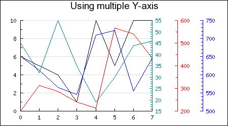
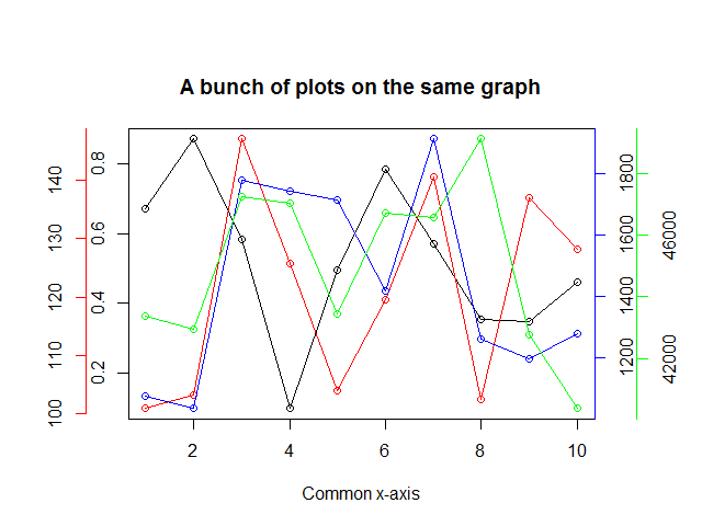
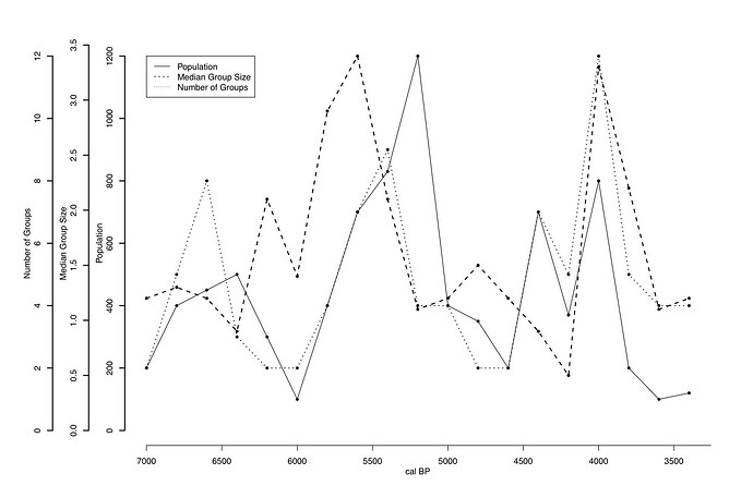
The result must be similar to the captures in the links Below :


I am sorry but I cannot conceive of any reason that one would create such an abortion of a graph. A faceted graph might be a good idea. As it stands, any research area that tolerates such graphs is dubious.
This topic was automatically closed 21 days after the last reply. New replies are no longer allowed.
If you have a query related to it or one of the replies, start a new topic and refer back with a link.
