Hi, I am still new with Rstudio, and now I am looking to find a way to create a chart from 1 column keywords.
I know its working in Pandas, but I cannot find a way in Rstudio.
For example I have a dataframe CSV " headwear"
Name
Color
Winter Hat
Blue
Bunny Ears
Grey
Summer Hat
Pink
Woolen Cap
Purple
I want to make a bar chart based on how many "Hats", "Caps", "Ears", and ignore anything else in the cell.
Tried different ways with count, but 1 error is bigger than the next error.
Could someone help me in the right direction?
The following code generates a rather bland looking bar chart from some example data.
library(dplyr)    # to manipulate the data frame
library(stringr)  # for string operations
library(ggplot2)  # for the bar chart

# Incoming data set (from CSV or wherever).
headgear <- data.frame(Name = c("Winter Hat", "Bunny Ears", "Summer hat", "Woolen Cap"),
                       Color = c("Blue", "Grey", "Pink", "Purple"))

# Categories for the bar chart.
types <- c("Hat", "Ears", "Cap", "Fedora")

# Add a "Type" column to the data frame by comparing "Name" entries to know types.
# (Comparison is case-insensitive here.)
headgear <- headgear |> rowwise() |> mutate(Type = types[str_detect(Name, paste("(?i)", types))])

# Plot the bar chart.
ggplot(data = headgear, mapping = aes(x = Type)) + geom_bar()
It is fragile in that it assumes each entry in the "Name" column will contain exactly one match to one of the predefined types (hat, cap, ears, ...). The comparison is case-insensitive, so if someone enters "Bunny ears", the entry will be recognized as matching "Ears".
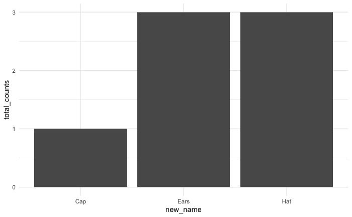
headgear %>%
  mutate(new_name= str_to_title(str_split_i(Name," ",-1))) %>%  # picks the last word, formats to uniform case
  count(new_name,sort=TRUE,name="total_counts") %>%  # gets counts of each new column value
  ggplot()+
  aes(new_name,total_counts)+
  geom_col()
You can categorize the keywords in your "Name" column using pattern matching (e.g., detecting "Hat," "Cap," or "Ears"), then count occurrences and visualize them with a bar chart using ggplot2. Use functions like grepl() to classify items and dplyr to summarize counts before plotting. This approach will help you analyze keyword frequency efficiently in RStudio.