Hi all,
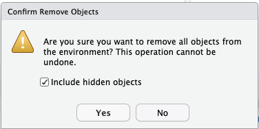
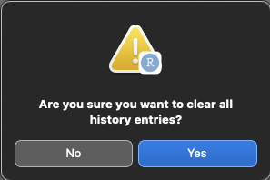
I seem to keep stumbling over some effects I would call consistency glitches in the RStudio IDE. As I am not sure if this is the place to discuss or even mention them, here is an example. (RStudio 2022.12.0build353 on MacOS 13.1) I am talking about the confirmation dialogs:
"Clear objects from the workspace"

"Clear all history entries": see next post, I am only allowed on media file per post ![]()
Why does the design differ so completely between the two, up to the annoying fact that even the position of the Yes- and No-buttons is swapped? There may be a reason behind this that I just don't get, so please if anyone could shed some light on this?
Thanks, Thomas
