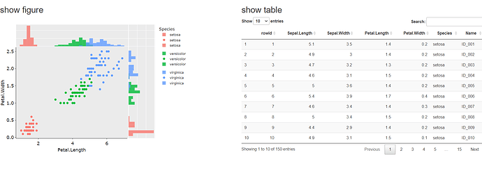
The side-by-side layout can be accomplished by writing a little HTML and CSS.
Just below the YAML header, you can add <style> tags to specify styling for "row" and "column" classes. The max-width for the "main-container" class was also expanded to 100% for easier viewing.
---
title: ""
output: html_document
---
<style type="text/css">
   .main-container {max-width: 100%;}
   .row {display: flex;}
   .column {flex: 50%;}
</style>
Then, for the figure and table code chunks, you can wrap each in <div> tags, specifying the "column" class. Both of these sections can then be wrapped in a <div> tag specifying the "row" class.
Here is what the code looks like. Please note - I had to drop one tick mark (`) below in the ```{r} chunks so they would show up here. Be sure to add back the tick mark at the beginning and end of each chunk.
<div class = "row">
<div class = "column">
## show figure
``{r echo=FALSE}
s1
``
</div>

<div class = "column">
## show table
``{r echo=FALSE}
dat.ct %>%
    datatable()
``
</div>
</div>
The result is below.
