Rmarkdown: place figure and table side-by-side in html document

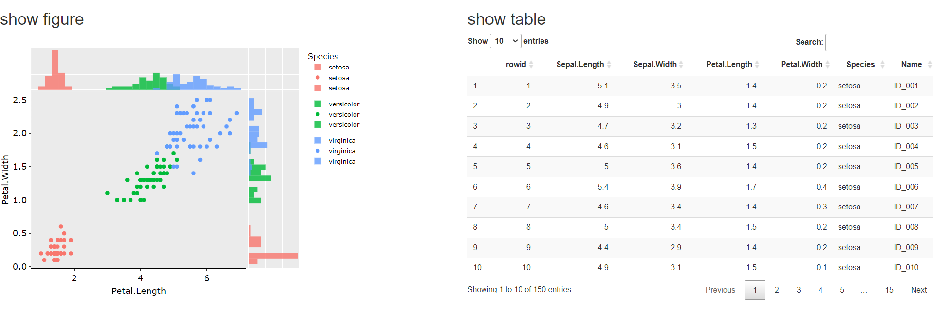
Is it possible to place figure and table side-by-side in Rmarkdown html document? I t is easier to see if figure and table are placed horizontally rather than vertically when using long-wide monitor.

currently;

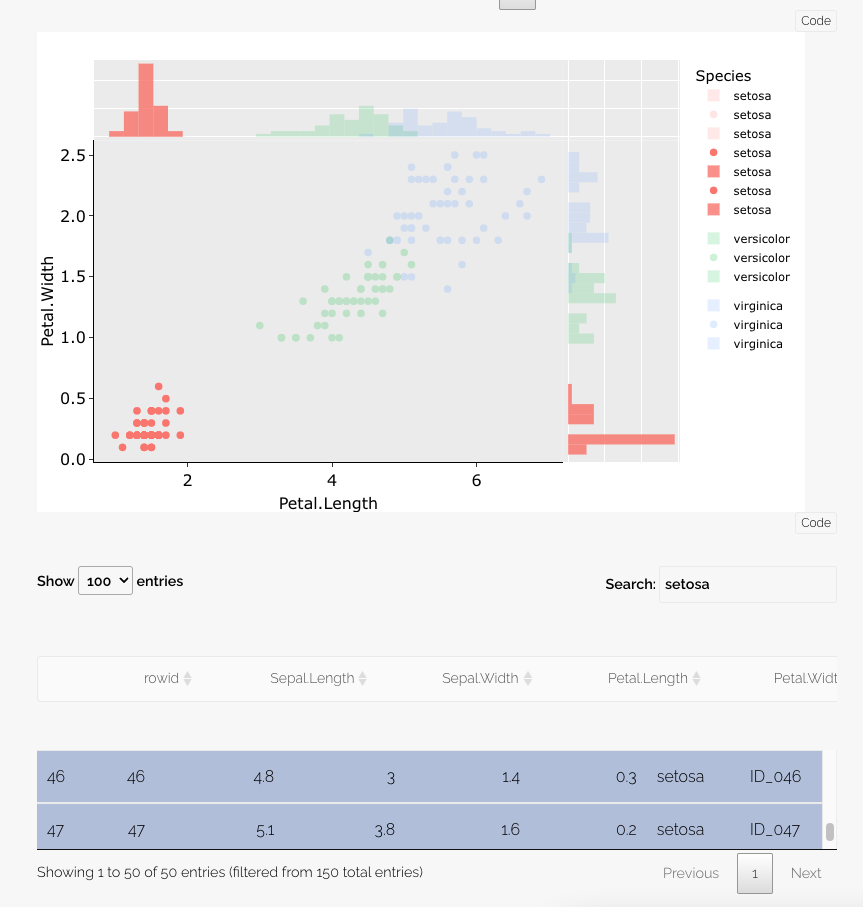
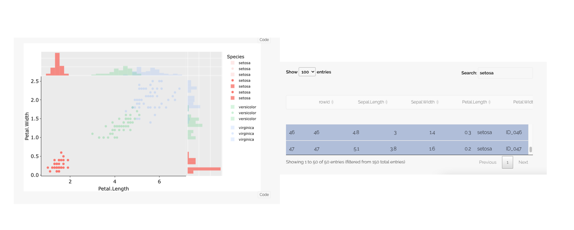
I would like to layout as following in rmarkdown html document;


```{r }
library(plotly)
library(crosstalk)
library(ggplot2)
library(tibble)
library(ggpubr)


## iris
tibble(iris) %>%
    rowid_to_column() %>%
    mutate(Name=str_c('ID_', sprintf('%03d', rowid))) -> dat

## shared object
dat.ct <- SharedData$new(dat, key = ~Name)

## histogram x
dat.ct %>%
    ggplot(aes(x=Petal.Length, fill=Species)) + 
    geom_histogram(alpha = 0.8, position='identity') +
    theme(axis.title.y=element_blank(),
          axis.text.y=element_blank(),
          axis.ticks.y=element_blank()) -> histx1

## scatter
dat.ct %>%
    ggplot(aes(x=Petal.Length, y=Petal.Width, colour=Species,
               text=paste('Filename: ', Name))) +
    geom_point() +
    theme_pubr() -> g1


## histogram y
dat.ct %>%
    ggplot(aes(x=Petal.Width, fill=Species)) +
    geom_histogram(alpha = 0.8, position='identity') +
    theme(axis.title.x=element_blank(),
          axis.text.x=element_blank(),
          axis.ticks.x=element_blank())+
    coord_flip() -> histy1

ggplotly(histx1) -> histx1
ggplotly(g1) -> scatter1
ggplotly(histy1) -> histy1

## layout
s1 <- subplot(
    histx1,
    plotly_empty(), 
    scatter1,
    histy1,
    nrows = 2, heights = c(0.2, 0.8), widths = c(0.8, 0.2), margin = 0,
    shareX = TRUE, shareY = TRUE, titleX = TRUE, titleY = TRUE
)

## show figure
s1

## show table
dat.ct %>%
    datatable()

1 Like

The side-by-side layout can be accomplished by writing a little HTML and CSS.

Just below the YAML header, you can add <style> tags to specify styling for "row" and "column" classes. The max-width for the "main-container" class was also expanded to 100% for easier viewing.

---
title: ""
output: html_document
---
<style type="text/css">
   .main-container {max-width: 100%;}
   .row {display: flex;}
   .column {flex: 50%;}
</style>

Then, for the figure and table code chunks, you can wrap each in <div> tags, specifying the "column" class. Both of these sections can then be wrapped in a <div> tag specifying the "row" class.

Here is what the code looks like. Please note - I had to drop one tick mark (`) below in the ```{r} chunks so they would show up here. Be sure to add back the tick mark at the beginning and end of each chunk.


<div class = "row">
<div class = "column">
## show figure
``{r echo=FALSE}
s1
``
</div>

<div class = "column">
## show table
``{r echo=FALSE}
dat.ct %>%
    datatable()
``
</div>
</div>


The result is below.

1 Like

Thanks for your answer with easy-to-understand explanation. I was able to make it with my own dataset by following your codes!

1 Like

This topic was automatically closed 7 days after the last reply. New replies are no longer allowed.

If you have a query related to it or one of the replies, start a new topic and refer back with a link.