Hi all, I am currently a relatively new R student working on a project with a professor of mine with the goal of it being to eventually create a package that is able to obtain data from a Twitter account and, after proper cleaning and processing of data, produce a directed graph replicating graphs from artist Mark Lombardi. Mark Lombardi created drawings in the form of graphs that detailed alleged political frauds and conspiracies.
What I am currently trying to do is to recreate the following graph in R
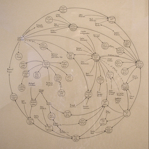
It has been quite struggling for me to try and recreate this graph. Right now I am not worried about the actual contents/labels of the vertices and directions of the graph, rather just creating an example.
The main problems I am facing are that my professor specified that I should place outliers on the outside circle, with all the other content inside the circle. I have no idea how to go about accomplishing this. I have tried creating 2 iGraph objects or 2 ggplot objects and tried combining them, however i cannot find a way to do that or even find a consistent way to layer them because the iGraph layout changes everytime it gets created even if I set a seed. I assume the way to do this is something to do with how I build my adjacency matrix, but the other part of that problem would be figuring out how to get a consistent layout every time.
Here's the code I have so far and the example that I have tried to work on.
#import data

net_nodes = read_csv("https://www.dropbox.com/s/ieaoo7efx87etyk/Dataset1-Media-Example-NODES.csv?dl=1")
net_edges = read.csv("https://www.dropbox.com/s/s4mli5l6j30gc5n/Dataset1-Media-Example-EDGES.csv?dl=1")
#Create an adjacency matrix for net_edges
net_edges_mat = as.matrix(net_edges)
First I created an adjacency matrix for some random dummy data.
netgraph1 = graph_from_data_frame(d=net_edges, vertices=net_nodes, directed=FALSE)

df4 = net_edges$from
df5 = net_edges$to
set.seed(5)

lombardi1 = plot(netgraph1, main = "Lombardi Graph", frame = TRUE, edge.arrow.size=.5, vertex.color = "salmon", vertex.label=net_nodes$media, vertex.label.color="black", vertex.size = 7, edge.curved = .5, edge.width=2, shape='sphere')
#lines(df4,df5, col = "red",)

lombardi2 = tkplot(netgraph1, main = "Network Graph Ex", frame = TRUE, edge.arrow.size=.5, vertex.color = "salmon", vertex.label=net_nodes$media, vertex.label.color="black", vertex.size = 7, vertex.label.family = "Times", edge.curved = .5,)
And then I created a couple of graphs. With the first graph, I cannot figure out a way to get a consistent layout everytime I run it. If I could figure out a way to do that then I would try and mess with my matrix and try to add outliers and run it again to see a difference, but I cannot visualize a difference without a consistent graph.
As for the tkplot graph, I am able to manipulate the layout in a circle, but it just puts everything on the edge of the circle which I don't want either.
(It won't let me post more than 1 image because I'm a new user but just imagine a simple undirected graph with about 12 vertices. Feel free to run the code in R to see the graphs)
I hope I provided enough insight to describe my goals and what my problems are. Again, I am rather new to R and this is my first package I am trying to develop so I am learning as much as I can and appreciate any and all help/tips. I know this is a big project and request but I am just looking for help with pushing me towards the right direction because I just feel lost right now. Thank you everyone.