Report with compound values and charts together

I have an existing report that I want to convert into R.

It looks like this:

It has 5 distinct columns, there's the name, the horizontal bar chart, actual values, guideline values, and a time series spark style chart. I can produce all 5 of the bits, but I can't quite wrap my head around how to bring them together and line them up properly.

It looks like there are a number of possibilities all with pretty significant challenges:

  1. Put it in an RMarkdown table: Seems like it would help line things up but will require building the table row-by-row. And putting ggplot inside of a table seems to have some challenges
  2. Build the whole exhibit in ggplot... lol wut?!?!? Not with my ggplot skills. Seems like a maintenance nightmare (we all know the chart will change over time)
  3. Build it up using gridExtra::tableGrob like in this example which is sort of a helper for doing #2. Still seems non-trivial.

I'm sure there are other ways. Any ideas?

While I'm mostly looking for ideas of how to glue these bits together, if you want a reprex, here's some play data and graphs:


library(tidyverse)
#> Warning: package 'tibble' was built under R version 3.5.2

df <- tibble(
  day = rep(1:4, 2),
  test = c(rep("test 1", 4), rep("test 2", 4)),
  value = c(5, 6, 4, 3, 6, 7, 5, 2),
  guideline = rep(10, 8)
)

for (thistest in unique(df$test)) {
  df %>%
    filter(test == thistest &
             day == max(.$day)) %>%
    mutate(per_limit = value / guideline) ->
    t
  
  print(paste(thistest, "value is:", t$value))
  print(paste(thistest, "guideline is:", t$guideline))
  
  print(paste("thermometer for", thistest))
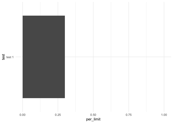
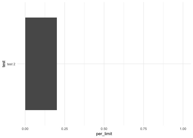
  ggplot(t, aes(x = test, y = per_limit)) +
    geom_bar(stat = "identity") +
    theme_minimal()  +
    ylim(0, 1) +
    coord_flip() ->
    g
  print(g)
  
  df %>%
    filter(test == thistest) %>%
    mutate(per_limit = value / guideline) ->
    t2
  
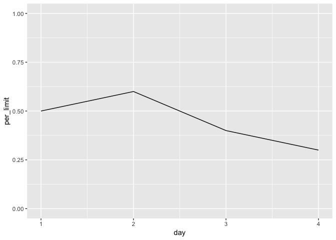
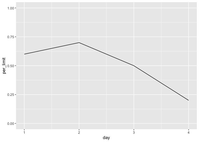
  print(paste("time series for", thistest))
  ggplot(t2, aes(day, per_limit)) +
    geom_line() +
    ylim(0, 1) ->
    g2
  print(g2)
}
#> [1] "test 1 value is: 3"
#> [1] "test 1 guideline is: 10"
#> [1] "thermometer for test 1"
#> [1] "time series for test 1"
#> [1] "test 2 value is: 2"
#> [1] "test 2 guideline is: 10"
#> [1] "thermometer for test 2"
#> [1] "time series for test 2"
Created on 2019-01-27 by the reprex package (v0.2.1)

I think this blog post is pretty close to what you want to do. Check the add sparklines part.

I like the idea. I'm a little frustrated with that blog post which is non reproducible because they don't provide the prevalence data frame. The syntax on the sparklines is pretty dense and not very readable... I'll have to work up some examples.

I think the data frame it's here

library(data.table)
    library(dplyr)
    
    #Download the Austin indicator data set
    #Original data set from: https://data.austintexas.gov/City-Government/Imagine-Austin-Indicators/apwj-7zty/data
    austinData= data.table::fread('https://raw.githubusercontent.com/lgellis/MiscTutorial/master/Austin/Imagine_Austin_Indicators.csv', data.table=FALSE, header = TRUE, stringsAsFactors = FALSE)
    i1 <- austinData %>%
        filter(`Indicator Name` %in% 
                   c('Prevalence of Obesity', 'Prevalence of Tobacco Use', 
                     'Prevalence of Cardiovascular Disease', 'Prevalence of Diabetes')) %>%
        select(c(`Indicator Name`, `2011`, `2012`, `2013`, `2014`, `2015`, `2016`)) %>%
        mutate (Average = round(rowMeans(
            cbind(`2011`, `2012`, `2013`, `2014`, `2015`, `2016`), na.rm=T),2), 
            `Improvement` = round((`2011`-`2016`)/`2011`*100,2))
    prevalence = i1

good eye... ahhh... yeah the use of data.table explains why it looks to me like it's written in a whole other language.

If you manage to make it work with the tidyverse, could you share a minimal example? I have let this blog post forgeted in my pocket app because I don't like data.table either.

A little bird told me that I can probably make this work using gt and ggplot and I must admit I'm drawn to the syntax of those packages a bit more. I'm playing with them now and I'll report back what I find.

https://twitter.com/riannone/status/1089688594535665664

1 Like

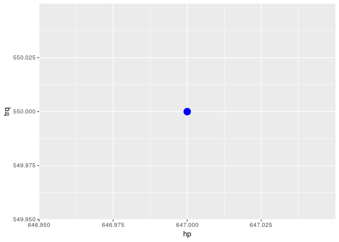
it seems like I'm on the cusp of progress with gt but can't quite get gt to render the ggplot objects:

I can make a tibble where each row contains one cell that is the ggplot object, but I can't get text_transform and ggplot_image to convert that into an image:

library(tidyverse)
#> Warning: package 'tibble' was built under R version 3.5.2
library(gt)

# make a function for creating a plot
# of a group
plot_group <- function(name, df) {
  plot_object <-
    ggplot(data = df,
           aes(x = hp, y = trq,
               size = msrp)) +
    geom_point(color = "blue") +
    theme(legend.position = "none")
  return(plot_object)
}

# make a plot of each mfr
gtcars %>%
  group_by(mfr) %>%
  nest() %>%
  mutate(plot = map2(mfr, data, plot_group)) %>%
  select(-data) ->
  tibble_plot

# tibble plot contains 2 columns: 
#   mfr & plot where plot is a ggplot object

# can't figure out how to plot those ggplot objects though
tibble_plot %>%
  gt() %>%
  text_transform(
    locations = cells_data(vars(plot)),
    fn = function(x) {
      ggplot_image(x, height = px(200))
    }
  )
#> Error in UseMethod("grid.draw"): no applicable method for 'grid.draw' applied to an object of class "list"

Created on 2019-01-27 by the reprex package (v0.2.1)

I also tried doing a map inside my text_transform as it seemed the ggplot_image function was having problems dealing with a list. But this seems to feed it a character object, which is problematic:

tibble_plot %>%
  gt() %>%
  text_transform(
    locations = cells_data(vars(plot)),
    fn = function(x) {
      x %>%
        map(ggplot_image)
    }
  )

The problem is in the map2 part, plot gets converted to list class

gtcars %>%
  group_by(mfr) %>%
  nest() %>%
  mutate(plot = map2(mfr, data, plot_group)) %>%
  select(-data) ->
  tibble_plot

class(plot_object)
[1] "gg"     "ggplot"
class(tibble_plot$plot[1])
[1] "list"

Exploring subsetting to print the plot in the ggplot list object. I have this so far, however it is only finding the first plot! Looking forward to learning the solution to this one.

  gt() %>%
  text_transform(
    locations = cells_data(vars(plot)),
    fn = function(x) {
      .$plot[[1]] %>% 
      ggplot_image(height = px(200))
    }
  )

Well... I'm not sure that's a problem. This works:

map(tibble_plot$plot, print)

So I perused through the code for some of gt...

text_transform loops over each location

> text_transform
function (data, locations, fn) 
{
    locations <- as_locations(locations)
    for (loc in locations) {
        data <- set_transform(loc, data, fn)
    }
    data
}

So that makes it feel like I could do something like:

tibble_plot %>%
  gt() %>%
  text_transform(
    locations = cells_data(vars(plot)),
    fn = function(x) {
      ggplot_image(x$plot)
    }
  )

Interestingly that gives me more of a gt internal error:

cannot open file 'temp_ggplot.png': No such file or directoryError in file(con, "rb") : cannot open the connection

plot() works with the ggplot object as list class, but ggplot_image() doesn't like it so much

print(tibble_plot$plot[1])
#> [[1]]

ggplot_image(tibble_plot$plot[1], height = px(200))
#> Error in UseMethod("grid.draw"): no applicable method for 'grid.draw' applied to an object of class "list"

ggplot_image(plot_object, height = px(200))
#> [1] "<img cid=\"uwyeboqkhxpg__temp_ggplot.png\" src=\"data:image/png;base64,iVBORw0KGgoAAAANSUhEUgAAAfQAAAH0CAIAAABEtEjdAAAACXBIWXMAAA9hAAAPYQGoP6dpAAAgAElEQVR4nO3deWATZd4H8GeOTO6k6UGRllq5FBC5BEEQBFFRPFlEhFUXQQ4BAUVclXWVIsqrKKUiCB4rHiCX94WuqF1ZVmRVhIJ4FCiFUq6mua+Z94+wpbTTNE2TTObp9/NX+jRJf4SZb5555plnGEmSCAAA0IVVugAAAIg/hDsAAIUQ7gAAFEK4AwBQCOEOAEAhhDsAAIUQ7gAAFOKVLqBxdrs9EAgoWIDBYPD7/cFgUMEaosRxnM1mq66u9vv9StfSOJZljUajw+FQupCoWCwWhmHsdrvShUTFbDa7XC5RFJUupHGCIFgslqqqKlXsYjzPa7Val8uldCFnZGZmyraj5w4AQCGEOwAAhRDuAAAUQrgDAF

ohhhh.... good find. There's some sort of subsetting issue in the iteration over the list items done by text_transform...

this works, FWIW (note double brackets):

ggplot_image(tibble_plot$plot[[1]], height = px(200))

Just to close the loop on this—@jdlong opened an issue at the request of @rich_i and there is now some working code in that thread: https://github.com/rstudio/gt/issues/152.

The sparktable package might be able to do the job. I haven't used it, but I thought I'd put it out there as a possibility.

This is an area of active work in gt. We are adding a new function called fmt_ggplot() that makes it easier to add plots to a table. Right now, there's work on this in this branch: https://github.com/rstudio/gt/tree/fmt_ggplot

Once that is ready, you'd be able to add plots like this:

gtcars_plot_column <-
  gtcars %>%
  dplyr::group_by(mfr) %>%
  tidyr::nest(.key = plot) %>%
  dplyr::mutate(
    plot = map(plot, ~ggplot(., aes(hp, trq)) + geom_point())) %>%
  head(3)

tab_1 <- 
  gtcars_plot_column %>%
  gt()

tab_2 <- 
  gtcars_plot_column %>%
  gt() %>%
  fmt_ggplot(
    columns = vars(plot),
    height = 200,
    aspect_ratio = 2.5
  )
5 Likes

This topic was automatically closed 21 days after the last reply. New replies are no longer allowed.

If you have a query related to it or one of the replies, start a new topic and refer back with a link.