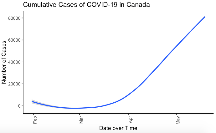
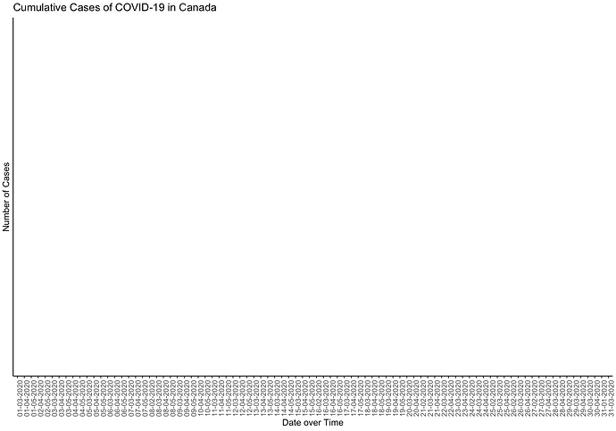
I have created this graph using this data set, however I have noticed 2 problems with plot I have created and cannot figure out why this is occurring. Rather than showing the summary of Months on the X-Axis I would like to show the dates individually. However, when I do this, no plot appears. I am looking to have the same graph however with the x-axis looking like image 2 with the dates in the correct chronological order.
library(lubridate)
data <- read.csv("2020-05-20.csv",header=T)

data2 <- filter(data, data$prname == "Canada") %>%
  mutate(date = dmy(date))

data2 %>%
  ggplot(aes(x=date, y=numconf)) +
  #geom_point() +
  #geom_line() +
  geom_smooth() +
  ggtitle("Cumulative Cases of COVID-19 in Canada") +
  ylab("Number of Cases") +
  xlab("Date over Time") +
  theme(panel.grid.major = element_blank(), panel.grid.minor = element_blank(),
        panel.background = element_blank(), axis.line = element_line(colour = "black")) +
  theme(axis.text.x = element_text(angle = 90, hjust = 1))
Current Plot
Plot of How I would like the X-Axis to look

