Repeated measures anova in R: comparing each month against itself across a ten year period

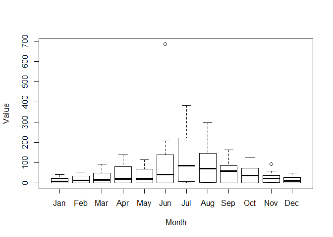
I am an R novice and trying to perform a repeated measures anova to compare each month against the same month across all 10 years (e.g. Jan 2010, Jan 2011, Jan 2012 and so on... for each month). And then with the final results I would like to plot this into a boxplot as such with a new box for each month like in the image?

I have fiddled around on various tutorial but unable to reach a success. Any help appreciated thanks so much!

The code below is how I have been inputting the data into R to create the data.frame in the format below.

Year    Jan    Feb    Mar    Apr    May    Jun    Jul    Aug    Sep    Oct    Nov    Dec
2010    0      0      0      0      0      1      1      4      1      1      4      1                   
2011    0      1      0      1      1      3      7      0      0      2      2      1                   
2012    0      0      1      0      0      0      3      2      0      2      3      1                   
2013    2      2      2      6      6      2      33     17     18     9      9      3                      
2014    5      6      15     18     14     26     60     47     39     19     15     10                            
2015    10     22     14     24     26     57     110    94     82     73     38     17                               
2016    22     34     36     64     68     79     223    120    81     56     30     13                               
2017    23     27     50     82     70     140    243    197    112    102    59     27                                   
2018    42     39     94     140    116    209    384    297    165    124    93     49                                    
2019    37     54     64     127    115    684    178    148    87     67     31     27
Notice I used the package tidyr to reshape the data. You should consider how well the data meet the assumptions underlying an anova analysis.

DF <- read.csv("c:/users/fjcc/Documents/R/Play/Dummy.csv")
DFtall <- tidyr::pivot_longer(DF,Jan:Dec,names_to = "Month", values_to = "Value")
head(DFtall)
#> # A tibble: 6 x 3
#>    Year Month Value
#>   <int> <chr> <int>
#> 1  2010 Jan       0
#> 2  2010 Feb       0
#> 3  2010 Mar       0
#> 4  2010 Apr       0
#> 5  2010 May       0
#> 6  2010 Jun       1
DFtall$Month <- factor(DFtall$Month, 
                       levels = c("Jan", "Feb", "Mar", "Apr", "May", "Jun",
                                  "Jul", "Aug", "Sep", "Oct", "Nov", "Dec"), ordered = TRUE) 
ANOVA <- aov(Value ~ Month, data = DFtall)
summary(ANOVA)
#>              Df Sum Sq Mean Sq F value Pr(>F)  
#> Month        11 168069   15279   2.187 0.0201 *
#> Residuals   108 754355    6985                 
#> ---
#> Signif. codes:  0 '***' 0.001 '**' 0.01 '*' 0.05 '.' 0.1 ' ' 1
boxplot(Value ~ Month, data = DFtall)

Created on 2020-04-29 by the reprex package (v0.3.0)

1 Like

Thank you so much for this help, great advice.

My next query would be what is the best way and if i should remove that extreme outlier for June and re-run the test.

#Made a dataframe from the data and converted months and years into factors so you can group using these
dfsights <- data.frame(sights) %>%
  convert_as_factor(Month, Year)
  dfsights$Month <- factor(dfsights$Month, levels= c("Jan", "Feb", "Mar", "Apr", "May", "Jun", "Jul", "Aug", "Sep", "Oct", "Nov", "Dec"))
?levels
?factor
#Named the different variables for ease of coding
names(dfsights) <- c("Year", "Month", "Sightings")
dfsights
#Boxplot representing the raw data
bxp <- ggplot(data = dfsights, mapping = aes(x = Month, y = Sightings)) +
  geom_boxplot(outlier.shape=NA)
bxp


#group by month
by_month <- dfsights %>%
  group_by(Month)
view(by_month)
names(by_month) <- c("Year", "Month", "Sightings")

#one way anova showing that there is strong evidence for a difference in sightings between the months
anova_sights <- anova_test(data = by_month, dv= Sightings , wid = Year, within = Month)
get_anova_table(anova_sights)

#pariwise t-test to test difference in sightings between individual months- I think this compares
#all months to april atm but may change if january becomes the first month- check 'pwc' output
by_month <- group_by(dfsights, Month)
by_month
pwc <- by_month %>%
  pairwise_t_test(Sightings ~ Month, paired = TRUE,
                  p.adjust.method = "bonferroni")
pwc
pwc <- pwc %>% add_xy_position(x = "Month")  

#creating a boxplot graph that shows anova and pairwise t test values
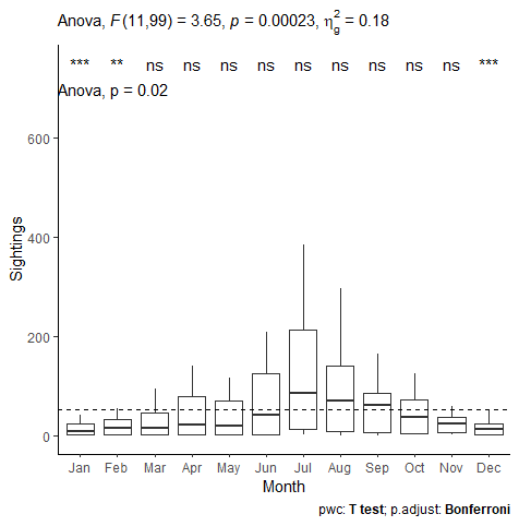
bxp +
  labs(subtitle = get_test_label(anova_sights, detailed = TRUE),
        caption = get_pwc_label(pwc))

#attempting to include p values between months on graph but doesn't seem to be working...
library(ggpubr)
bxp +
  labs(subtitle = get_test_label(anova_sights, detailed = TRUE),
       caption = get_pwc_label(pwc)) +
  geom_hline(yintercept = mean(dfsights$Sightings), linetype = 2) +
  stat_compare_means(method ="anova", label.y = 700) +
  stat_compare_means(label = "p.signif", method = "t.test",
                     ref.group = ".all.", label.y = 750) +
  theme_classic()

This is where I have gotten so far and just wondering why i have two different p-values: is one for the anova, and another for the t-test etc and what do these mean. I am sorry for these basic questions I am very new to this analysis.

Anova1

I can only partially answer your questions at the moment. You can filter out the one data point using the filter function of the dplyr package.

dfsightsFiltered <- dfsights %>% filter(Sightings < 600)

Personally, I would not do that unless there is a known cause for the outlier that makes it at least highly suspect, e.g. an electronic component burst into flame during the measurement. You could do the analysis both ways to demonstrate the importance of that point. If your conclusions materially change when that point is excluded, then you really have to wonder whether the conclusion is robust.

1 Like

This topic was automatically closed 7 days after the last reply. New replies are no longer allowed.