rafa1
1
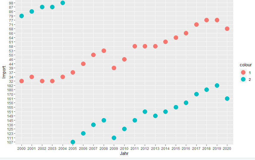
How can I reorder the values rising at the y axis using ggplot2 as below?
What I have done so far:
install.packages("tidyverse")
library(tidyverse)
Deutscher_Maschinenbau
ggplot(Deutscher_Maschinenbau,
aes(x = Jahr))+
geom_point(aes(y = Import, color = "1"), size = 5)+
geom_point(aes(y = Export, color = "2"), size = 5)
I'm sure this is very simple, but I can't find any examples out there.
Many, many thanks for your help!
Use scale_y_reverse(), take a look at this example:
library(ggplot2)

sample_df <- data.frame(
    x = 1:10,
    y = 1:10
)

ggplot(sample_df, aes(x = x, y = y)) +
    geom_point() +
    scale_y_reverse()
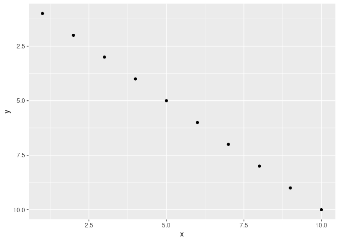
Created on 2022-01-22 by the reprex package (v2.0.1)
If you need more specific help, please provide a proper REPRoducible EXample (reprex) illustrating your issue.
1 Like
It looks as though your y axis isn't numeric.
Notice the differences here:
library(tidyverse)

tibble(x = c("1", "33", "100"),
       y = c(1,2,3)) |>
  ggplot(aes(y = y, x = x)) +
  geom_point()
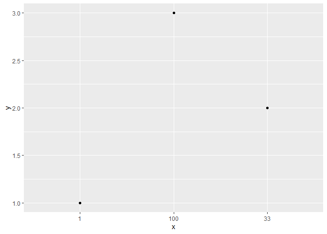
tibble(x = c("1", "33", "100"),
       y = c(1,2,3)) |>
  mutate(x = as.numeric(x)) |>
  ggplot(aes(y = y, x = x)) +
  geom_point()
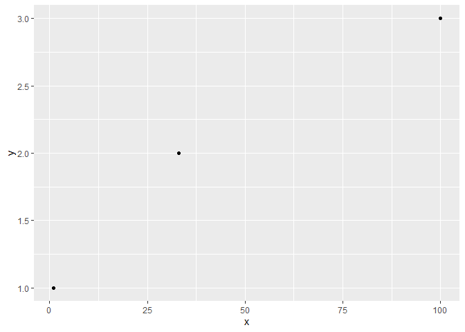
Created on 2022-01-22 by the reprex package (v2.0.1)
1 Like
rafa1
5
Hi Andreas, unfortunately, I don´t get any further. Can I provide you with the excel file than you can take a look? Any contact to you? Thank you
As I said, if you need further help, please provide a proper reproducible example as explained here
1 Like
rafa1
7
I wrote you an email from your blog. Thank you for your reply:)
EeethB
8
This looks to me like Jack's solution is what you need. It might be as simple as this:
ggplot(Deutscher_Maschinenbau,
aes(x = Jahr))+
geom_point(aes(y = as.numeric(Import), color = "1"), size = 5)+
geom_point(aes(y = as.numeric(Export), color = "2"), size = 5)
1 Like
system
Closed
9
This topic was automatically closed 21 days after the last reply. New replies are no longer allowed.
If you have a query related to it or one of the replies, start a new topic and refer back with a link.