Hi,
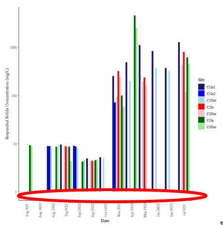
I have created a plot (image and code shown below). However, there is whitespace below the bars (circled in red). Does anyone know how to make the y-axis start with 1 at the intersection of the x and y-axis so that all the bars start at the axis and the white space is removed?
TIA
Using the code:
library(lubridate)
library(ggplot2)
mydata = structure(list(Date = c("2022-08-05", "2022-08-18", "2022-02-23",
                                 "2022-09-09", "2022-09-25", "2022-10-12", "2022-11-06", "2023-04-29",
                                 "2023-05-19", "2023-06-24", "2023-06-29", "2023-07-09", "2023-07-26"),
                        C1In1 = c(NA, 8.794, NA, 9.38, 8.86, 4.866, 5.124, 250, 484.63,
                                  1107.53, 821.92, 367.5, 1265.6),
                        C1In2 = c(NA, 8.794, NA, NA, 8.66, NA, NA, 70.59,
                                  NA, NA, NA, NA, NA),
                        C1Out = c(NA, 8.898, NA, 8.9, 7.98, 4.28, 4.88,
                                  91.95, 197.91, 196.26, 367.92, 317.3, 433.3),
                        C2In = c(NA, NA, NA, 8.64, NA, 4.38, NA, 313.87, NA,
                                 233.01, NA, NA, 788.6),
                        C2Out = c(NA, NA, NA, 8.5, NA, 4.21, NA, 237.7, NA,
                                  162.16, NA, NA, 117.2),
                        C3In = c(NA, 8.52, 9.1, 8.5, 4.21, 4.46, NA, 98.16,
                                 4494.04, NA, NA, NA, 606.6),
                        C3Out = c(NA, 8.96, 8.85, 4.23, 4.48, 4.54, NA,
                                  57.43, 2487.91, NA, NA, NA, 447.6)),
                   row.names = c(NA, 13L),
                   class = "data.frame")

df = mydata |>
  pivot_longer(cols = -'Date')

p <- ggplot() + scale_y_continuous(trans = "log10") + xlab("Date") + ylab("Suspended Solids Concentration (mg/L)") +
  geom_bar(data = df, aes(x = Date, y = value, fill = name),
           stat = 'identity',
           position = 'dodge') +
  guides(fill= guide_legend(title = "Site")) +
  theme(
    text = element_text(family = "serif"),
    axis.line = element_line(color='black'),
    plot.background = element_blank(),
    panel.background = element_rect(fill = "white"),
    panel.grid = element_blank(),
    panel.grid.major = element_blank(),
    panel.grid.minor = element_blank(),
    panel.border = element_blank(),
    axis.text.x = element_text(angle = 90, vjust = 0.5)
  ) +
  scale_x_discrete(labels = c('Aug 5/22', 'Aug 18/22', 'Aug 23/22', 'Sep 9/22', 'Sep 25/22', 'Sep 25/22', 'Oct 12/22', 'Nov 2/22', 'Apr 29/23', 'May 19/23', 'Jun 24/23', 'Jun 29/23', 'Jul 9/23', 'Jul 26/23'))
p # display the plot ```


# plot works, now need to change y-axis and change the colors in the legend
# C1In1 = midnightblue, C1In2 = blue, C1Out = lightblue, C2In = red, C2out = pink, C3In = darkgreen, C3Out = lightgreen

# define fill colours of bars
SScols <- c(C1In1 = "midnightblue",
            C1In2 = "blue",
            C1Out = "lightblue",
            C2In = "red",
            C2Out = "pink",
            C3In = "darkgreen",
            C3Out = "lightgreen")


p <- ggplot() + scale_y_continuous(trans = "log10") + xlab("Date") + ylab("Suspended Solids Concentration (mg/L)") +
  geom_bar(data = df, aes(x = Date, y = value, fill = name),
           stat = 'identity',
           position = 'dodge') +
  guides(fill= guide_legend(title = "Site")) +
  theme(
    text = element_text(family = "serif"),
    axis.line = element_line(color='black'),
    plot.background = element_blank(),
    panel.background = element_rect(fill = "white"),
    panel.grid = element_blank(),
    panel.grid.major = element_blank(),
    panel.grid.minor = element_blank(),
    panel.border = element_blank(),
    axis.text.x = element_text(angle = 90, vjust = 0.5)
  ) +
  scale_x_discrete(labels = c('Aug 5/22', 'Aug 18/22', 'Aug 23/22', 'Sep 9/22', 'Sep 25/22', 'Sep 25/22', 'Oct 12/22', 'Nov 2/22', 'Apr 29/23', 'May 19/23', 'Jun 24/23', 'Jun 29/23', 'Jul 9/23', 'Jul 26/23')) + scale_fill_manual(values = SScols)
p # display the plot ```