Hello friends...I want to add bar labels at the top of each bar in ggplot().using geom_text().I have taken the Iris dataset
My code:
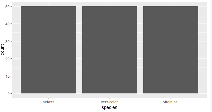
ggplot(iris) + aes(species) +geom_bar()
Output:

There’s actually an example of how to do this in the geom_text() documentation: https://ggplot2.tidyverse.org/reference/geom_text.html#examples (scroll down until you see the bar plots). Does that cover what you’re trying to do?
Hello jcblum....in my grpah its only one variable x = species..y is species count....can you wtite the code ahead in my code with geom_text() and reply back it will be of great help..
There is a similar question on this site, where I answered giving an example of how to do this. Here is my answer:
If the part you're stuck on is what to do when the values you want as bar labels aren't already in your data frame (since geom_bar() is calculating the counts for you), then this StackOverflow answer shows how to do it:
By the way, the code you posted has a couple of different syntax errors and won't run as-is. We strongly encourage people posting here to use the tools in the reprex package, which helps to catch that sort of thing before you post.
Thank you very much jcblum...it worked now....phew...thanks..
here is the code now: I just have a doubt why are there two dots before and after the count in aes(label = ..count.. can you tell mw the significance of the two dots before and after the count
ggplot(iris) +
  aes(x = species) +
  geom_bar() +
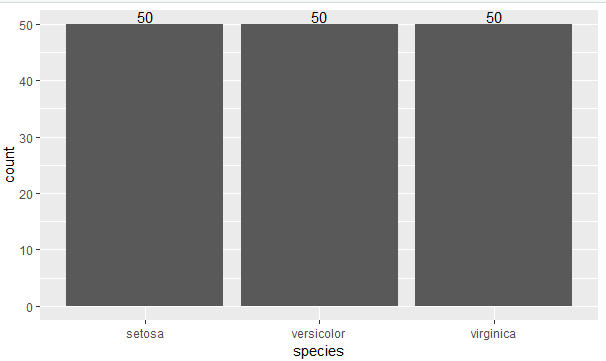
  geom_text(stat = 'count',aes(label =..count.., vjust = -0.2))
Output:

Good question! That's a ggplot2-specific convention for referring to values that are calculated by the geom or stat. You can see a list of the ones available by looking under "Computed Variables" in the documentation for a geom or stat (for this case, where stat_count() is doing the work: Bar charts — geom_bar • ggplot2).
The twist is that since the recent release of ggplot2 3.0, the awkward ..s can be replaced by the new stat() function. So a more modern version of your code would be:
ggplot(iris) +
  aes(x = species) +
  geom_bar() +
  geom_text(stat = 'count', aes(label = stat(count), vjust = -0.2))
For more info, see: https://ggplot2.tidyverse.org/reference/stat.html
(If by any chance the talk of geoms and stats above left you confused, your best bet is to work through the Data Visualization chapter of R for Data Science: 3 Data visualisation | R for Data Science)
Jcblum..thanks very much..I really appreciate your efforts for solving my doubt...will work on ghplot2 now...thanks
Amod Shirke
jcblum how do you know all these minute details...I really thank you..do you refer to any book if you get any doubts...Can you refer me any book which has helped you..with R...it will be of great help to me..
Amod Shirke
Dear jcblum, I want to know the list of colours available in Rstudio for colouring all type of plots (scatter, bar, pie, histogram etc)....which function to use to see the list of colours available for colouring to enhance our plots...
Thanks,
Amod Shirke
Hi @amodaks10! You can simply use colors() to get a list of all the named colours that are recognised by R. However, a lot of systems, like ggplot2, also recognise arbitrary colours using #RRGGBBAA or #RRGGBB hex strings too 
You can also use scales::show_col() to quickly visualise any vector of colours (although if you do show_col(colors()) you're going to lose them in a mess of labels... maybe use show_col(colors(), labels = FALSE) instead!).
Thanks rensa for your help...I have downloaded the colour palette pdf which has all the colours