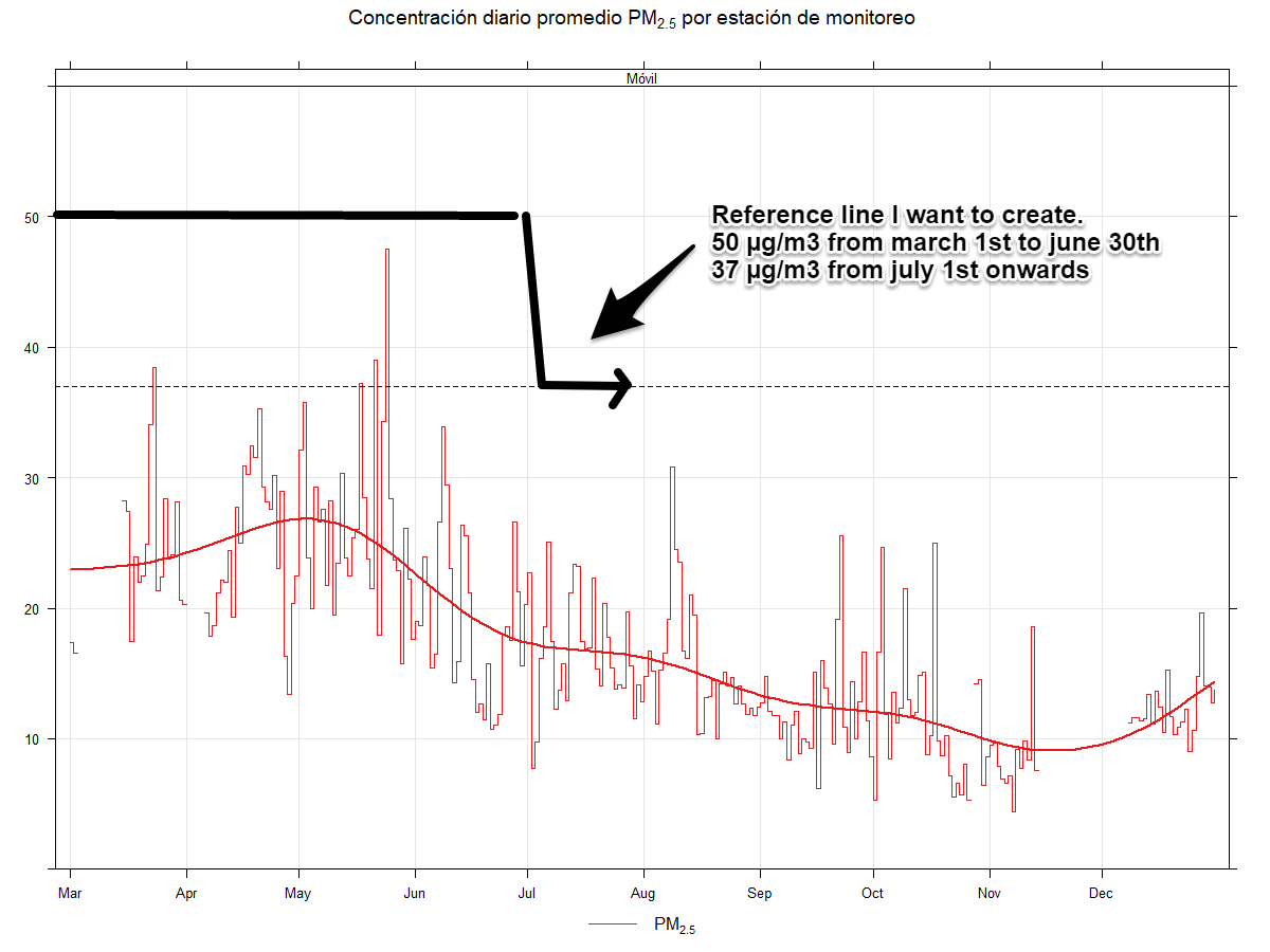
Using the openair package, I created a timeplot using the following code:
a=timePlot(data, pollutant="pm2.5", type="site", avg.time="24 hour", plot.type="s", smooth=TRUE, ci=FALSE, ylab="", main="Concentración diario promedio PM2.5 por estación de monitoreo", ylim=c(0,60))
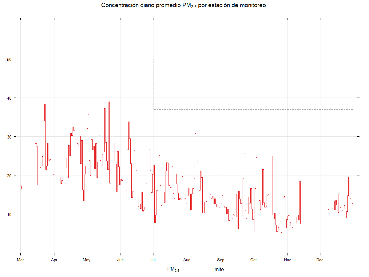
(The resulting plot is in the image link down below as I can only post 1 image per post).
Notice I created a reference line at y=37 using the ref.y=list(h=37) function, however, I need this value to be 50 from march 1st to june 30th and 37 from july 31 onwards, this is due to my country's air quality guidelines.
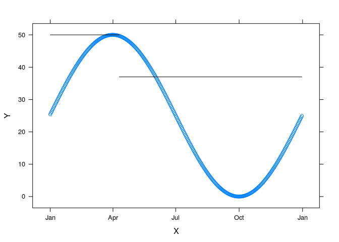
I see that openair uses the lattice package for plotting. I managed to make a lattice plot with two horizontal reference lines and dates on the x axis using the code below. Maybe if you pass a panel argument as I did, you can get lines at 50 and 37. You would need to define the functions lineAt37 and lineAt50 and adjust the from and to arguments of panel.curve to match the dates you have in your plot. Frankly, I would be surprised if that works, but it will not hurt to try.
DF <- data.frame(X = seq.Date(as.Date("2020-01-01"), as.Date("2020-12-31"), by = 1),
                 Y = 25 * sin(6.28/366*(1:366)) + 25)

library(lattice)
lineAt50 <- function(x) 50
lineAt37 <- function(x) 37

xyplot(Y ~ X, data = DF,
       panel = function(x,y,...) {
         panel.xyplot(x,y,...)
         panel.curve(lineAt50, from = 18262, to = 18362)
         panel.curve(lineAt37, from = 18362, to = 18627)}
)
#18262 is the result of as.numeric(as.Date("2020-01-01"))
#18627 is the result of as.numeric(as.Date("2020-12-31"))
I have to read about panel functions to try and reproduce your example, as I am not that much of an expert with r.
However, I was thinking about this: What if I use the rep, seq and/or merge functions to create another variable inside my data frame containing the actual 50 and 37 values by date...Is there a way to plot this new variable on top of my timePlot?
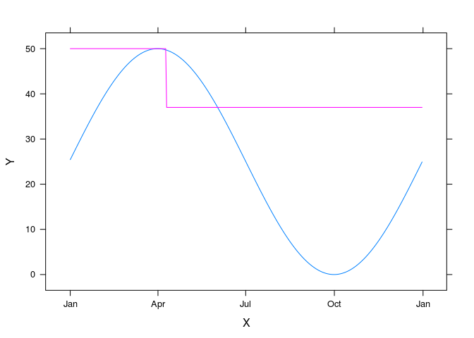
You can certainly plot multiple lines on the graph using lattice. I give a very simple example below. What I do not know is how flexible the openair package is. It may be easy to pass additional plot feature to the timeplot function or it may be difficult. The best way to approach this depends on your goals. Are you committed to making the graph using the openair package, or do you want to learn to use the underlying lattice graphs, or are you willing to use any graphing method at all?
I have never used lattice plots and it would take me more time than I can probably afford to make the plot you want. I expect someone on this site knows more about lattice than I do and they may come along and help. The ggplot2 package is most commonly used, at least on this site, and you could probably get more help using that.
DF <- data.frame(X = rep(seq.Date(as.Date("2020-01-01"), as.Date("2020-12-31"), by = 1),2),
                 Y = c(25 * sin(6.28/366*(1:366)) + 25, rep(50, 100), rep(37, 266)),
                 GRP = c(rep("Data", 366), rep("Ref", 366)))

library(lattice)

xyplot(Y ~ X, data = DF, groups = GRP, type = "l")
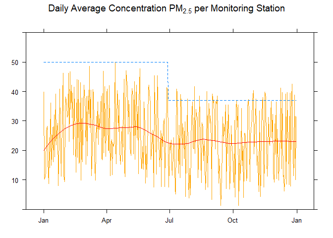
FJCC, turns out the solution for this was much simpler and included in the openair package, though I had to carefully review the manual for the past 2 days to find it.
I just had to add a new variable to the already existing dataframe by using:
data$limit=c(rep(50,122), rep(37,184))
Then I created a combined vector for the pollutant parameter and used group=TRUE so it shares the same axis:
timePlot(data, pollutant=c("pm2.5", "limit"), main="Concentración diaria promedio PM2.5 por estación de monitoreo", avg.time="24 hour", ylim=c(0,60), plot.type="s", ylab="", group=TRUE, lwd=1.5)