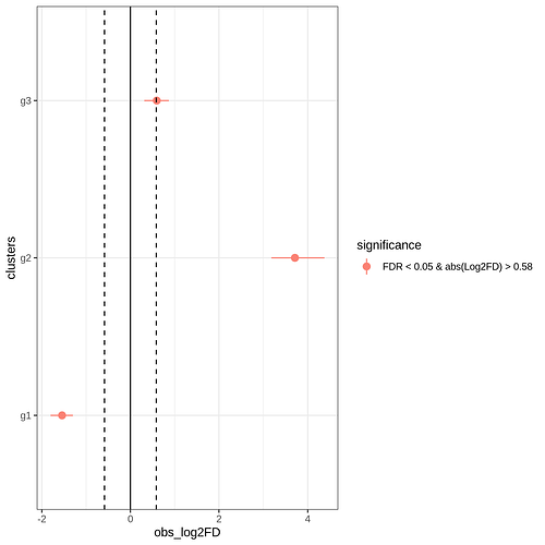
So I'm trying to create a geom point range diagram with 3 categories, to essentially show a permutation test. The relevant plotting code is:
	## Plot the results.
	p <- ggplot(plot_data, aes(x = clusters, y = obs_log2FD)) +
		geom_pointrange(aes(ymin = boot_CI_2.5, ymax = boot_CI_97.5, color = significance), fatten = 4) +
		theme_bw() +
		geom_hline(yintercept = log2FD_threshold, lty = 2) +
		geom_hline(yintercept = -log2FD_threshold, lty = 2) +
		geom_hline(yintercept = 0) +
		scale_color_manual(values = c("salmon", "grey")) +
		coord_flip()
However, the space between each category is very large. We're a bit limited on space for what we need this for, so ideally we want to cut down on the space between the axis categories. The produced plot is below:
