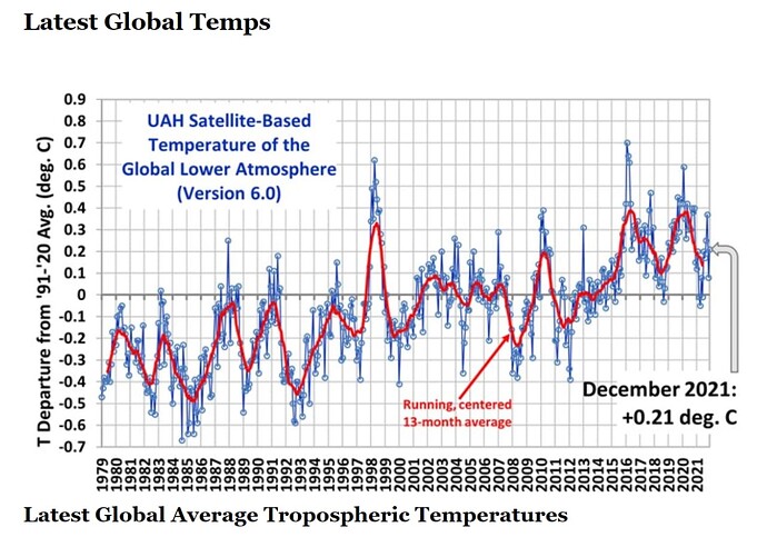
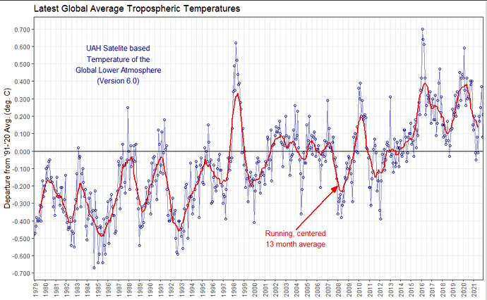
Oh this was a nice distraction from my work... I noticed the plot looks different and the rolling average wasn't working correctly. The problem is you just plotted the year, so all 12 months are stacked on top of eact other at the same position - this is not what you want. You need to show the months as well.
For this you better combine the 2 columns year and month and recode this into a "date" column, this can be handled easier later on.
low_trop1 <- fread("https://www.nsstc.uah.edu/data/msu/v6.0/tlt/uahncdc_lt_6.0.txt",
                   nrows = 517) # directly remove the laste line at importing

low_trop2 = low_trop1 %>%
  select(Year:Globe) %>%
   # combine Year and month to date column
  mutate(Date = paste(Year, Mo, sep = "-")) %>%
   # convert this to a real date
  mutate(Date = lubridate::ym(Date)) %>%
   # calculate the rolling mean
  mutate(average_temp = zoo::rollmean(Globe, 13,
                                     fill = NA, align = "center"))

str(low_trop2)
# Data column should now be of format date!
Classes ‘data.table’ and 'data.frame':	517 obs. of  5 variables:
 $ Year        : int  1978 1979 1979 1979 1979 1979 1979 1979 1979 1979 ...
 $ Mo          : int  12 1 2 3 4 5 6 7 8 9 ...
 $ Globe       : num  -0.48 -0.47 -0.43 -0.38 -0.4 -0.4 -0.39 -0.31 -0.4 -0.32 ...
 $ Date        : Date, format: "1978-12-01" "1979-01-01" "1979-02-01" "1979-03-01" ...
 $ average_temp: num  NA NA NA NA NA ...
Then you can do the plot:
text_box_label = "UAH Satelite based\nTemperature of the\nGlobal Lower Atmosphere\n(Version 6.0)"

low_trop2 %>%
  ggplot(aes(x = Date)) +
  geom_hline(yintercept = 0) +   # add line at 0
  # add points and line:
  geom_point(aes(y = Globe), colour = "blue4", shape = 21) + # colour should be outside the aes as it is not based on a column
  geom_line(aes(y = Globe), colour = "blue4", alpha = 0.5) +
  # add average:
  geom_line(aes(y = average_temp, group = 1),
           colour = "red", size = 1)  +
  scale_y_continuous(breaks = seq(from= -0.7,to=0.9, by = 0.1) ,
                     labels = scales::comma) + # comma to round the axis
  # format the x-axis
  scale_x_date(date_breaks = "year", date_labels = "%Y",
               expand = c(0,0.1)) +
  labs(title = "Latest Global Average Tropospheric Temperatures",
       x = NULL,
       y = "Departure from '91-'20 Avg. (deg. C)") +
  theme_bw() +
  # add the text annotations:
  annotate(geom="text", x=as.Date("2004-01-01"), y=-0.5,
           label="Running, centered\n13 month average",
           colour = "red") +
  geom_segment(x = as.Date("2004-01-01"), y=-0.45,
               xend = as.Date("2008-01-01"), yend=-0.2,
               arrow = arrow(angle = 20, type = "closed",
                             length = unit(0.15, "inches")),
               colour = "red", size = 1) +
  # add the textbox
  annotate(geom="text",
           x=as.Date("1987-01-01"),
           y = 0.5, hjust = 0.5,
           label = text_box_label,
           colour = "blue4" ) +
  # some finetuning:
  theme(axis.text.x = element_text(angle = 90, vjust = 0.5),
        panel.grid.minor.y = element_blank())

