Reactive functions for 2 filters

I tried with code in Flexdashboard and it is working partially. There are 3 filters here "Performance", "Class" and "Product Family"

  1. When Performance is plot, Class is All and Product Family is All, the plot is displayed and it is perfect.
  2. When Performance is plot, Class is "A" and Product Family is empty, the plot is displayed and it is perfect.
  3. But When Performance is plot, Class is "A" and Product Family is "Product Family 1", the plot is not displayed for Product Family 1, instead there is a plot for all three families.

Basically I need these filters to be used as my wish. Is there a way to do above thing?

---
title: "ABC INC"
runtime: shiny
output: 
  flexdashboard::flex_dashboard:
    orientation: rows
    vertical_layout: scroll
    source_code: embed
    theme: cosmo
    
---

```{r setup, include=FALSE}
library(flexdashboard)
library(readxl)
library(tidyverse)
library(ggplot2)
library(plotly)
library(reshape)
```


```{r}
df  <- structure(list(Class = c("A", "A", "A", "A", "A", "B", "B", "B", 
"B", "B"), Product = c("Product 1", "Product 2", "Product 3", 
"Product 4", "Product 5", "Product 1", "Product 2", "Product 3", 
"Product 4", "Product 5"), `Product Family` = c("Product Family 1", 
"Product Family 1", "Product Family 1", "Product Family 2", "Product Family 3", 
"Product Family 1", "Product Family 1", "Product Family 1", "Product Family 2", 
"Product Family 3"), `Month Ending Date` = structure(c(1420070400, 
1422748800, 1425168000, 1427846400, 1430438400, 1420070400, 1422748800, 
1425168000, 1427846400, 1430438400), class = c("POSIXct", "POSIXt"
), tzone = "UTC"), Spend = c(95, 93, 98, 100, 93, 95, 93, 98, 
100, 93)), row.names = c(NA, -10L), class = c("tbl_df", "tbl", 
"data.frame"))
df <- as.data.frame(df)
colnames(df) <- gsub(" ","_",colnames(df))
df$Month_Ending_Date <- as.Date(df$Month_Ending_Date)
```

Performance
=======================

Filters {.sidebar}
------------------

```{r}
selectInput("Plot",h5("Performance"),choices = c("","Plot"))
selectInput("Class",h5("Class"),choices = c("All",levels(factor(df$Class))),multiple = TRUE)
selectInput("Product_Family",h5("Product Family"),choices =c("All",levels(factor(df$Product_Family))),multiple = TRUE)
```

Output
------------------

### Chart A {data-height=1000}

```{r}
plotOutput("graph",height = "5000px",width = "1000px")
sel_data <- reactive({
           df[df$Class %in% input$Class | df$Product_Family %in% input$ProductFamily,]
         })


graph <- reactive({
  if (input$Plot == "Plot" && (input$Class == "All" || input$Class != "All" )) {
    ggplot(sel_data(),aes(x=Month_Ending_Date,y=Spend,color =   
                          Product))+geom_point()+facet_wrap("Product_Family")+theme(legend.position = "none")+theme(legend.position = "none")
  } else if (input$Plot == "Plot" && (input$Product_Family == "All" || input$Product_Family != "All")){
    ggplot(sel_data(),aes(x=Month_Ending_Date,y=Spend,color =   
                          Product))+geom_point()+facet_wrap("Product_Family")+theme(legend.position = "none")+geom_text(data = sel_data(),aes(x=Month_Ending_Date,label=round((Spend/10),1)),size=3,angle = 45, color = "black",vjust=-0.25)+theme(legend.position = "bottom")
  }
})
output$graph <- renderPlot({
  graph()
})

```
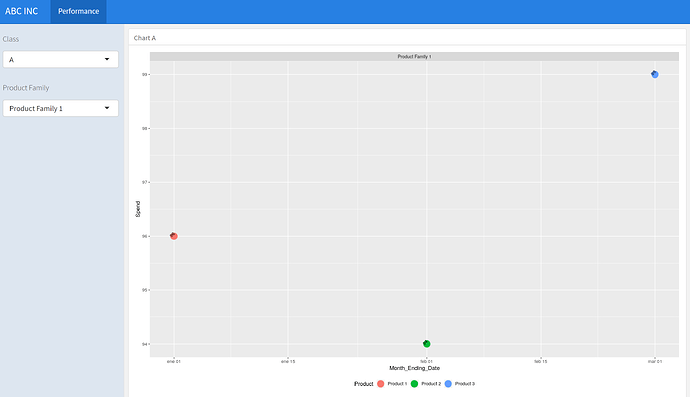


I think you are seeing that behavior for case 3 because you have connected the two conditions that filter df with an OR. That results in all data where Class == A being plotted, regardless of what Product Family is and you should also get all Classes plotted as long as the data have Product Family 1 . Change the filtering to

sel_data <- reactive({ df[df$Class %in% input$Class & df$Product_Family %in% input$ProductFamily,] })

Your code will still not handle the case where only one of Class or Product Family is set to All, but that is a separate question.

Thanks for the response. Yeah I tried that code as well. Replacing or with and. But then also if I filter on Class as A and Product Family as Product Family 1. The plot is not getting changed.

I ran the following code and it filters the plotted data just as expected. When I set Class to A and Product Family to Product Family 1, I get a single plot with three points. The important change is that I used & to connect the filter conditions. I also increased the point size just so I could see the markers better and I commented out the loading of packages that are not needed for this example.

Note that I commented out the closing back tics of the chunks to preserve the formatting. You will have to remove the # characters.

---
title: "ABC INC"
runtime: shiny
output: 
     flexdashboard::flex_dashboard:
     orientation: rows
     vertical_layout: scroll
     source_code: embed
     theme: cosmo
---

```{r setup, include=FALSE}
       library(flexdashboard)
       #library(readxl)
       library(tidyverse)
       library(ggplot2)
       #library(plotly)
       #library(reshape)
```
```{r}
          df <- structure(list(Class = c("A", "A", "A", "A", "A", "B", "B", "B",        
       "B", "B"), Product = c("Product 1", "Product 2", "Product 3", 
       "Product 4", "Product 5", "Product 1", "Product 2", "Product 3", 
       "Product 4", "Product 5"), `Product Family` = c("Product Family 1", 
       "Product Family 1", "Product Family 1", "Product Family 2", "Product Family 3", 
       "Product Family 1", "Product Family 1", "Product Family 1", "Product Family 2", 
       "Product Family 3"), `Month Ending Date` = structure(c(1420070400, 
       1422748800, 1425168000, 1427846400, 1430438400, 1420070400, 1422748800, 
       1425168000, 1427846400, 1430438400), class = c("POSIXct", "POSIXt"
       ), tzone = "UTC"), Spend = c(95, 93, 98, 100, 93, 95, 93, 98, 
       100, 93)), row.names = c(NA, -10L), class = c("tbl_df", "tbl", 
       "data.frame"))
       df <- as.data.frame(df)
       colnames(df) <- gsub(" ","_",colnames(df))
       df$Month_Ending_Date <- as.Date(df$Month_Ending_Date)
```

Performance
=======================

Filters {.sidebar}
------------------

```{r}
       selectInput("Plot",h5("Performance"),choices = c("","Plot"))
       selectInput("Class",h5("Class"),choices = c("All",levels(factor(df$Class))),multiple =               TRUE)
       selectInput("ProductFamily",h5("Product Family"),choices        =c("All",levels(factor(df$Product_Family))),multiple = TRUE)
```

Output
------------------

### Chart A {data-heigh=500}

```{r}
       plotOutput("graph",height = "5000px",width = "1000px")
       sel_data <- reactive({
           df[df$Class %in% input$Class & df$Product_Family %in% input$ProductFamily,]
         })


       graph <- reactive({
  if (input$Plot == "Plot" && input$Class == "All" && input$ProductFamily == "All") {
    ggplot(df,aes(x=Month_Ending_Date,y=Spend,color = Product))+ geom_point() + 
      facet_wrap("Product_Family") + theme(legend.position = "none") + 
      theme(legend.position = "none")
  } else {
    ggplot(sel_data(),aes(x=Month_Ending_Date,y=Spend,color =   
      Product)) + geom_point(size = 6) + facet_wrap("Product_Family") + 
      theme(legend.position = "none") + 
      geom_text(data = sel_data(), aes( x = Month_Ending_Date, 
                                        label = round((Spend/1000000),2)), 
                size = 3, angle = 45, color = "black", vjust=-0.25) + 
      theme(legend.position = "bottom")
  }
})
output$graph <- renderPlot({
  graph()
})
```

Yeah I know :slight_smile: But If I select only Performance as Plot and Class as A. I should get 3 plots and then if I select Product Family 1 I need to get one plot. :slight_smile: I am trying this from 3 hours but not getting. It is similar to Filtering in Excel. What I am trying to do is that, I need to know how my class A is performing. But After I know how my class A is performing, I need to go in detail like if I select Product family 1 i should get only 1 plot . Hope I made it clear? :slight_smile:

May be this is little tricky I believe :slight_smile:

If you change your filtering function to perform the filtering for Class and Product Family sequentially, I think you will get what you want. This does not handle the cases where a selection is left blank but you can have All in one input and a particular selection in the other.

sel_data <- reactive({
         if (input$Class != "All") {  
           df <- df[df$Class %in% input$Class,]
         }
         if (input$ProductFamily != "All") {
           df <- df[df$Product_Family %in% input$ProductFamily, ]
         }
         df
         })

Since this has come up more than once in this conversation…

To learn how to format R Markdown source for posting here, please read FAQ: How to Format R Markdown Source

It’s a really good idea to follow the method described in the FAQ, since it maximizes copy-paste-ability. Messing with indentation (as in the original topic post) will often make the R Markdown un-runnable, since the YAML header is extremely sensitive to indentation.

Thanks :slight_smile: But still it is not working.

I tried recoding my program and run it . It is again partially working. Now if select Plot and class as A I get 3 plots and this is fine. Keeping this if Select Product Family as Product Family 1, the plot is not changing. Please help

I don't think this is particularly tricky, the problem here is with your design logic not with the code it self, and improper reprex makes understanding your problem even harder. Maybe this shorter reprex could help with that.

---
title: "ABC INC"
runtime: shiny
output: 
     flexdashboard::flex_dashboard:
     orientation: rows
     vertical_layout: scroll
     source_code: embed
     theme: cosmo
---

```{r setup, include=FALSE}
library(flexdashboard)
library(tidyverse)
library(shiny)
```

```{r}
          df <- structure(list(Class = c("A", "A", "A", "A", "A", "B", "B", "B",        
       "B", "B"), Product = c("Product 1", "Product 2", "Product 3", 
       "Product 4", "Product 5", "Product 1", "Product 2", "Product 3", 
       "Product 4", "Product 5"), `Product Family` = c("Product Family 1", 
       "Product Family 1", "Product Family 1", "Product Family 2", "Product Family 3", 
       "Product Family 1", "Product Family 1", "Product Family 1", "Product Family 2", 
       "Product Family 3"), `Month Ending Date` = structure(c(1420070400, 
       1422748800, 1425168000, 1427846400, 1430438400, 1420070400, 1422748800, 
       1425168000, 1427846400, 1430438400), class = c("POSIXct", "POSIXt"
       ), tzone = "UTC"), Spend = c(96, 94, 99, 101, 94, 96, 97, 99, 
       100, 93)), row.names = c(NA, -10L), class = c("tbl_df", "tbl", 
       "data.frame"))
       df <- as.data.frame(df)
       colnames(df) <- gsub(" ","_",colnames(df))
       df$Month_Ending_Date <- as.Date(df$Month_Ending_Date)
```

Performance
=======================

Filters {.sidebar}
------------------

```{r}
selectInput("Class",
            h5("Class"),
            selected = "All",
            choices = c("All",levels(factor(df$Class))))
selectInput("ProductFamily",
            h5("Product Family"),
            selected = "All",
            choices = c("All",levels(factor(df$Product_Family))))
```

Output
------------------

### Chart A {data-heigh=500}

```{r}
plotOutput("graph",
           height = "5000px",
           width = "1000px")

output$graph <- renderPlot({    
    ploting_data <- df
    
    if (input$Class != "All") {
        ploting_data <- ploting_data %>% 
            filter(Class %in% input$Class)
    }
    
    if (input$ProductFamily != "All") {
        ploting_data <- ploting_data %>% 
            filter(Product_Family %in% input$ProductFamily)
    }
    ggplot(ploting_data, aes(x = Month_Ending_Date, y = Spend, color = Product)) +
            geom_point(size = 6) +
            facet_wrap("Product_Family") + 
            geom_text(aes(label = Spend), 
                      size = 3, angle = 45, color = "black", vjust=-0.25) + 
            theme(legend.position = "bottom")
})
```

Thanks, But still I am not getting what I need. In your code only after all 3 filters are filled the plot is displayed. No Below is the thing I need.

  1. Select Plot and Select Class A : Output should be 3 plots (Hope this is fine)
  2. Select Plot and Select Class A and Select Product Family as Product Family 1 : Output should be only 1 plot

Basically what I need is that to create a story here

1st scenario : I select Plot(Filter 1), All(Filter 2) and All(Filter 3) : Output to be all plots
From above scenario I will see which to focus so I go for second scenario

2nd Scenario : I select Plot(Filter 1), A(Filter 2) : Output to be only for A that is 3 plots
From above scenario, I will see from the 3 plots which to select so I go for third scenario

3 rd Scenario : I select Plot(Filter 1), A(Filter 2) and Product Family 1(Filter 3) : Output to be only 1 plot

Hope I have made points very clear :):slight_smile:

I have edited my code for your reference. It is partially working

My code only has 2 filters not 3 since I'm sharing an example of a design logic for independent filters, not a final solution for your especifyc code, is up to you to apply that to your specific application.