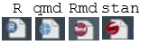
The R and qmd rider icons for the different tabs in a RStudio code pane seem very similar to me (small blue symbols in slightly different shades of blue, you only see that there's a "R" or a "+" if you look closely) and I have trouble quickly spotting a qmd amongst some R files. Other things look vaguely similar, but for example Rmd vs. stan files seems easier to quickly distinguish.
Is there an obvious way to make these visually more distinct? E.g. some manual setting or is this better in a newer RStudio version (I'm still using RStudio 2023.06.1 Build 524 for Windows)?
This topic was automatically closed 90 days after the last reply. New replies are no longer allowed.
If you have a query related to it or one of the replies, start a new topic and refer back with a link.