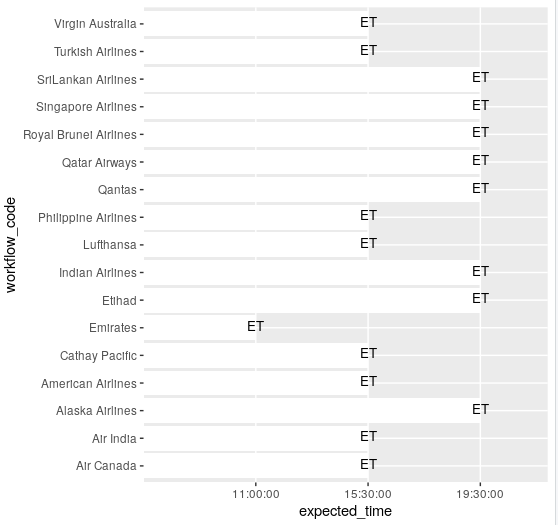
I'm using the table shown below to produce a chart:
| workflow_code | expected_time | processed_time |
|---|---|---|
| Emirates | 11:00:00 | 10:38:10 AM |
| American Airlines | 15:30:00 | 3:25:11 PM |
| Qantas | 19:30:00 | 3:25:20 PM |
| Virgin Australia | 15:30:00 | 3:25:14 PM |
| Etihad | 19:30:00 | 3:26:18 PM |
| Air Canada | 15:30:00 | 3:28:10 PM |
| Lufthansa | 15:30:00 | 3:28:12 PM |
| SriLankan Airlines | 19:30:00 | 3:27:06 PM |
| Singapore Airlines | 19:30:00 | 3:27:06 PM |
| Cathay Pacific | 15:30:00 | 3:25:12 PM |
| Indian Airlines | 19:30:00 | 3:25:12 PM |
| Air India | 15:30:00 | 3:26:21 PM |
| Qatar Airways | 19:30:00 | 3:25:15 PM |
| Philippine Airlines | 15:30:00 | 3:27:09 PM |
| Royal Brunei Airlines | 19:30:00 | 3:26:24 PM |
| Turkish Airlines | 15:30:00 | 3:25:15 PM |
| Alaska Airlines | 19:30:00 | 3:25:11 PM |
I need to produce a chart as shown below:
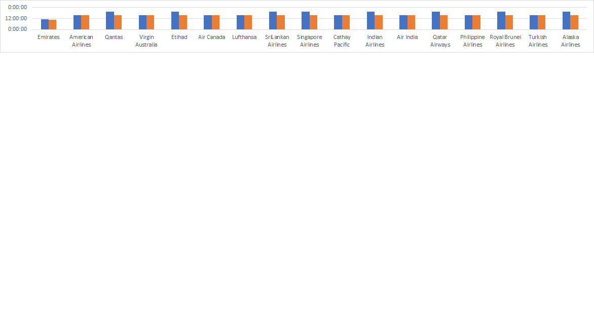
The R code I've used is as shown below:
c1_data <- actuals %>% select(workflow_code, expected_time) %>% melt()
c1_graph <- ggplot(as.data.frame(c1_data), aes(y=c1_data$expected_time, x=c1_data$worflow_code)) +
geom_bar(stat="identity", fill="white")
geom_text(aes(label="ET"),vjust=0.3, size=3.5)+ theme_minimal()
c1_graph
This gives me an error message : geom_bar requires the following missing aesthetics