As a starting point, you used geomsmooth(method=lm, aes(fill=Habitat)) to fit an inline model while plotting.
Consider refactoring your code to create a proper lm object, that can be interrogated. Here is an example with R built in data.
library(tidyverse)
#example data
myiris <- iris
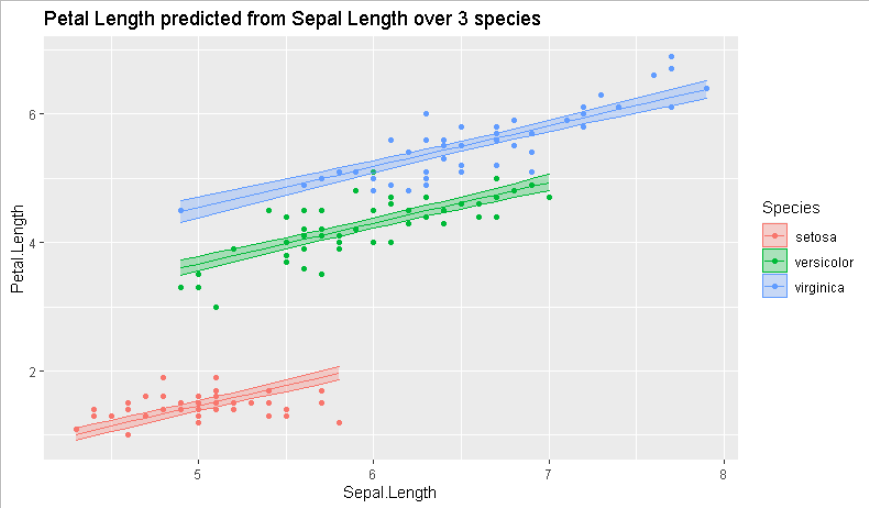
my_lm <- lm(Petal.Length ~ Sepal.Length + Species,data=iris)
myiris$lm_pred_val <- predict(my_lm,newdata = myiris,
interval = "confidence"
) %>% as.data.frame()
ggplot(data=myiris,
aes(x=Sepal.Length,
y=Petal.Length,
color=Species,
fill=Species)) + geom_point()+
geom_line(aes(y=lm_pred_val$fit)) +
geom_ribbon(aes(ymin=lm_pred_val$lwr,
ymax=lm_pred_val$upr), alpha=.3) +
ggtitle("Petal Length predicted from Sepal Length over 3 species")
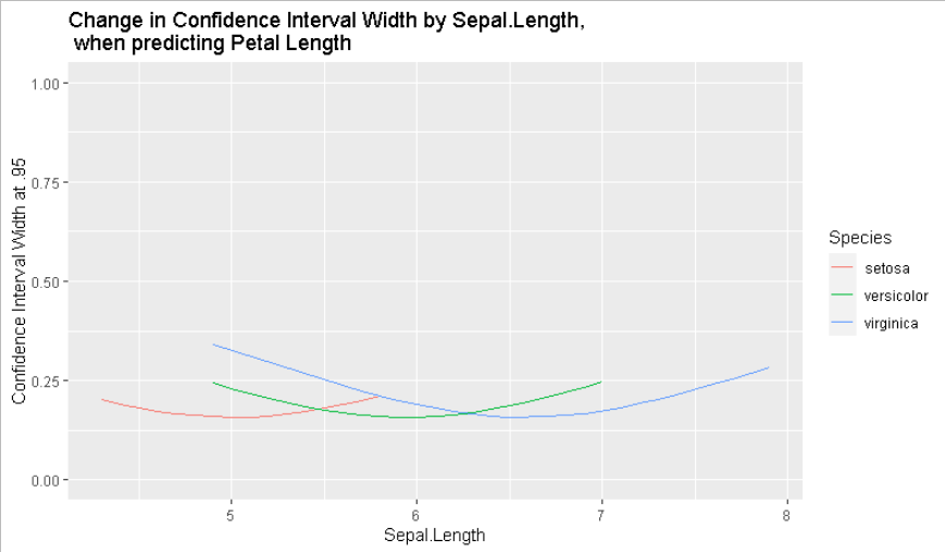
ggplot(data=myiris,
aes(x=Sepal.Length,
y=lm_pred_val$upr - lm_pred_val$lwr,
color=Species,
fill=Species)) +
geom_line() +
ylab("Confidence Interval Width at .95") +
ylim(c(0,1)) +
ggtitle("Change in Confidence Interval Width by Sepal.Length,\n when predicting Petal Length")