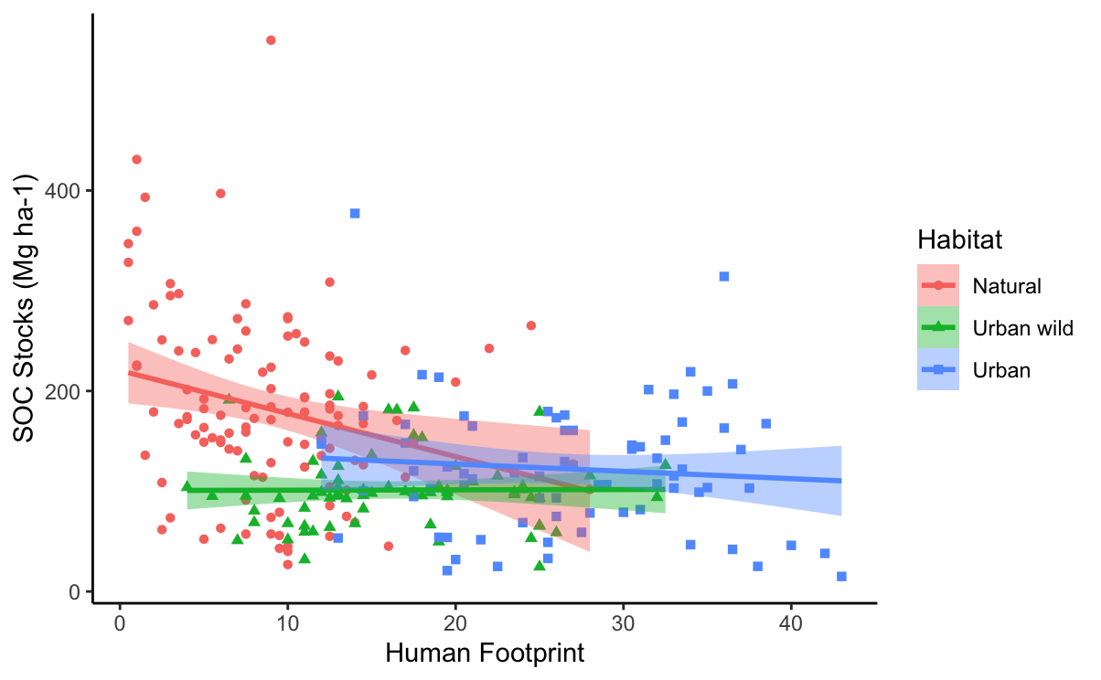
I made a scatter plot by using ggplot2 to show the relationship between human footprint and soil carbon in different habitat types (natural, urban wild, and urban). The human footprint is a continuous variable which indicates human pressure on the nature. Higher footprint value means a land is more modified by humans.
Here is the code I used and the plot I have:
library(ggplot2)
SOC$Habitat <- factor(SOC$Habitat, levels = c("Natural", "Urban wild", "Urban")
#reorder the three habitat types

p <- ggplot(SOC, aes(x=Footprint, y=Stocks, shape=Habitat, color=Habitat) +
     geom_point() +
     geomsmooth(method=lm, aes(fill=Habitat))

p + xlab("Human Footprint") + ylab("SOC Stocks (Mg ha-1)") + theme_classic()

p
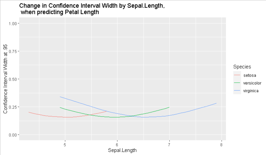
Now I want to extract the confidence interval to see how it changes as the human footprint increases under different habitat types. The y variable in the new plot (I assume it can be a line graph) that I want now can be confidence interval range or confidence interval width, and x variable is the human footprint. The new line graph needs to contain three lines, representing each habitat type (natural, urban wild, and urban) with color.
However, I have no idea how to do it. Hope you can help me if you know how to do in ggplot2 or other packages. Thank you very much in advance.
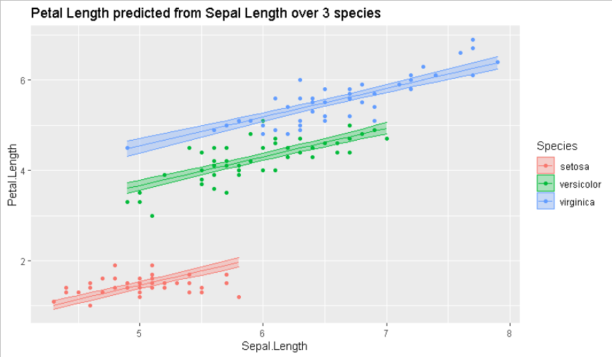
As a starting point, you used geomsmooth(method=lm, aes(fill=Habitat)) to fit an inline model while plotting.
Consider refactoring your code to create a proper lm object, that can be interrogated. Here is an example with R built in data.