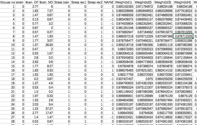
so I have data like this, and I want to make some plots based on it, with y axis represents the mean weight of mice of different days, x-axis represents the time (days), since there are two variables, one is strains , another one is the condition of stress (there are four categories of the combinations of stress train, stress rec1, and stress rec2), I will need to put 8 lines in one plot, I wonder how can I make the ggplot for this? ex. two color used for distinguishing two strains and four types of lines used to represent four combinations of stress condition? I found categorizing those four types combination of stress conditions especially tricky? could anyone help me to write the code for making ggplot of this! thx a lot~
Hi, welcome!
We don't really have enough info to help you out. Could you ask this with a minimal REPRoducible EXample (reprex)? A reprex makes it much easier for others to understand your issue and figure out how to help.
If you've never heard of a reprex before, you might want to start by reading this FAQ:
This topic was automatically closed 21 days after the last reply. New replies are no longer allowed.
If you have a query related to it or one of the replies, start a new topic and refer back with a link.
