A quick way to get close to what you're describing would be to change the standard boxplot so that it plots percentiles for the whiskers rather than 1.5*IQR (I find the 1.5*IQR to be difficult to interpret and generally use the 5th and 95th percentiles for the whiskers in my own plots). Also, what you've called the "shortest half" sounds like what I've seen called the highest-density interval (HDI)--the shortest interval that contains some percentage of the data. The HDInterval package has the hdi function for calculating the HDI.
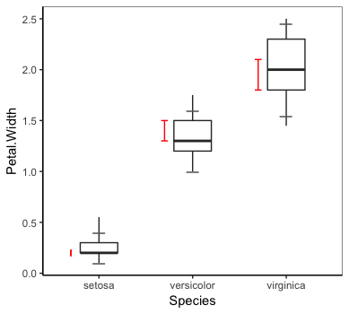
Below is a ggplot version of the above. We create three helper functions to calculate, respectively, the boxplot percentiles (1st, 25th, 50th, 75th, and 99th by default), the HDI (50% by default), and two additional percentiles (5th and 95th by default) and then use stat_summary to draw the geoms.
library(ggplot2)
theme_set(theme_classic() +
           theme(panel.background=element_rect(colour = "grey40", fill = NA)))

# Function to calculate boxplot percentiles
bp.pctiles = function (x, probs = c(0.01, 0.25, 0.5, 0.75, 0.99)) {
  r <- quantile(x, probs = probs, na.rm = TRUE)
  names(r) <- c("ymin", "lower", "middle", "upper", "ymax")
  r
}

# Function to calculate HDI
hdi.stat = function(x, credMass=0.5) {
  r = unname(HDInterval::hdi(x, credMass=credMass))
  r = c(y=r[1], yend=r[2])
  r
}

# Function to calculate two more percentiles
add.percentiles = function(x) {
  r = quantile(x, probs=c(0.05, 0.95))
  names(r) = c("lwr", "upr")
  r
}
ggplot(iris, aes(x=Species, xend=Species,  y=Petal.Width)) +
  # Add boxplots
  stat_summary(fun.data=bp.pctiles, geom="boxplot", aes(width=0.4)) +
  # Add two more percentiles as dashes across the boxplot whiskers
  stat_summary(fun.y=add.percentiles, geom="point", pch="_", colour="grey40", size=6) +
  # Add HDI
  stat_summary(fun.data=hdi.stat, geom="segment",
               position=position_nudge(x=-0.3), colour="red",
               arrow=arrow(angle=90, ends="both", length=unit(0.1, "cm")))