Wow -- stop! I had written some code similar to your very first one (except mine only drew one plot, and I was trying to use segment instead of arrows, which didn't occur to me. I may use it in a book I'm working on, but certainly not your expanded ones that show so much effort.
I've never really known why the plot exists. It shows up in SAS/JMP, so I figured there must be some reason behind it. Initially I thought it was to determine distribution shape, but (a)a regular box plot does that and (b)I already know how to draw a histogram.
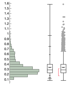
Aside from the strange quantile box plot, JMP puts something called the shortest half on its Outlier (==typical) box plot. I think it has something to do with the shorth statistic, but the documentation only defines what it is (the shortest interval that contains 50% of the data), and gives a vague reference to a book (Rousseeuw, P. J., and Leroy, A. M. (1987). Robust Regression and Outlier Detection. New York: John Wiley & Sons) whose 2nd edition I own, and which doesn't help. I'll attach a picture; the shortest half is in red. And vertically is JMP's default way of showing histograms and box plots. Another mystery.
I envy your skill!