Q-Q Plot Visualization Tool
Authors: Sam Bacon
Abstract: This applet allows users to experiment with different Q-Q Plot visualizations. Use the dropdown menus to generate/import data and select features you would like to include. The app also performs a formal normality test and provides sample statistics.
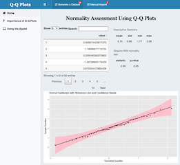
Full Description: This applet allows users to experiment with different types of Quantile-Quantile (Q-Q) Plot visualizations. As stated in the application, the normality of a population can be assessed using a variety of formal and informal methods. Formal methods, such as the Shapiro-Wilk test, have a high accuracy for large samples, but they lose a significant amount of power as sample size decreases. In these circumstances, informal methods such as Q-Q Plots are a powerful tool if they are understood and interpreted correctly.
The purpose of this applet is to introduce viewers to different Q-Q Plot variations so that they are better able to assess the distribution of a sample visually. The first tab on the left sidebar contain background information about the theory behind these visualizations as well as their importance.
The second tab, 'Using the Applet,' provides detailed instructions that users can follow to create and analyze their own data. The data can be randomly sampled from a population with a predetermined distribution, or it can be imported by the user. In each instance, there are a variety of options regarding both the data that is represented in the visualizations as well as the visualizations themselves.
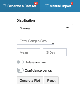
For randomly generated data, users must select a parent distribution, input a sample size and other relevant statistics, and select the features that they would like in their Q-Q Plot.
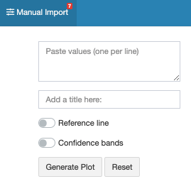
Manually imported data simply requires that users paste their data set into the form and add a title if necessary. Again, they can select if they would like to add a reference line or confidence bands to their output.
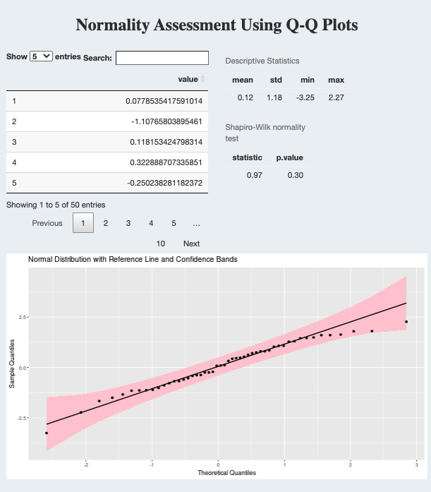
Once all required fields have been entered, click 'Generate Plot' to view a variety of descriptive statistics and visualizations for the data. The output consists of a data table of values, a five-number summary and a Q-Q Plot. It also performs the Shapiro-Wilk test to formally analyze the normality of the distribution.
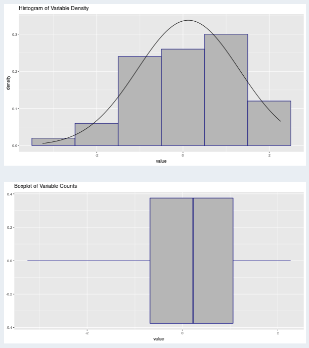
The applet will also generate a histogram of the density of the input variable as well as a boxplot of the counts.
The goal of this applet is to introduce viewers to a powerful method for determining the distribution of a data set. Although formal tests are powerful, visualizations such as Q-Q Plots are another valuable option, especially for smaller data sets. As we become more familiar with these informal techniques, we will greatly improve our collective ability to assess distributions and describe data, a crucial component of the data analysis process.
Keywords: teaching, education, qqplot, ggplot2, qqplotr, shinyDashboardPlus
Shiny app: Q-Q Plot Visualizations
Repo:
RStudio Cloud: Posit Cloud
Thumbnail:
Full image: