Hi,
it's not letting me uploading the dataset in here. I will try to provide as much information as possible. The brief is I have been asked to looked at The Company X campaigns and decide which campaign is the best and for each department.
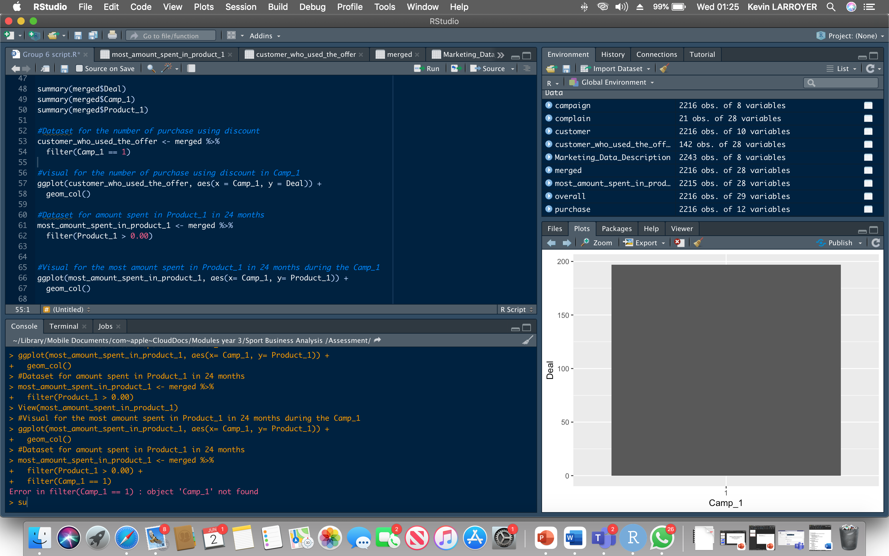
This is my script
#>>>>>>>>>>>>>>>>>>Company X Script>>>>>>>>>>>>>>>
#start script with this to clear variables in the environment >>>>>
rm(list = ls())
1. load the package tidyverse
library(tidyverse)
#to check if it has been set correctly
getwd()
#Load Company X data
campaign <- read_csv("campaign_data.csv")
customer <- read_csv("customer_data.csv")
purchase <- read_csv("purchase_data.csv")
#making the data ready for analysis
#Merge the datasets (campaign, customer and purchase)
merged <- campaign %>%
full_join(customer) %>%
full_join(purchase)
glimpse(merged)
#Changing the format of the campaigns
merged <- merged %>%
mutate(Camp_1= as.factor(Camp_1),
Camp_2= as.factor(Camp_2),
Camp_3= as.factor(Camp_3),
Camp_4= as.factor(Camp_4),
Camp_5= as.factor(Camp_5),
Camp_6= as.factor(Camp_6))
#New datasets for overall sales in all campaigns
campaign_1 <- filter(merged, Camp_1 == 1)
campaign_2 <- filter(merged, Camp_2 == 1)
campaign_3 <- filter(merged, Camp_3 == 1)
campaign_4 <- filter(merged, Camp_4 == 1)
campaign_5 <- filter(merged, Camp_5 == 1)
campaign_6 <- filter(merged, Camp_6 == 1)
#Overall sales in Campaign 1
overall_sales <- campaign_1 %>%
mutate(Overall = Deal + Web + Catalogue + Store)
#Visuals for Overall Sales from Campaign 1
ggplot(overall_sales, aes(x= Camp_1, y= Overall))+
geom_col(fill = "blue")+
labs(x= "Campaign 1",
y= "Overall Sales",
title = "Overall Sales of Campaign 1",
subtitle = "Overall Sales includes purchases from Deal, Web, Catalogue and Store",
caption = "Created by Group 6") +
theme_bw() +
theme(plot.title = element_text(color = "black", size = 20, face = "bold"),
plot.subtitle = element_text(color= "black", size = 10, face = "italic"),
plot.caption = element_text(color = "black", face = "italic"),
axis.text.x = element_text(face = "bold", size = 10),
axis.text.y = element_text(face = "bold", size = 10))
#Overall sales in Campaign 2
overall_sales <- campaign_2 %>%
mutate(Overall = Deal + Web + Catalogue + Store)
#Visuals for Overall Sales from Campaign 2
ggplot(overall_sales, aes(x= Camp_2, y= Overall))+
geom_col(fill = "red")+
labs(x= "Campaign 2",
y= "Overall Sales",
title = "Overall Sales of Campaign 2",
subtitle = "Overall Sales includes purchases from Deal, Web, Catalogue and Store",
caption = "Created by Group 6") +
theme_bw() +
theme(plot.title = element_text(color = "black", size = 20, face = "bold"),
plot.subtitle = element_text(color= "black", size = 10, face = "italic"),
plot.caption = element_text(color = "black", face = "italic"),
axis.text.x = element_text(face = "bold", size = 10),
axis.text.y = element_text(face = "bold", size = 10))
I managed to create to create some plots but I don't know how to plotting results from different datasets in one graph. For example, having in the same graph the overall sales of each campaign in one graph. apparently, To achieve what you want you need to change the data structure but we never seen that in lectures. Someone suggested me to The easiest way is to create separate box plots for each campaign, and then arrange them on one slide. However, it means having 6 separate box plots in one slide to respond which campaign is the best.