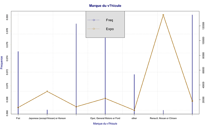
Hello everyone I have a graph to calculate the frequency by type of vehicle, given the huge number of vehicles, I would like each modality to be displayed horizontally.
to this :
here is my code :
PLOT_FREQ_VAR=function(VECT,N=FRQ$ClaimNb,EXP=FRQ$Exposure,nm)
{
  R <<- by(N, VECT, sum)
  E <<- by(EXP, VECT, sum)

  name_R <<- names(R)
  name_E <<- names(E)

  R <<- as.vector(R)
  E <<- as.vector(E)

  FREQ <<- R/E

  DATA<<-data.frame(FREQ=FREQ,EXP=E)
  rownames(DATA)<<-name_R

  plot.new()
  plot.window(xlim=range(c(1:dim(DATA)[1])),ylim=range(DATA[,1]),col.main="darkblue", col.lab ="darkblue",cex.main = 1.5,cex.lab = 1.2,panel.first=grid())
  lines(c(1:dim(DATA)[1]),DATA[,1],type='h', col ='blue4', lwd = 3)
  axis(side=1, at = c(1:dim(DATA)[1]), labels=rownames(DATA))
  axis(side=2, col = "gold", lty = 2, lwd = 0.5)
  title(xlab=paste(nm),cex.lab = 1.2, col.lab ="darkblue")
  title(ylab="Frequence",cex.lab = 1.2, col.lab ="darkblue")

  plot.window(xlim=range(c(1:dim(DATA)[1])),ylim=range(DATA[,2]))
  lines(c(1:dim(DATA)[1]),DATA[,2],type='b',col ='darkgoldenrod', lwd = 3)
  axis(4)
  title(main=nm,col.main="darkblue",cex.main = 1.5)
  mtext("Exposition",side=4,line=2.)
  box()
  legend("top", c('Freq','Expo'), col=c('blue4','darkgoldenrod'),pch=21,lty = 2,cex = 1.5,bg = "gray90")
}
PLOT_FREQ_VAR(FRQ$Brand,FRQ$ClaimNb,FRQ$Exposure,"vehicle brand")

the data is in
library(CASdatasets)
data("freMTPLfreq")
FRQ <- freMTPLfreq
i want also, if it possible to put the legend outside the graph , as we can see the graph
thank you for your help

