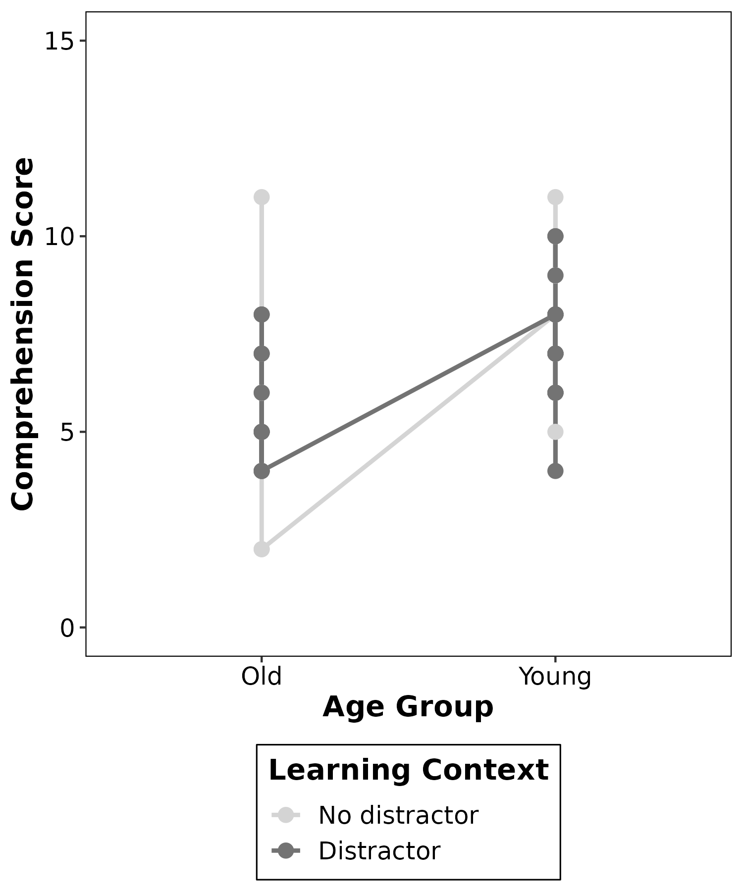
Hello everyone, I hope you're well. I'm trying to make a line graph for my dissertation and after much effort, I've gotten really close. Unfortunately, I can't seem to fix it beyond this point - there are so many extra lines & points when I only need one each learning context per age group (so 2 lines, 4 data points).
I'll attach a screenshot below; if you could let me know how to fix this I'd really appreciate it!
ggplot(data = longdata, mapping = aes(x = age_group, y = score, group = learning_context)) +
  geom_line(size = 1, aes(color = learning_context)) +
  geom_point(size = 3, aes(color = learning_context)) +
  scale_color_manual(values=c("#D4D4D4", "#737373"), labels = c("No distractor", "Distractor")) +
  ylim(0,15) +
  labs(x = "Age Group", y = "Comprehension Score", color = "Learning Context") +
  scale_x_discrete(labels = c('Old','Young')) +
  theme_bw() +
  theme(panel.grid.major      = element_blank(),
        panel.grid.minor      = element_blank(),
        panel.background      = element_blank(),
        panel.border          = element_rect(colour = "black", fill=NA),
        axis.line             = element_blank(),
        axis.title.x          = element_text(size = 14, face = "bold"),
        axis.text.x           = element_text(size = 12, color = "black"),
        axis.title.y          = element_text(size = 14, face = "bold"),
        axis.text.y           = element_text(size = 12, color = "black"),
        legend.title          = element_text(size = 14, face = "bold"),
        legend.background     = element_blank(),
        legend.box.background = element_rect(colour = "black"),
        legend.text           = element_text(size = 12),
        legend.position       = "bottom",
        legend.direction      = "vertical"
  )