Problems with ggbreak (scale_x_break customization problems )

Hello Rstudio community,

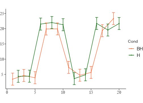
I would like to make 2 breaks of x axis on my graphic with the package ggbreak and function scale_x_break.
I have some problems to define well my parameters and arguments.
I would like to :
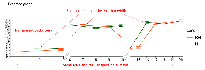
-remove the X axis on the top of my graphic,
-remove the background of my graph ( transparent background),
-have the same width of my error bar on all my graphics section ( there are a problems and some error bar are more important than others),
-keep the same space/scale between all labels on my X axis ( regular space on all axis ),

  • add parrallel bar for significate the axis break.

I join the code , the expected graphic (with in red the customize suggestion on graph)

Thank you for your help :).

my code :

library("ggplot2")
library("scales")
library("grid")
library("reshape2")
library("ggbreak")

setwd("name of the route")

df <- data.frame(Temps_jour = 1:20,Cond=c("BH", "H"), SE= c(rnorm(0.1) + 0.015, rnorm(0.23) + 0.011, rnorm(0.51) + 0.0001, rnorm(1) + 0.61),
Conc = c(rnorm(5) + 4, rnorm(5) + 20, rnorm(5) + 5, rnorm(5) + 22)
)

head(df) #verifie le formatage du fichier

df$cond <- factor(df$Cond, levels = c("BH","H"))

palette=c("#ff6633","#006600")

p1<-ggplot(df, aes(x=Temps_jour, y=Conc, color= cond))+
theme_void()+
scale_colour_manual(values=palette)+
geom_point(size=.5, aes(colour = cond)) +
geom_line(size=.5, aes(colour = cond, group= cond))+
theme(aspect.ratio = 2 / 3,
axis.line = element_line(colour = "black"),
axis.text.y=element_text(face="plain", colour = "black", size=11, family="Times New Roman"),
axis.text.x=element_text(face= "plain", colour = "black", size=11, family="Times New Roman"),
axis.ticks = element_line(colour="black", size= 0.3),
axis.ticks.length = unit(0.15, "cm"),
panel.spacing = unit(4, "lines"),
strip.background = element_blank(),
strip.text.x = element_blank(),
legend.text=element_text(size=12))

p<- p1+ scale_y_continuous(limits = c(0, 25),expand = c(0, 0), breaks = seq (0, 30, by= 2))+
scale_x_continuous(expand = c(0, 0), breaks = seq (0,20, by= 1)) +
scale_x_break(expand = F, breaks=c(3, 6),scale= 1, space = 0.5, ticklabels =c(3,4,5,6,7,8,9,10))+
scale_x_break(expand = F, breaks=c(10.1,14 ),scale= 1, space = 0.5, ticklabels =c(15,16,17,18,19,20))+
geom_errorbar(aes(ymin=Conc-df$SE, ymax=Conc+df$SE), width=0.5,position=position_dodge(0.05))

ggsave(filename = "test.png",
plot = p,
bg = "transparent",
width = 8, height = 5, units = "in")
Discarding this requirement does what you are asking.

library(ggbreak)
#> ggbreak v0.1.2
#> 
#> If you use ggbreak in published research, please cite the following
#> paper:
#> 
#> S Xu, M Chen, T Feng, L Zhan, L Zhou, G Yu. Use ggbreak to effectively
#> utilize plotting space to deal with large datasets and outliers.
#> Frontiers in Genetics. 2021, 12:774846. doi: 10.3389/fgene.2021.774846
library(ggplot2)
#> Warning: package 'ggplot2' was built under R version 4.3.1
library(grid)
library(reshape2)
library(scales)

set.seed(42)

d <- data.frame(
  Temps_jour = 1:20, Cond = c("BH", "H"), SE = c(rnorm(0.1) + 0.015, rnorm(0.23) + 0.011, rnorm(0.51) + 0.0001, rnorm(1) + 0.61),
  Conc = c(rnorm(5) + 4, rnorm(5) + 20, rnorm(5) + 5, rnorm(5) + 22)
)
d$Cond <- as.factor(d$Cond)
d |> str()
#> 'data.frame':    20 obs. of  4 variables:
#>  $ Temps_jour: int  1 2 3 4 5 6 7 8 9 10 ...
#>  $ Cond      : Factor w/ 2 levels "BH","H": 1 2 1 2 1 2 1 2 1 2 ...
#>  $ SE        : num  1.98 1.98 1.98 1.98 1.98 ...
#>  $ Conc      : num  3.44 4.36 4.63 4.4 3.89 ...

Palette <- c("#ff6633", "#006600")

p <- ggplot(d, aes(x = Temps_jour, y = Conc, color = Cond)) +
  scale_colour_manual(values = Palette) +
  geom_point(size = .5, aes(colour = Cond)) +
  geom_line(size = .5, aes(colour = Cond, group = Cond)) +
  geom_errorbar(aes(ymin = Conc - d$SE, ymax = Conc + d$SE), width = 0.5, position = position_dodge(0.05)) +
  theme_void() +
  theme(
    aspect.ratio = 2 / 3,
    axis.line = element_line(colour = "black"),
    axis.text.y = element_text(face = "plain", colour = "black", size = 11, family = "Times New Roman"),
    axis.text.x = element_text(face = "plain", colour = "black", size = 11, family = "Times New Roman"),
    axis.ticks = element_line(colour = "black", linewidth = 0.3),
    axis.ticks.length = unit(0.15, "cm"),
    panel.spacing = unit(4, "lines"),
    strip.background = element_blank(),
    strip.text.x = element_blank(),
    legend.text = element_text(size = 12)
  ) 
#> Warning: Using `size` aesthetic for lines was deprecated in ggplot2 3.4.0.
#> ℹ Please use `linewidth` instead.
#> This warning is displayed once every 8 hours.
#> Call `lifecycle::last_lifecycle_warnings()` to see where this warning was
#> generated.
p
#> Warning: Use of `d$SE` is discouraged.
#> ℹ Use `SE` instead.
#> Warning: Use of `d$SE` is discouraged.
#> ℹ Use `SE` instead.

image

Created on 2023-10-23 with reprex v2.0.2

Hello,
thank you for your help,
but the problem still the same , if I use scal_x_break for cut my x axis.
See the figure attach.
R.

I don't clearly understand your intent. For the x axis is it that you want to show conditions that exclude values of c(4,5,11,12)? That the three groups are in some way distinct and should be disconnected? Is the motivation substantive or stylistic or both?

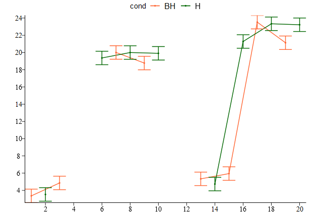
Yes, I try to cut in three part my graph with the conservation of the scale, and the style, because in my real data set all the data are not pertinent and only some section are interesting but only with a conservation of the x_scale , here I have a zoom on the interesting part but it is not my aim.

Maybe I don't use the adapt package, there are gg.gap and plotrix too.
I hope I am clear :slight_smile:
R.

I think you can achieve the effect of focussing the eye on the 3 parts, by having them be seperate groups.

library(tidyverse)
df <- data.frame(Temps_jour = 1:20,Cond=c("BH", "H"), SE= c(rnorm(0.1) + 0.015, rnorm(0.23) + 0.011, rnorm(0.51) + 0.0001, rnorm(1) + 0.61),
                 Conc = c(rnorm(5) + 4, rnorm(5) + 20, rnorm(5) + 5, rnorm(5) + 22)
)

head(df) #verifie le formatage du fichier

df$cond <- factor(df$Cond, levels = c("BH","H"))

# get rid of data we dont want to show
df <- filter(df,
             ! Temps_jour %in% c(4,5,11,12)
)

df <- mutate(df,
             group1=factor(case_when(
  Temps_jour <6 ~ 1L,
  Temps_jour <12 ~ 2L,
  TRUE ~ 3L
)),
group2 = forcats::fct_cross(cond,group1),
ymin= Conc-SE,
ymax=Conc+SE)

palette=c("#ff6633","#006600")

p1<-ggplot(df)+
  aes(x=Temps_jour, y=Conc, color= cond,group=group2) + 
  theme_void()+
  scale_colour_manual(values=palette)+
  geom_point(size=.5) +
  geom_line(linewidth=.5)+
  geom_errorbar(aes(ymin=ymin, ymax=ymax)) + 
  theme(aspect.ratio = 2 / 3,
        axis.line = element_line(colour = "black"),
        axis.text.y=element_text(face="plain", colour = "black", size=11, family="Times New Roman"),
        axis.text.x=element_text(face= "plain", colour = "black", size=11, family="Times New Roman"),
        axis.ticks = element_line(colour="black", size= 0.3),
        axis.ticks.length = unit(0.15, "cm"),
        panel.spacing = unit(4, "lines"),
        strip.background = element_blank(),
        strip.text.x = element_blank(),
        legend.position = "top",
        legend.text=element_text(size=12)) + 
  scale_y_continuous(breaks = seq (0, 30, by= 2),expand = c(0,0))+
  scale_x_continuous(breaks = seq (0, 20, by= 2),expand = c(0,0))
p1

image

1 Like

This topic was automatically closed 7 days after the last reply. New replies are no longer allowed.

If you have a query related to it or one of the replies, start a new topic and refer back with a link.