Problem with violin plots areas

Hi, I just did this violin plot

Rplot

The problem I find is that the sum of my 2017 observations is 1.7 times bigger than the sum of 2012 observations (double check) but I the plot doesn´t show that. In fact only by seeing the plot I´d say the sum of 2012 variable is bigger.

1 Like

Violin plots show the density of points, not the number. I do not know of any way to change that. Maybe someone else will have a suggestion for that. You could consider a histogram if you want to show the differences in numbers.

1 Like

could have a second axis where you plot with points the sum of var 1 per group

library (tidyverse) 

my_data_2017 <- tibble(Var_1 = c(900, 1500, 350, 1200, 750, 100,125,250,300),
                       Gender = c("W", "W", "W", "M", "M", "W", "W", "M", "W"),
                       my_weights = c(2.2, 3.1, 8.2, 4.2, 5.3, 6.8, 12, 25, 1))

my_data_2018 <- my_data_2017 %>% mutate(Var_1 = Var_1 *2)

 my_data <- union_all(my_data_2017 %>% mutate(grp=2017),
                      my_data_2018 %>% mutate(grp=2018)
 )

 (sums_df <- my_data %>% group_by(grp,Gender) %>% summarise(sum_var_1 = sum(Var_1*my_weights)))
 sums_scalar <- 10 # try different numbers
 
 my_data %>%
   ggplot(aes(Gender, Var_1, weight = my_weights, fill = Gender))+
   facet_wrap(~grp)+
   geom_violin(color = "black", scale = "count") +
   geom_point(data=sums_df,mapping=aes(x=Gender,y=sum_var_1/sums_scalar,weight=NULL)) +
   scale_y_continuous(sec.axis = sec_axis(~.*sums_scalar, name = "var 1 in group sums"))

image

2 Likes

Many thanks for your answer I realized I don't understand this line of the code:

my_data_2018 <- my_data_2017 %>% mutate(Var_1 = Var_1 *2)

it makes a dataframe with twice the values of the first.

The problem I find is that the sum of my 2017 observations is 1.7 times bigger than the sum of 2012 observations (double check) but I the plot doesn´t show that.

1 Like

Many thanks now I understand and it works. But now I have both years in one tibble there isn't any way the area of the violin plots would be comparable for the two years?

I'm finding it difficult to parse your question sorry.
It just a question of cconvenience as to whether the data is in one frame or two. It makes no difference to any plot made out of the same information.... My innovation that I offered to you is a right axis where the sum of the values per year and per group are plotted using the geom_point, this allows a direct comparison of the total sums

1 Like

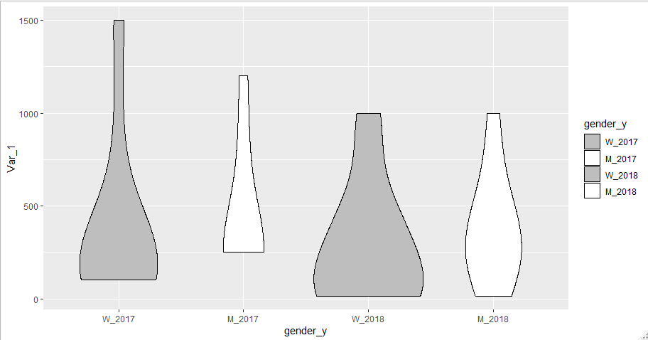
I found this solution

library (tidyverse) 

my_data_2017 <- tibble(Var_1 = c(900, 1500, 350, 1200, 750, 100,125,250,300),
                       Gender = c("W", "W", "W", "M", "M", "W", "W", "M", "W"),
                       my_weights = c(2.2, 3.1, 8.2, 4.2, 5.3, 6.8, 12, 25, 1))

my_data_2018 <- tibble(Var_1 = c(850, 1000, 370, 1000, 600, 50,15,250,300,500,100,15),
                       Gender = c("W", "W", "W", "M", "M", "W", "W", "M", "W", "W", "W", "M"),
                       my_weights = c(2.2, 3.1, 8.2, 4.2, 5.3, 6.8, 12, 25, 1,2.5, 1.2, 1.1))


my_data_2017$Gender <- replace(my_data_2017$Gender, my_data_2017$Gender == "M", "M_2017")
my_data_2017$Gender <- replace(my_data_2017$Gender, my_data_2017$Gender == "W", "W_2017")
my_data_2018$Gender <- replace(my_data_2018$Gender, my_data_2018$Gender == "M", "M_2018")
my_data_2018$Gender <- replace(my_data_2018$Gender, my_data_2018$Gender == "W", "W_2018")

my_data_new <- union_all(my_data_2017,
                         my_data_2018)

And here is the plot

my_data_new %>%
  ggplot(aes(Gender, Var_1, weight = my_weights, fill = Gender))+
  geom_violin(color = "black", scale = "count") 

Rplot

The problem now it´s I want to change ther order and the colors:
1st W_2017, 2nd M_2017, 3rd W_2018 and last M_2018.
And grey color for W_2017 and W_2018 and white for M_2017 and M_2018

Here I use the levels param of the factor definition to impose an order on gender_y
scale_fill_manual is used to provide a manual fill

library (tidyverse) 

my_data_2017 <- tibble(Var_1 = c(900, 1500, 350, 1200, 750, 100,125,250,300),
                       Gender = c("W", "W", "W", "M", "M", "W", "W", "M", "W"),
                       my_weights = c(2.2, 3.1, 8.2, 4.2, 5.3, 6.8, 12, 25, 1)) %>% mutate(
                         year=2017
                       )

my_data_2018 <- tibble(Var_1 = c(850, 1000, 370, 1000, 600, 50,15,250,300,500,100,15),
                       Gender = c("W", "W", "W", "M", "M", "W", "W", "M", "W", "W", "W", "M"),
                       my_weights = c(2.2, 3.1, 8.2, 4.2, 5.3, 6.8, 12, 25, 1,2.5, 1.2, 1.1))%>% mutate(
                         year=2018
                       )

my_data_new <- union_all(my_data_2017,
                         my_data_2018) %>% mutate(
                           gender_y = paste(Gender,year,sep="_")
                         )

my_data_new$gender_y <- factor(my_data_new$gender_y ,
                             levels=c("W_2017","M_2017","W_2018","M_2018"))
my_data_new %>%
  ggplot(aes(gender_y, Var_1, weight = my_weights, fill = gender_y))+
  geom_violin(color = "black", scale = "count") +
  scale_fill_manual(values=rep(c("grey","white"),2))

1 Like

This topic was automatically closed 7 days after the last reply. New replies are no longer allowed.