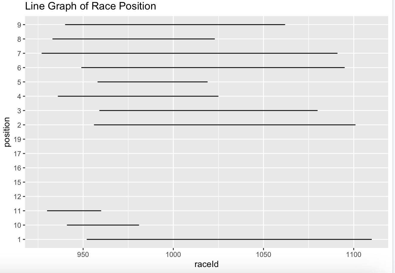
I'm in a data science class and we've been asked to interpret or analyze a particular dataset, and I've wanted to make a predictive model of F1 drivers. This is SUPPOSED to be a graph of Verstappen's final race position over time, starting with his first. However, the y-axis isnt in order and the lines are simply horizontal, and I dont understand why. Any help is appreciated.
library(ggplot2)
Verstappen2 <- subset(Verstappen, (Verstappen$position != "\N"))
ggplot(Verstappen2) + geom_line(aes(x = raceId, y = position)) + ggtitle("Line Graph of Race Position")
warnings()