Problem with geom_text ggplot2

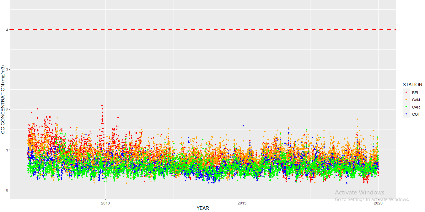
Hello all! I want to add text in my horizontal red line. I was using the function geom_text, but I always have this Error: Invalid input: time_trans works with objects of class POSIXct only. Please help!

ggplot() + geom_point(data=CO_24h, aes(x=TIME,y=BEL,colour="BEL"),size=0.9) + 
geom_point(data=CO_24h, aes(x=TIME,y=COT,colour="COT"),size=0.9) +  geom_point(data=CO_24h, aes(x=TIME,y=CAM,colour="CAM"),size=0.9) +  geom_point(data=CO_24h, aes(x=TIME,y=CAR,colour="CAR"),size=0.9) +  coord_cartesian(ylim = c(0,4.5))  + geom_hline(yintercept = 4,linetype="dashed",color="red",size=1.2) +  labs(colour="STATION",x="YEAR",y="CO CONCENTRATION (mg/m3)") + scale_color_manual(values=c('red','orange','green','blue')) + geom_text(aes(x=0,y=3,label="AQG = 4 mg/m3",color="black",size=6))

I think we need some data.

A handy way to supply sample data is to use the dput() function. See ?dput. If you have a very large data set then something like head(dput(myfile), 100) will likely supply enough data for us to work with.

what class is TIME in CO_24h ? if its a POSIXct date and define the axis for your chart, then other X values that you might use should conform to that. your geom text wants X to take 0. I think probably there is no 0 valued POSIXct at least without a set Origin

Hi! Thanks for your answer. Yes, TIME in CO_24h is a date. It starts in 2007-03-01 and ends in 2019-12-31. How can I define in geom_text that the X values are dates? Or do you know another option to add the text in the horizontal red line

You can specify the x-value for the geom_text by using the date scale of your data. For example, if you want the annotation near the left edge of the plot, you can set the x-value to something like x=min(CO_24h$TIME) + 7 (7 days after the earliest date in your data). This ensures that the value is specified on the scale ggplot is expecting.

Using the code in your example:

library(tidyverse) 

ggplot() + 
  geom_point(data=CO_24h, aes(x=TIME,y=BEL,colour="BEL"),size=0.9) + 
  geom_point(data=CO_24h, aes(x=TIME,y=COT,colour="COT"),size=0.9) +  
  geom_point(data=CO_24h, aes(x=TIME,y=CAM,colour="CAM"),size=0.9) +  
  geom_point(data=CO_24h, aes(x=TIME,y=CAR,colour="CAR"),size=0.9) +  
  coord_cartesian(ylim = c(0,4.5))  + 
  geom_hline(yintercept = 4,linetype="dashed",color="red",size=1.2) +  
  labs(colour="STATION",x="YEAR",y="CO CONCENTRATION (mg/m3)") + 
  scale_color_manual(values=c('red','orange','green','blue')) + 
  geom_text(aes(x=min(CO_24h$TIME) + 7,   
                y=3, label="AQG = 4 mg/m3", color="black", size=6))

geom_text works here, because there's no data frame specified in the main call to ggplot. If there were, then geom_text would plot the label once for each row of data. In that situation, you can use the annotate function for a one-off annotation.

Also, if you pivot your data to long format, you'll only need one call to geom_point. Here's an example with both pivoting and the annotate function:

CO_24h %>% 
  pivot_longer(c(BEL,COT,CAM,CAR)) %>% 
  ggplot(aes(TIME, value, colour=name)) +
   geom_point(size=0.9) +
   coord_cartesian(ylim = c(0,4.5))  + 
   geom_hline(yintercept = 4,linetype="dashed", color="red", size=1.2) +  
   labs(colour="STATION",x="YEAR",y="CO CONCENTRATION (mg/m3)") + 
   scale_color_manual(values=c('red','orange','green','blue')) + 
   annotate(geom="text", 
            x=min(CO_24h$TIME) + 7, 
            y=3, label="AQG = 4 mg/m3", color="black", size=6)
This topic was automatically closed 21 days after the last reply. New replies are no longer allowed.

If you have a query related to it or one of the replies, start a new topic and refer back with a link.