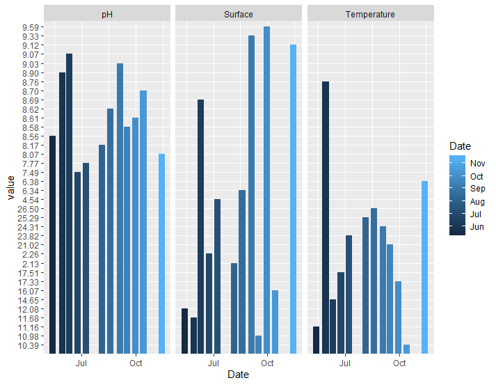
I have been trying to create a bar chart showing pH, Surface DO, and Temperature. My data set seems to not be in the correct format but I am not sure why. Someone had helped me by creating a dataset from my data but I could not replicate their graph from my excel file. This is what I am working from:
Date
Surface

             Surface    pH     Temperature
1   2019-05-13  12.08   8.56    11.16
2   2019-05-29  11.68   8.90    8.76
3   2019-06-10  8.69    9.07    14.65
4   2019-06-24  2.26    7.49    17.51
5   2019-07-08  4.54    7.77    23.82
6   2019-08-05  2.13    8.17    25.29
7   2019-08-19  6.34    8.62    26.50
8   2019-09-04  9.33    9.03    24.31
9   2019-09-16  10.98   8.58    21.02
10  2019-09-30  9.59    8.61    17.33
11  2019-10-14  16.07   8.70    10.39
12  2019-11-14  9.12    8.07    6.38
When I produce a graph with this data set, I end up with a graph that is clearly not right and the y-axis is all over the place.
dat.g <- gather(Plaster_2019_Data, type, value, -Date)

ggplot(dat.g, aes(Date, value)) +
  geom_bar(aes(fill = Date), stat = 'identity', position = "dodge2") +
  facet_grid(.~type) +
  expand_limits(y = c(1,30))
Another user created this code and made their own data set with my data:
df<-structure(list(Date = structure(c(3L, 4L, 5L, 6L, 7L, 9L, 8L,
                                  12L, 10L, 11L, 1L, 2L), .Label = c("10/14/2019", "11/14/2019",
                                                                     "5/13/2019", "5/29/2019", "6/10/2019", "6/24/2019", "7/8/2019",
                                                                     "8/19/2019", "8/5/2019", "9/16/2019", "9/30/2019", "9/4/2019"
                                  ), class = "factor"), Surface = c(12.08, 11.68, 8.69, 2.26, 4.54,
                                                                    2.13, 6.34, 9.33, 10.98, 9.59, 16.07, 9.12), pH = c(8.56, 8.9, 9.07, 7.49, 7.77, 8.17, 8.62, 9.03, 8.58, 8.61, 8.7, 8.07), Temperature = c(11.16,8.76, 14.65, 17.51, 23.82, 25.29, 26.5, 24.31, 21.02, 17.33,                                                                                                                                                                                             10.39, 6.38)), class = "data.frame", row.names = c(NA, -12L))

df$Date <- as.Date(df$Date, format = "%m/%d/%Y")

dat.g <- gather(df, type, value, -Date)

ggplot(dat.g, aes(Date, value)) +
  geom_bar(aes(fill = type), stat = 'identity', position = "dodge2") +
  facet_grid(.~type) +
  expand_limits(y = c(1,30))+
  scale_x_date(date_breaks = "month",
               date_labels = "%b")+
  theme(axis.text.x = element_text(angle = 45, hjust = 1))
This produces the correct graph. The bars are where they should be and the y axis is in the correct order.
(https://i.stack.imgur.com/kM3wS.png)
I would love some help figuring out why my data set is not working correctly!
