legend <- c("score" = "black", "answer" = "red")

plot <- df_l %>% ggplot(aes(date, score, color = "score")) + geom_line() +
  geom_vline(aes(xintercept = getDate(df_all %>% filter(name == List[5])), color = "answer"), linetype = "dashed", size = 1,) +
  scale_color_manual(name = "Legend", values = legend) +
  scale_x_date(labels = date_format("%m/%y"), breaks = date_breaks("months")) +
  theme(axis.text.x = element_text(angle=45)) +
  labs(title = "", x = "", y = "", colors = "Legend")
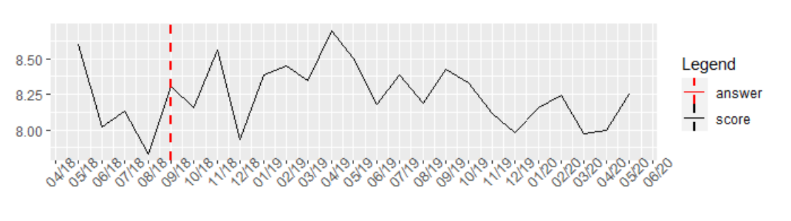
I get the result above and could not figure out how to resolve the problem that in the legend always both lines are mixed up. One legend should of course show the slim black line only and the other the dashed black line. Thanks in advance!