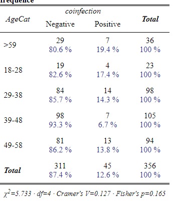
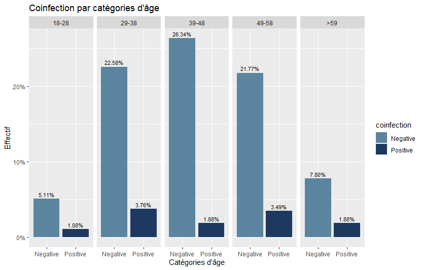
Hello everyone! I'm trying to do a bar plot with a multiply y-axis. I wanted to plot the cross tab below, but the percentages are wrong.
Coinfection rates in each Age category.

this is the code I used:
Data %>%
count(AgeCat= factor(AgeCat), coinfection = factor(coinfection)) %>%
mutate(pct = prop.table(n))%>%
mutate(AgeCat = fct_relevel(AgeCat, "18-28", "29-38", "39-48","49-58", ">59")) %>% #this for order
filter(!(AgeCat %in% NA)) %>% #Remove NAs
filter(!(coinfection %in% NA)) %>%
ggplot(aes(x=coinfection, y=pct, fill = coinfection, label = scales::percent(pct))) +
geom_col(position = 'dodge') +
geom_text(position = position_dodge(width = .9),
vjust = -0.5,
size = 3) +
scale_y_continuous(labels = scales::percent)+
facet_grid(cols = vars(AgeCat))
