The code:
ggplot(data = EH, aes(x = date, y = oil)) + geom_point (aes(color = well)) + facet_wrap(~ well)
The date in the plot is not displayed well for each well:
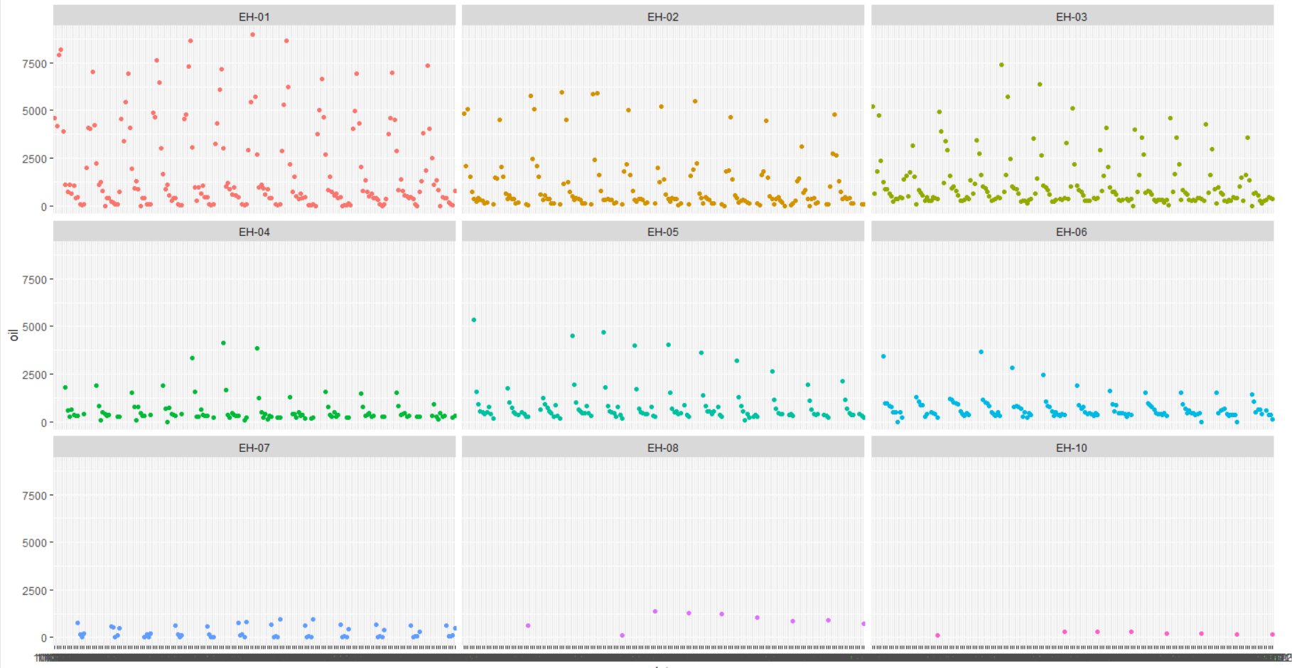
What should I change in the code to enhance the display of (x axis)?
The code:
ggplot(data = EH, aes(x = date, y = oil)) + geom_point (aes(color = well)) + facet_wrap(~ well)
The date in the plot is not displayed well for each well:
What should I change in the code to enhance the display of (x axis)?
Have a look at ?scale_x_date() and see if that helps. I'm assuming that "date" is a date type (!).
A (slightly modified) example from the help page looks something like this, which might help, but you'd need to adjust to suit the date range of your data:
df <- data.frame(
  date = last_month,
  price = runif(30)
)
ggplot(df, aes(date, price)) +
  geom_line() +
  scale_x_date(date_labels = "%b %d")
Try scale_x_date() first (i.e. the defaults) and see if that helps.
Stephen
Thanks for your reply and your help
This topic was automatically closed 45 days after the last reply. New replies are no longer allowed.
If you have a query related to it or one of the replies, start a new topic and refer back with a link.