library(ggpubr)
library(tidyverse)
test <- read_csv("test.csv")
plot2 <- ggboxplot( test, x = "type", y = "brightness", color = "type", add = "jitter" )
list.comparisons = list(c("A0", "A1"), c("A0", "A2"), c("A0", "A3"), c("A0", "A4"), c("A1", "A2"), c("A1", "A3"),c("A1", "A4"), c("A2", "A3"), c("A2", "A4"), c("A3", "A4") )
plot_sig <- plot2 + stat_compare_means(comparisons = list.comparisons, label = "p.signif", step.increase = 0.2) + stat_compare_means(label.y = 300)
plot_sig
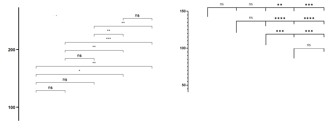
The code will plot well spaced significance bars but stacked above each other.
I tried using different packages:
library(rstatix)
library(ggprism)
df_p_val <- rstatix::tukey_hsd(x = test, brightness ~ type)
plot_test + add_pvalue(df_p_val, y.position =(c(130, 130, 130, 130, 118, 118, 118, 105, 105,90)), tip.length = 0.05 )
add_pval
Though I was able to have the significance bar placed side by side, I now have a problem with the position of astreisks/n.s .
They are not placed correctly because the default position is half length of the bar. How could we adjust for that to reach the final image depicted here in the attached image?
Thanks for the help.
here is the file containing the data:
https://drive.google.com/file/d/1ehof-ZXU3Y4jCK04lrxggSf-S767yzFa/view?usp=sharing
