hi everyone, I would like to make a plot with an empty column in it. The reason that I still want to include this column in the R code is, I have multiple groups, with this column empty for some groups, but not for others. And the data of these groups are not available at the same time. I would like to make an R code for all these groups so that I do not need to change the code every time I obtain the data from a new group.
Here is an replicable example for one group with a column of missing data.
Hi @xinxi813,
It looks like you are trying to plot a single graph with several different Y axes; this is generally a bad idea and is difficult to achieve. Another option is to do a "pairs plot" and exclude at the beginning any columns of the data frame containing missing values. This approach produces a single graph that has multiple panels (which can be customized to your liking):
suppressPackageStartupMessages(library(tidyverse))
library(GGally)
#> Registered S3 method overwritten by 'GGally':
#> method from
#> +.gg ggplot2
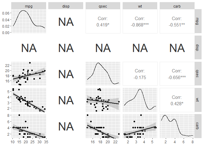
mtcars$disp=NA # Put missing values in one column
head(mtcars)
#> mpg cyl disp hp drat wt qsec vs am gear carb
#> Mazda RX4 21.0 6 NA 110 3.90 2.620 16.46 0 1 4 4
#> Mazda RX4 Wag 21.0 6 NA 110 3.90 2.875 17.02 0 1 4 4
#> Datsun 710 22.8 4 NA 93 3.85 2.320 18.61 1 1 4 1
#> Hornet 4 Drive 21.4 6 NA 110 3.08 3.215 19.44 1 0 3 1
#> Hornet Sportabout 18.7 8 NA 175 3.15 3.440 17.02 0 0 3 2
#> Valiant 18.1 6 NA 105 2.76 3.460 20.22 1 0 3 1
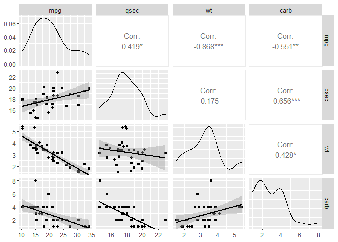
# Columns we are interested in (although some MAY have missing values)
response <- c("mpg","disp","qsec","wt")
explanatory <- "carb"
# Plot the graphs
mtcars %>%
select(matches(c(response, explanatory))) %>%
select_if(~ !any(is.na(.))) %>% # Ignore any columns with NAs
ggpairs(lower=list(continuous="smooth"))
# Or, leave the missing values in and see where they are
mtcars %>%
  select(matches(c(response, explanatory))) %>%
  #select_if(~ !any(is.na(.))) %>%   # Ignore any columns with NAs
  ggpairs(lower=list(continuous="smooth"))
I finally got the idea of ggpairs(), I think the three panels on the button line are what I need. But how to make the carb as the X-axis? The output plot matrix is quite complicated for presentation, is it possible to get rid of other panels and keep the three with mpg, qsec, and wt as Y-axis?